


Illuminate: The Art of Neon

My museum exhibit is called Illuminate. It focuses on the art and history of neon. For my logo I decided to do a combination logo and replaced the “A” in Illuminate with a lightbulb to represent the light that neon emits.
Color Logo

Once I had my logo and my color schemes, I knew I wanted to make the logo look like it was actually made of neon. The neon version of the logo is 3 different layers. The top layer is a logo in a muted light yellow. I blurred the edges very slightly to give it a sort of buzzy feel. I then duplicated the layer and increased the line weight and changed the color to a bright yellow. I used a gaussian blur to make it feel like it was light being emitted from the logo. I then duplicated that layer, increased the gaussian blur and decreased the opacity to add a glow to the wall.
Identity

I decided to challenge myself with this project. I always tend to go for a more muted monochromatic color scheme and it usually tends to be more girly with lots of cursive. I wanted to do bright bold colors for the project to push myself which led me to the idea to do neon. All of the colors are based on different neon signs that I found in my research. The typography for the logo is bold, straying away from my typical go to cursive style.
Environmental Graphic: Exhibit Room 1
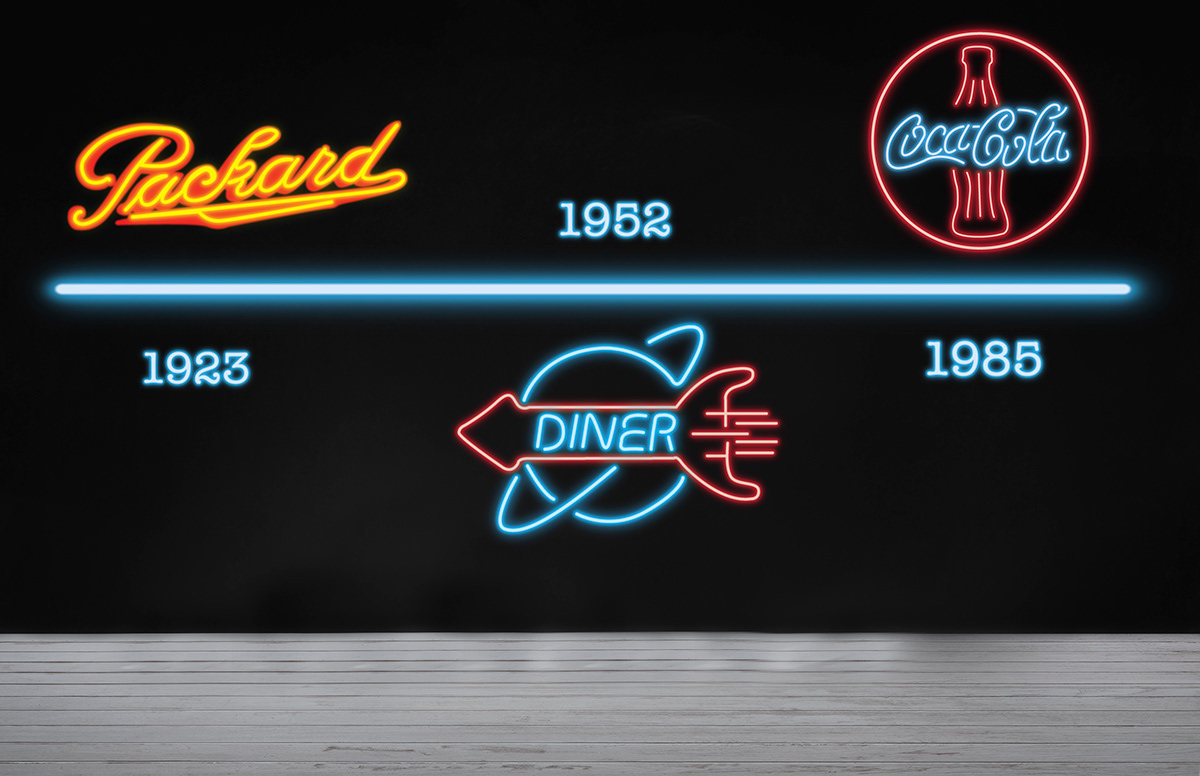
The first wall is reflecting the history of the neon sign. The first sign on the wall is a replication of the first neon sign ever made. The other two are also based on real historical neon signs. I used the same technique from the logo to make all three signs.
Environmental Graphic: Exhibit Room 2

My second room explored the art of neon. It showcases multiple types of neon art that the viewer will learn about in their brochure. It features photography mixed with neon, neon used for interior design and a portrait made with neon.
Narrative Literature

My hand out gives information on how neon is made, its history, and the art of neon shown in the second room. With the brochure comes glow sticks that the viewer can take into the room with them. But the brochure has a secret…

...It glows in the dark! Since all the rooms in the exhibit are dark I thought that it would be beneficial. Actual neon ink would be used in production but I used a clear neon paint that doesn’t show up until the lights are turned off. This is probably my favorite part of the project.
Environmental Graphic: Outdoor Billboard

For the outdoor sign I used a billboard at night. It’s simple and easy to read which makes it easy for drivers on the freeway or road to see and read. And at night the neon sign at the bottom points people in the direction of the museum and ties back into the neon in the exhibits.
Environmental Graphic: "Enter Here" GIF

In addition to the billboard, I thought it would beneficial to include a neon sign at the entrance to the exhibit. I created a gif of it flicking on and off. The center of it includes the lightbulb from the logo.
Ideation Sketches


