
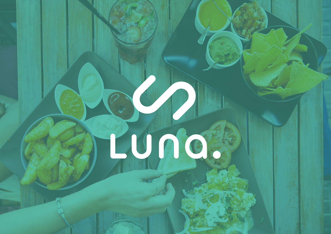
Luna - Chat Bot
New mobile chat bot application, built to handle bookings and inquiries for restaurants.
Brief:
Create a type logo and marque which look great together but also can be used separately on marketing materials. It needed to be very contemporary and appeal to a young audience who enjoy the convince of accessing information on their phones.
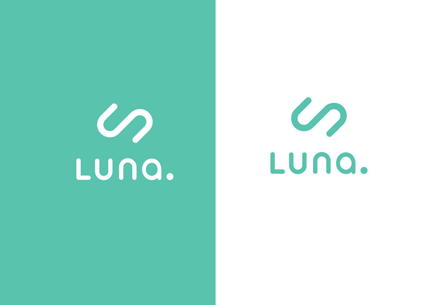
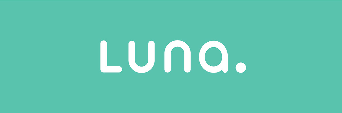
The Typeface
The soft curves and lines along with the bigger counter space give an approachable and friendly feel to this typeface also because this is a tech based brand I needed to use something which felt modern and would look good used mainly in a digital environment.
Instead of using the separate u & n characters available I decided to stick with the u and repeat this for it's neighbouring character n. This went on to form the base of the logo design.
The Logo
Here I started with two separate characters (as seen in logo above) which reminded me of a birds eye view of two chairs, which is reminiscent or sitting to dine together. I played around with these shapes until reaching a more abstract conclusion.
The final logo is more about being and staying connected both through technology and food but still echos the original idea I saw in the type logo of two chairs close to one another, almost like a restaurant floor plan.

Thank you