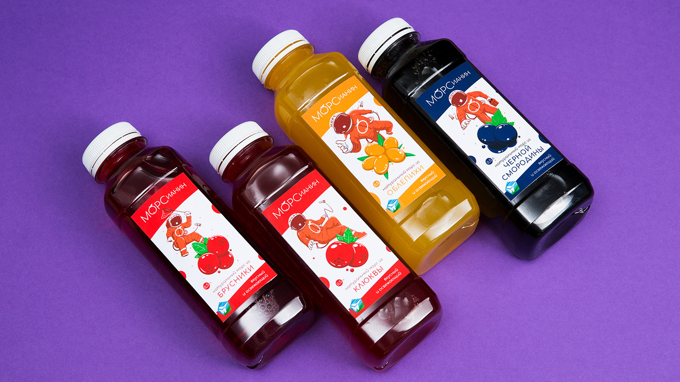
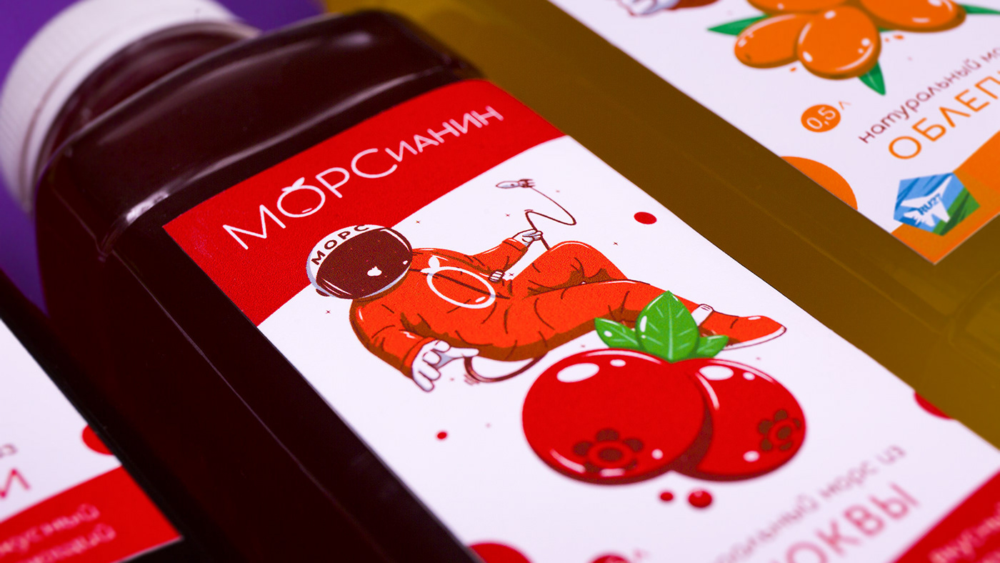
Morsianin
natural mors (fruit-drink) from Russia.
Task: Sova Branding Agency was tasked to develop a design of the packaging and the logo of natural fruit drinks, communicating high quality.
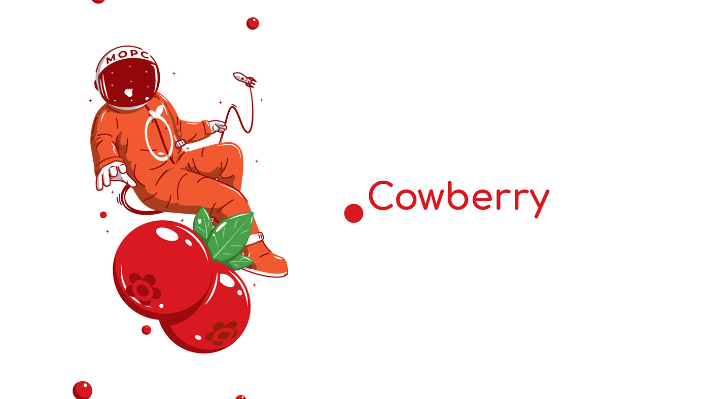
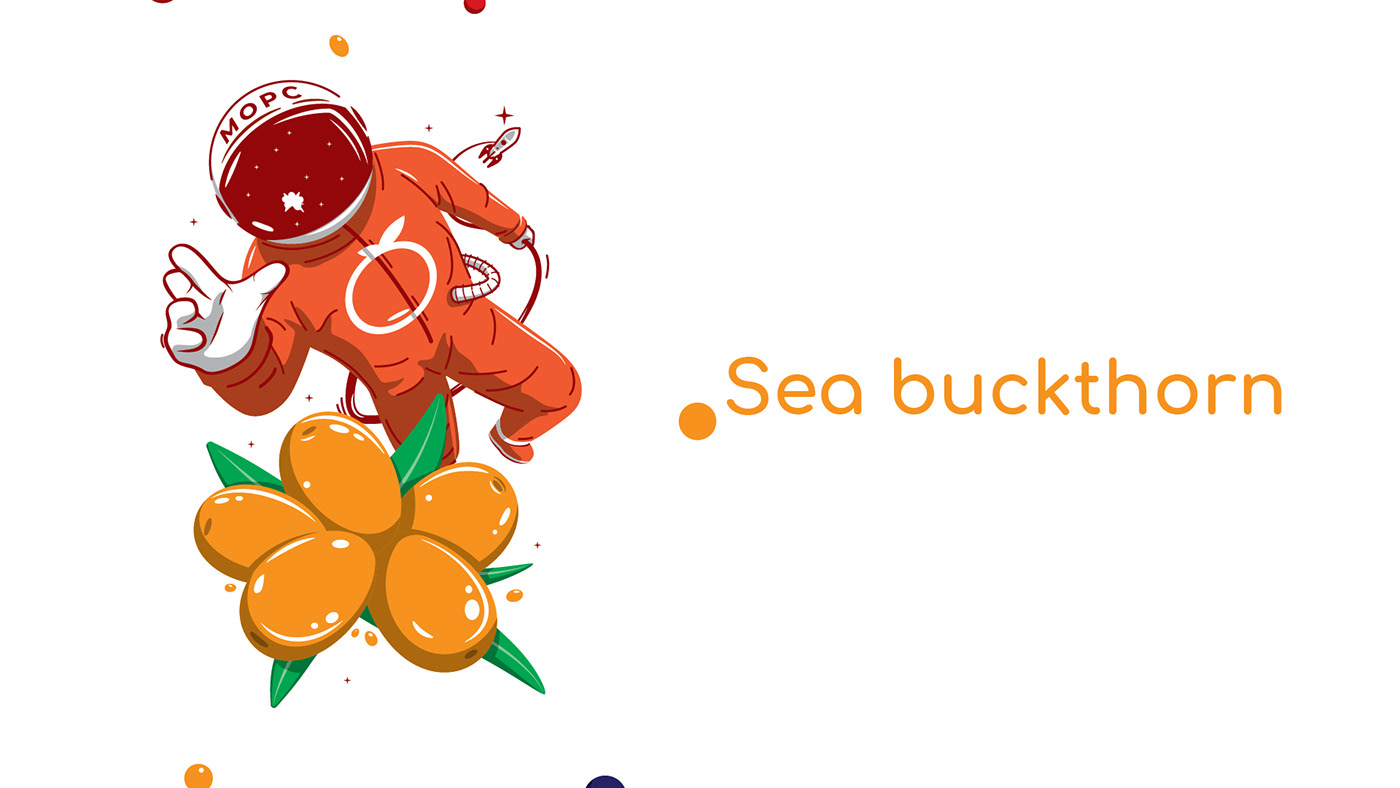
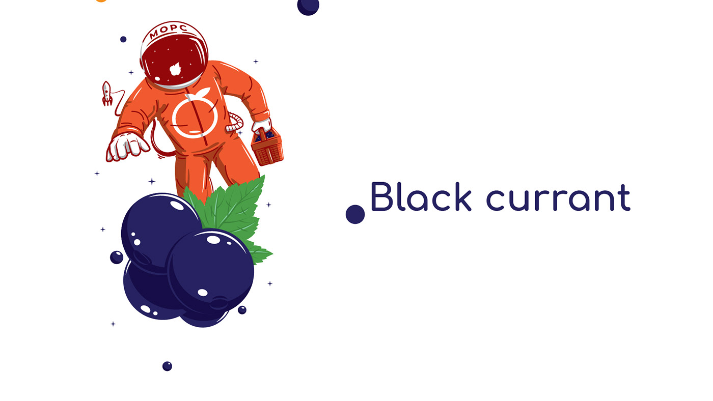
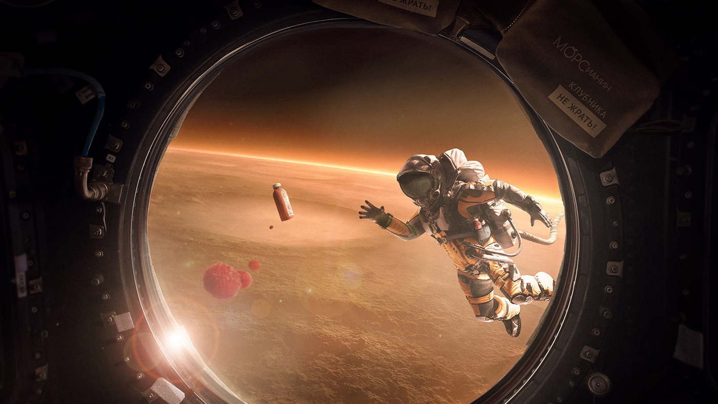
Insight: Morsianin (named from the combination of two words in Russian: "Martian" and "mors") is a brand that offers delicious and healthy fruit drinks, rich in vitamins and created according to their own recipe. The first series contains 4 flavors: black currant, sea buckthorn, cranberry and lingonberry. In the future, the line will be updated with new and exclusive tastes.

The sign is made in a minimalist style, and is based on the font Comfortaa, it is also used as the main corporate font. The writing was finalized manually: kerning was performed and the optimal size of letters was selected for various parts of the logo. During the development, it was decided to focus on the word "Mors" in order to avoid erroneous reading of the name as "Martian". Rich red color and the absence of distracting details make the logo bright and eye-catching, like a berry in space.