uniqkey - password manager website
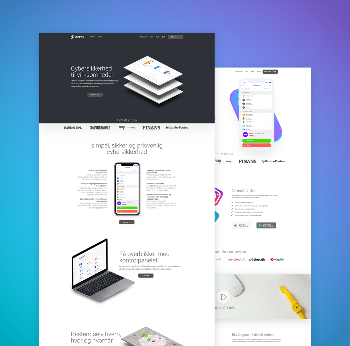
My goal with uniqkeys websites was to make a distinct feel for business-to-business and business-to-consumer respectively. It's overlight "lightness" was a must, and allowing the room for negative space was important to me. Uniqkey is a password manager, and making cybersecurity "sexy" is one heck of an assignment, so I was simply aiming for clean and confident instead.
I decided to re-use the dark #2E3138 color from the app's main navigation for the B2B landing page, as it should serve a more professional cause, than the consumer page - even though the product was the exact same. The B2C site ended up with a revamp of one of the earlier used gradients, from the apps original design. Downtoned a whole lot, but used with respect. These was originally made by Johannes Sejer - credit goes to him for that one.
The main differences between the two though is that the B2B site showcases the web-app dashboard where companies control their accounts and employees, whereas the consumer page is focused on app-downloads, CTAs and their mobile app in general.
Affraid of the dark
The rare non-use of darker section dividers for the bright white background was a bold move. Inspired by Pleo.io on that one, I fiddled a lot around with this, how much space each section should have, if they should in fact be white and so forth. Ended up with reasonable proportions and sticking with the all-white background really emphasizes the easy understandable bullet points that should explain the otherwise pretty complex security platform.
Ressources:
Big thanks to the creators for these fine ressources! They are very much appreciated!
Iphone X: Pixeden (Black front facing and isometric), LitusPro (Flat white model)
Isometric Macbook Pro: Ali Aziz
Isometric screenshot mockup: GraphicBurger
Big thanks to the creators for these fine ressources! They are very much appreciated!
Iphone X: Pixeden (Black front facing and isometric), LitusPro (Flat white model)
Isometric Macbook Pro: Ali Aziz
Isometric screenshot mockup: GraphicBurger