EN
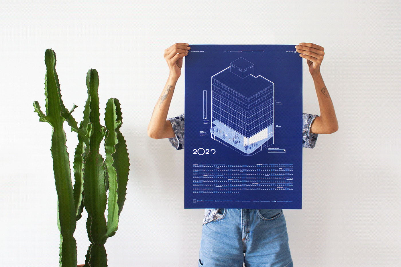
Long-time partners, the creators of the business invited us to propose a brand for the cafeteria they would run, occupying the event hall of IAB/SP (Brazilian Institute of Architects). The challenge was to create a contemporary identity yet respecting the unique architectural context of the physical space that would host it: one of the first modernist buildings in São Paulo, designed by Rino Levi in 1946.
PT
Parceiros de longa data, Jean e Ina, idealizadores do negócio, nos convidaram em janeiro/2019 a propor uma marca para a cafeteria que abririam no mês seguinte, ocupando o salão de eventos do IAB/SP. O desafio era criar uma identidade contemporânea, mas que respeitasse o singular contexto arquitetônico do espaço físico que a abrigaria: um dos primeiros edifícios modernistas de São Paulo, projetado por Rino Levi, em 1946.

EN
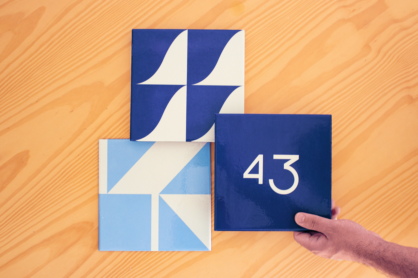
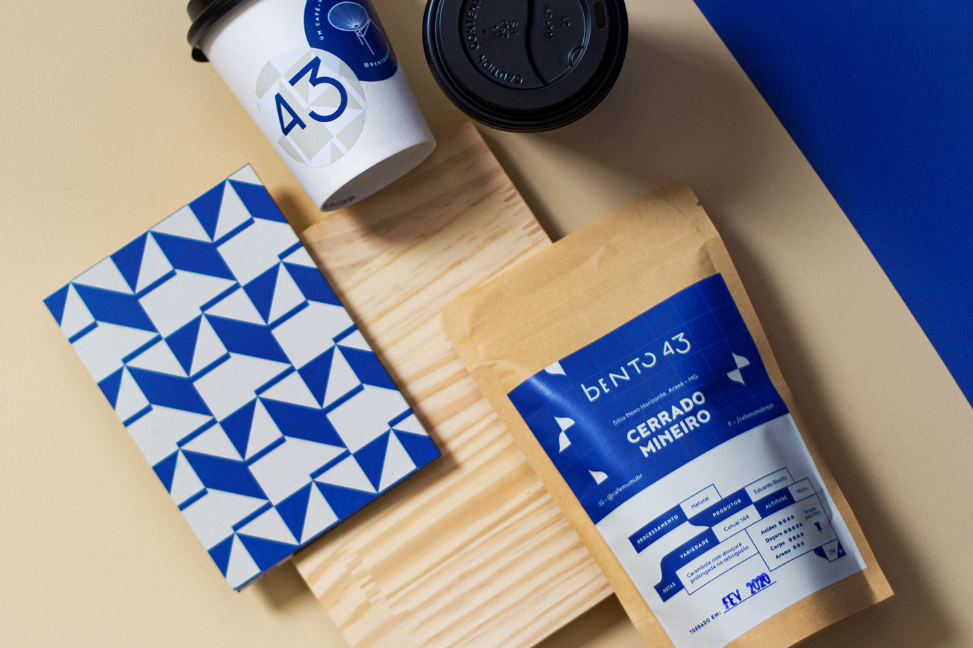
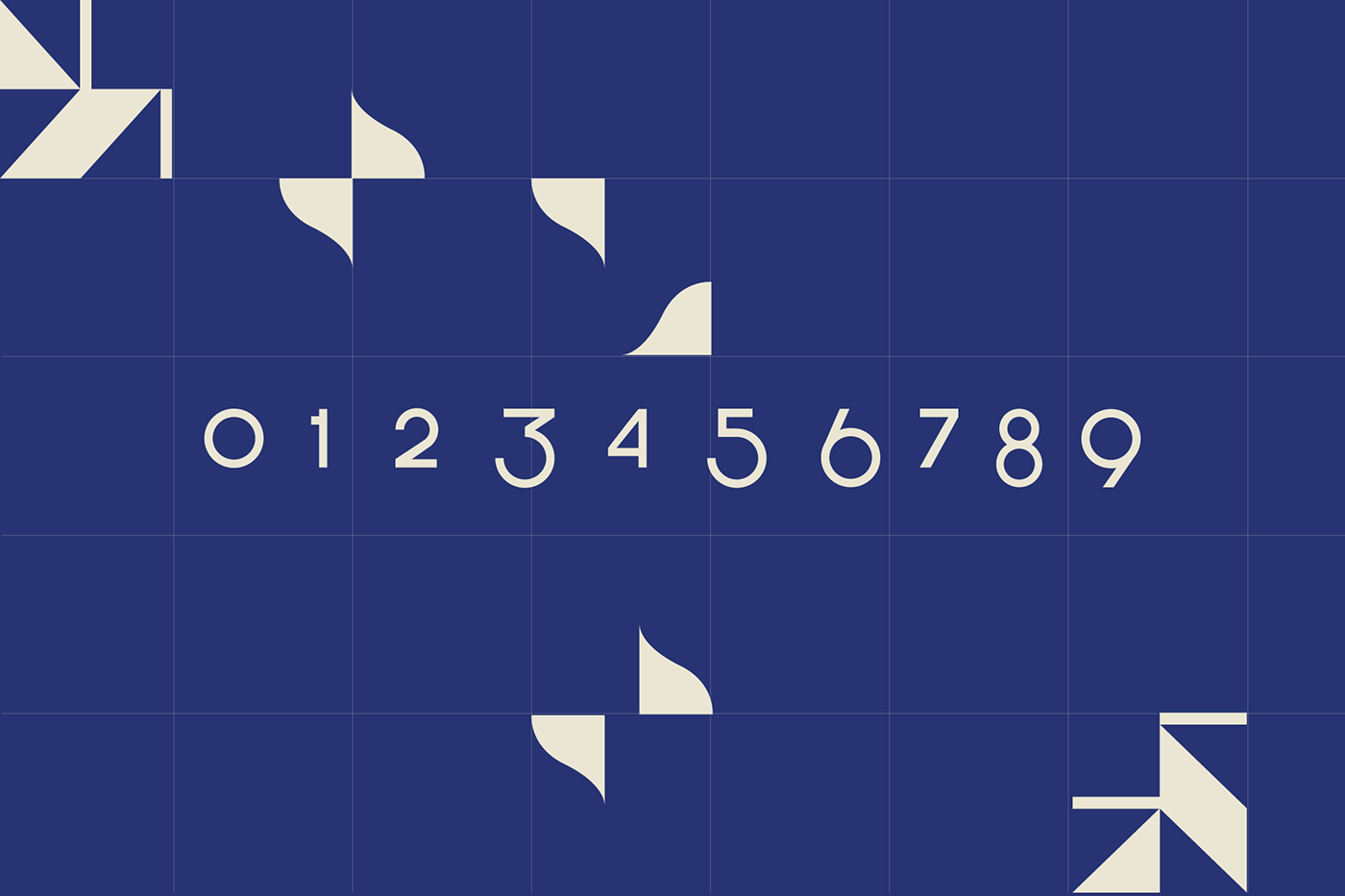
From the technical architectural drawings, we extracted two shapes that became abstract geometric patterns, in a clear reference to modern Brazilian tiles. From this meeting, we also defined blue as the main color of the palette, ranging from the pompous cobalt that stamped the classic Portuguese tiles, to the eye-catching indigo, acclaimed in the hands of great names of modern Brazilian tiles, such as Athos Bulcão and Oscar Niemeyer.
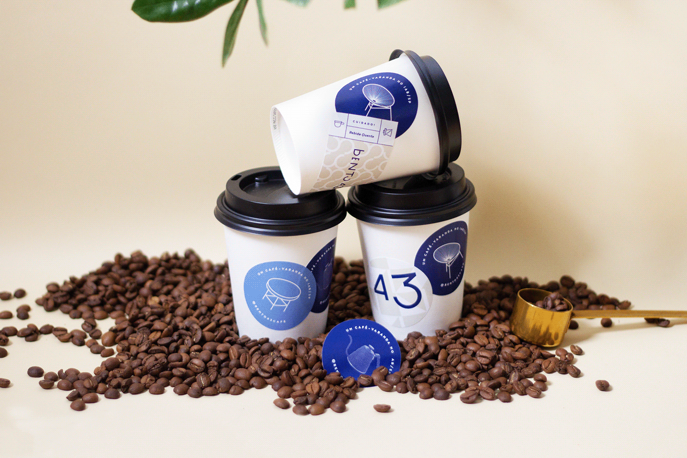
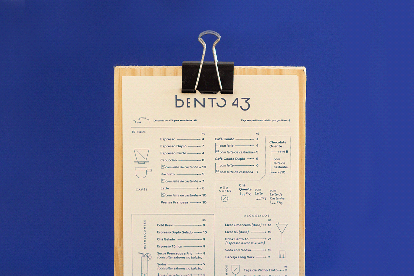
The logo is composed by characters designed especially for the project, in which we mixed uppercase and lowercase letters without obeying the traditional patterns of upper and lower case, highlighting then the ascending in the first character, lowercase, and the descending of equal height in the last digit of the set, visually balancing the tensions provoked.
PT
Dos desenhos técnicos de arquitetura, extraímos duas formas que se transformam em padrões geométricos abstratos, numa clara referência à azulejaria moderna brasileira. Desse encontro, definimos também o azul como a principal cor da paleta, destacando-se desde o pomposo cobalto que estampava a azulejaria portuguesa clássica, até o vistoso anil, consagrado nas mãos de grandes nomes da azulejaria moderna brasileira, como Athos Bulcão e Oscar Niemeyer.
Atravessando temporalmente as cores e formas geométricas básicas, o logo é composto por caracteres desenhados especialmente para o projeto, no qual misturamos letras maiúsculas e minúsculas sem obedecer aos padrões tradicionais de caixa alta e baixa, destacam-se então o ascendente no primeiro caractere, minúsculo, e o descendente de igual altura no último algarismo do conjunto, equilibrando visualmente as tensões provocadas.

EN
The result of the project is a visual set that pays homage to modernity, but without recreating it, marking its inherent contemporaneity through the movement and formal multiplicity of the brand.
PT
O resultado do projeto é um conjunto visual que homenageia a modernidade, mas sem recriá-la, marcando sua inerente contemporaneidade por meio do movimento e da multiplicidade formal da marca.

EN
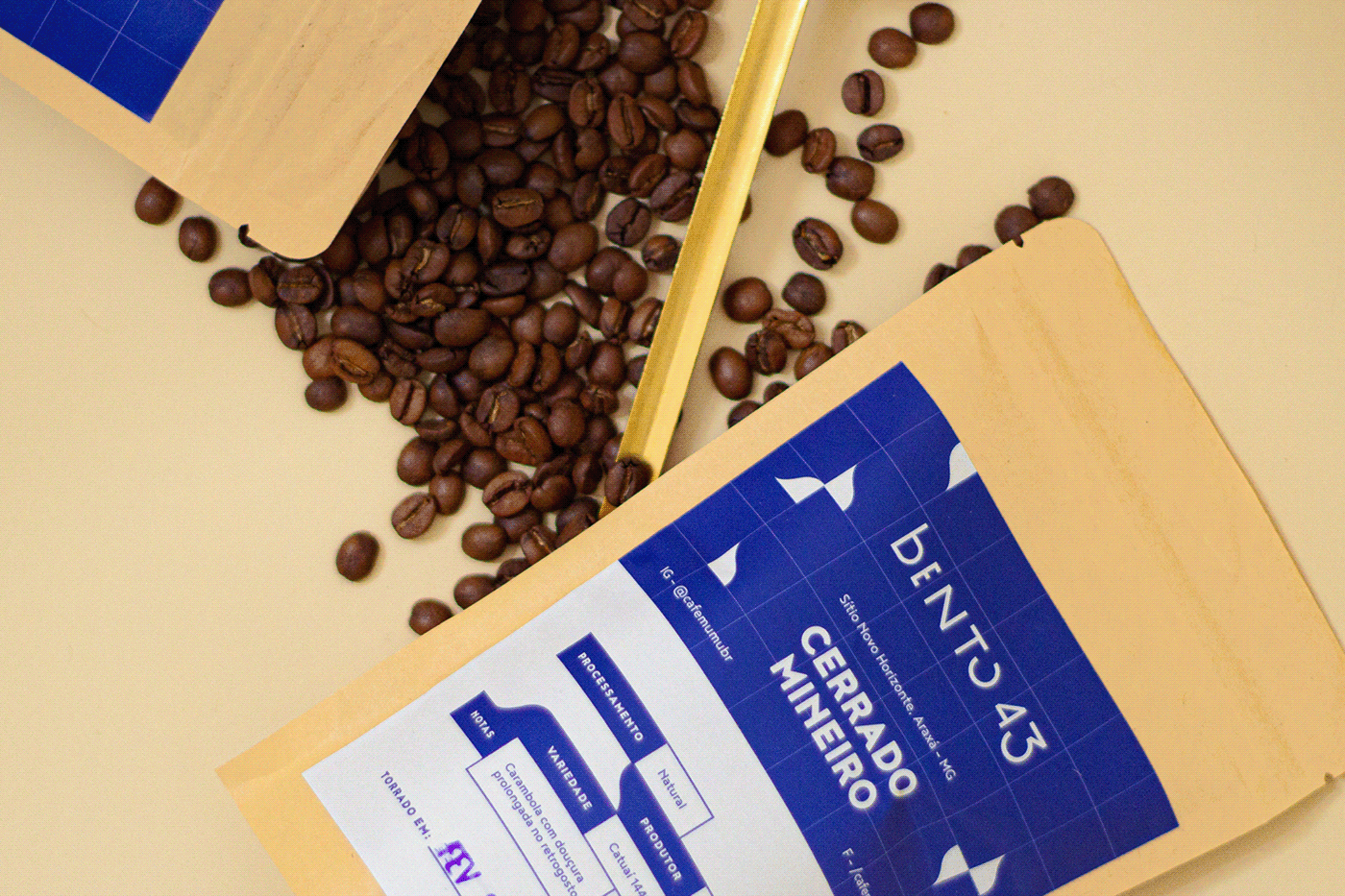
Bento 43, as the establishment was baptized, has its name composed of two parts: Bento, coming from the homonymous street where it was located; and 43, in reference to the year the Institute was founded, in 1943.
From then on, IAB went through several administrations and reforms, as the city around it rapidly changed. Bento 43 arose then from the need to re-qualify this location, creating an opportunity to use a space that until then was used only sporadically, for the Institute's events.
The brand, besides symbolizing and identifying the business, carries the intention of democratizing access to spaces and creating a plural and welcoming meeting place in the - often hostile - São Paulo downtown. We seek to show a better relationship between art, architecture and design so that, based on this, we can promote interests, meetings and reflections about these themes to those who were just looking for a good cup of coffee.
PT
Bento 43, como foi batizado o estabelecimento, tem seu nome composto por duas partes: Bento, advindo da rua homônima na qual se situa; e 43, em referência ao ano de fundação do Instituto, em 1943.
Desde então, o IAB passou por diversas administrações e reformas, à medida que a cidade ao seu redor rapidamente se modificava. O Bento 43 surge então a partir da necessidade de requalificação desse local, criando uma oportunidade de uso para um espaço que até então era utilizado apenas de forma esporádica, com os eventos do Instituto.
A marca, além de representar e identificar o negócio, carrega em si a intenção de democratizar o acesso aos espaços e criar um local de encontro, plural e acolhedor, no – por muitas vezes hostil – centro de São Paulo. Buscamos explicitar as relações entre arte, arquitetura e design para que, a partir disso, possamos propiciar interesses, encontros e reflexões acerca desses temas a quem estava procurando apenas por um bom café.
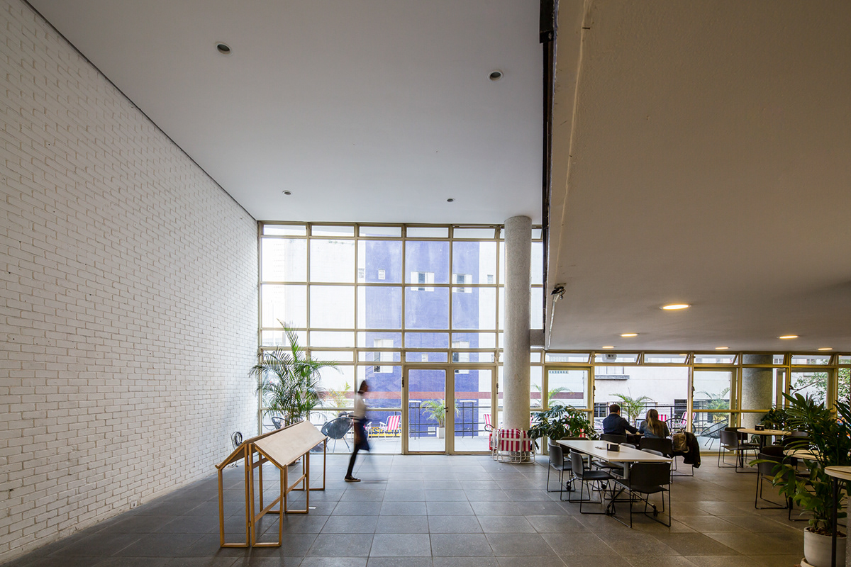
IAB/SP. Photo by Tony Chen