Client
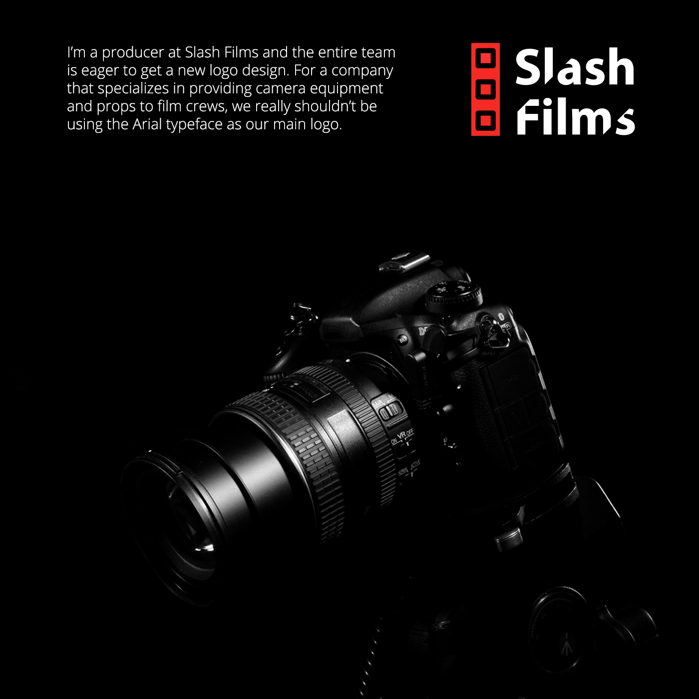
Slash Films is a company that provides camera equipment and props to film crews. As a company that works in movie industry they need a new logo which would provide professional appearance and (quoting) "convey their «thrilling» services to potential clients at a first glance".
At the same time producer Mike Carpenter wants to avoid violent graphic imagery and Arial typeface in the final logo design.
New logo would be used on business cards, vinyl stickers on rental equipment, and would be featured in the closing credits of films to which they contributed in terms of production.
Process
Searching for idea.
I started browsing film crews and equipment, wondering what is the most suitable symbol for a company in film industry? A camera? Or maybe a shutter? How can I use “Slash” symbol in a logo, in reference to a company name?

Realisation
I found out that cine-film is the most recognised sign in movie industry. This holds true whether this is a begining of film era when cine-film was essential for moviemakers or it's digital era where all of raw footage is stored in computers.
Since image of whole cine-film was too complicated to be a stand-alone logo, I decided to simplify it to only one piece of the film. Also it pictures three frames. Red color fits perfectly and reminds us of recording button which is also red.
Next, I have chosen Open Sans typeface for the company name and have shaped its form to look sharper and pass on those feelings of «thrilling» services.


Thanks for watching! Please leave a like or a review!
Credits
Icons: flaticon.com
Photos of cameras:
Chair photo: Jon Tyson
Joost Crop, pexels.com,
Mockups: Thanh Nguyen
Designer: Kirill Arapov


