


T&T Supermarket Rebrand
Logo Design | Typography
T&T Supermarket is a Canadian supermarket chain that sells a variety of Asian foods. The supermarket has greatly increased their store expansion across Canada (British Columbia, Alberta, and Ontario), making them the largest Canada's largest Asian supermarket chain. T&T Supermarket is more than just a supermarket chain; it builds a community of immigrants and bonds people together.
THE PURPOSE
To redesign a current grocery's logo strictly on typography and shape elements. From Typography 2 class, the challenge of the project was to integrate a typographic relation with the supermarket's history and establish a modern look. By the end of the project, the goal was to gain knowledge of creating a logo out of typographic elements while effectively maintaining a brand's story.

THE HISTORY
The supermarket brand was founded by Cindy Lee who began her business journey as she came to Canada. As an immigrant she worked at her husband's grocery store, which later ignited her interest to build a grocery industry. In the 1990s, it was difficult to shop in Chinatown for groceries considering they were tight spaced, unclean street stands. Cindy took this opportunity to make and open a supermarket that would solve these issues, creating an atmosphere to shop for Asian immigrants.
In 1993, Cindy opened the first T&T Supermarket in British Columbia. She accomplished all the expectations of what an Asian supermarket supposed to stand for immigrants. T&T Supermarket has succeeded by welcoming a clean and modern grocery shopping experience, providing an assorted of food selections from locals and international options. In 1996, the supermarket brand raised to the top of Canada's largest Asian grocer. In 2009, T&T was obtained a ton of money by the Loblaw Companies Limited. As of today, there are 23 stores across the nation, serving Asian food produce and products for all kinds of families.


THE STORY BEHIND THE LOGO
The logo, T&T Supermarket gives a tribute to the original investors (Tawa Supermarket and Uni-President Enterprises Corp, Tung Yee). The logo has a personal touch as it was also named after taking the initials of Cindy's two daughters, Tina & Tiffany. As a family-owned supermarket business, Cindy passed down her role as the CEO to her oldest daughter, Tina. She promised to continue her mother's work and lead the company forward in the future.

BEHIND THE LOGO REDESIGN CONCEPT
With the logo variations, the concept was inspired by looking at Asian architecture in Mississauga Chinatown. As you enter this Chinatown, there is a huge piece of Asian architecture that has pillars and a pagoda's roof structure. From looking at the two T's, it sparked an idea of combining the characters together and placing the ampersand in between. Once the typographic relation is set, I added shapes to form the roof and base, sandwiching the two T's as pillars.
Connecting the typographic relation to the supermarket's history began to form as I thought about the concept of architecture deeper. From my research of their history, the supermarket valued supporting families for their grocery needs. I developed a symbolism of the logo redesign; the "T&T" acts as the pillars holding up the supermarket to support families, immigrants, communities out there.


RATIONALE OF DESIGN CHOICES
To maintain their look, the typeface combination of the serif and cursive font are slightly updated from their previous typefaces. Using Baskerville and Dancing Script had the closest resemblances but sleeker appearance from their current logo's typefaces. The dark green is maintained for recognition but added the medium green (from their other logos) so it put emphasis on the "T&T".
T&T Supermarket Rebrand Market Applications

T&T Supermarket Business Card & Reusable Grocery Tote Bag

T&T Supermarket Food Packaging & Flyer
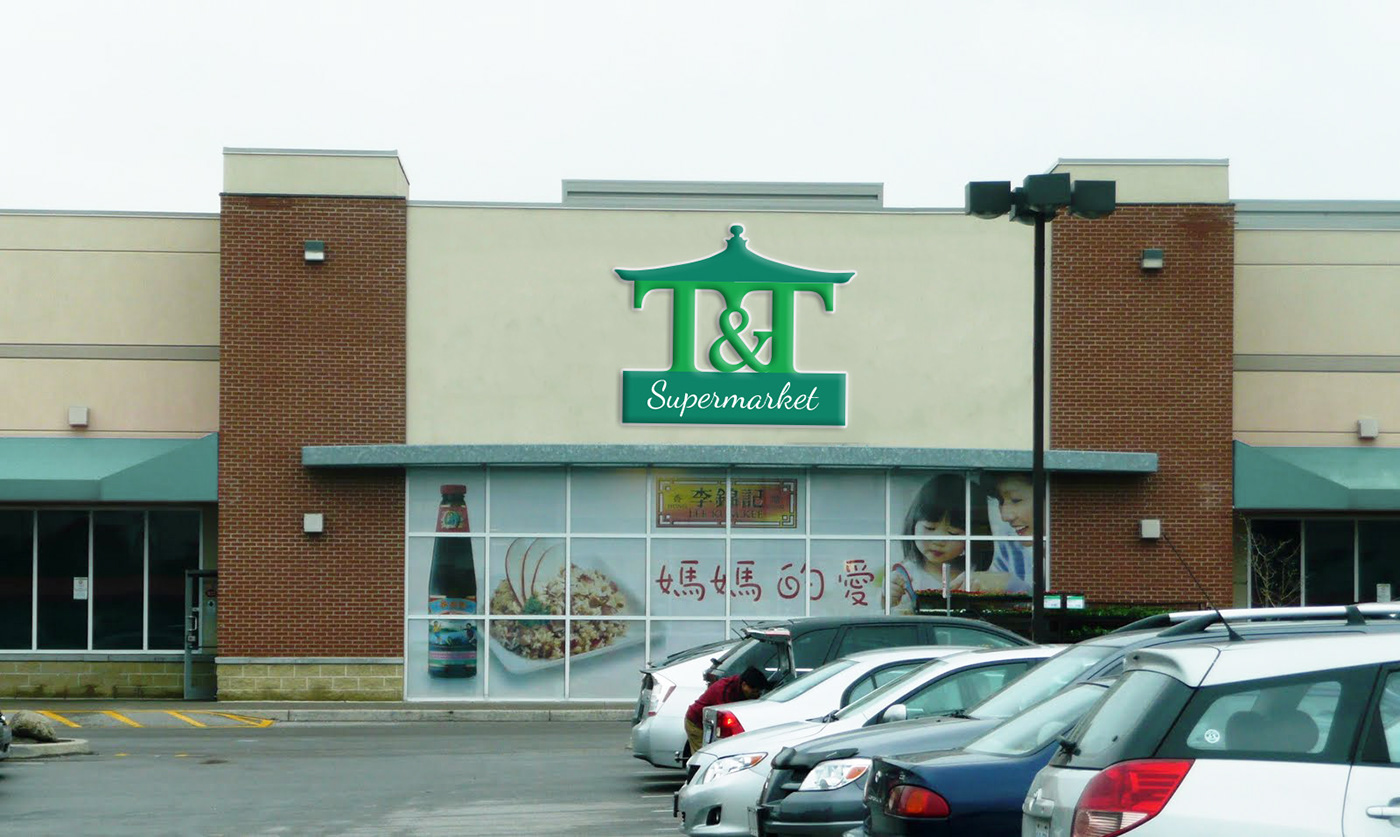
T&T Supermarket Outdoor Signage
CONCLUSION
Throughout the process of redesigning T&T Supermarket logo, I have learned how to create a logo with the power of typography and story-telling. I further branched out my typography skills from Typography 1 class and applied them in the process of the logo redesign. I came across typographic challenges such as the ampersand interconnecting with "T&T". I think what helped me push the logo redesign and brand identity the next step is my personal experience with the supermarket chain. T&T Supermarket is one of my go-to grocer that I can rely on getting my groceries from. I was able to channel my experiences and enhanced their identity.
The redesign of the logo reflects their history and the upbringing of how the supermarket became to be. Today, the grocer is still proudly running and welcomes everyone to their supermarket locations. The redesign proves the hardship and dedication of T&T Supermarket's establishment.
Photo of T&T Supermarket Logo (1993) and Outdoor Signage Credits to Google Images


