100 Day UI project
Find more documented here : https://www.instagram.com/b_skr.design/
Day 1 : Sign Up UI

Things I learnt here in terms of #interactiondesign and #experience were to pay attention to :
1. Ability to allow people to choose platforms they would like to sign in through.
2. In line validation of entries to spot errors up front, as in the email address.
3. Small visual cues- such as enabling #ctacolour changes to let user know that they can proceed.
4. Laying out information in a logical order.
Day 2 : Credit Card Checkout UI


Things I paid attention to, in terms of #interactiondesign and #experience :
1. Ability to allow people to choose platforms they'd like to pay through.
2. Chunking up of data and inline validation of the information entered by the #user
3. Consistent #footer element that changes upon #context to maintain visual focus.
3. Small visual cues- identifying card type to let the user know that the card type had been recognised.
4. Easy #navigation and Laying out information in a logical order.
Day 3 : Landing Page UI
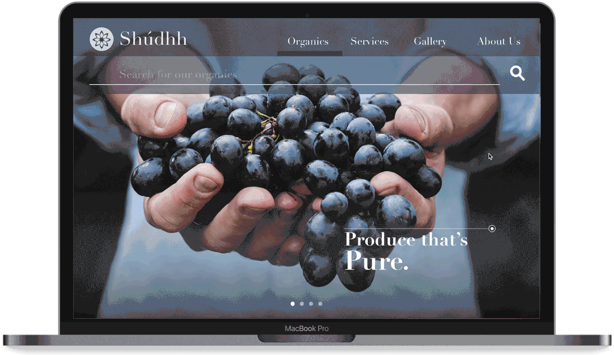


For today's topic - Landing page UI.
Things I paid attention to, in terms of #interactiondesign and #experience :
1. Choosing the layout, here Mobile.
2. Breaking down visual and textual content to draw attention.
3. Having one core element as the 'search' to create a an experience of progressive disclosure.
4. Basic knowhow of how responsive elements react when put in different layouts. Still noob but getting there.
5. Chunking up of relevant data and information in a logical order.
Day 4 : Calculator UI


For today's topic - #calculator UI.
Things I paid attention to, in terms of #interactiondesign and #experience :
1. Core keys and their layout design - numerical and scientific.
2. Interaction on how to switch between both functions.
3. Clear, crisp numbers to show users.
4. A history of previous calculations to show sequence of actions performed by user.
5. Detailing on how the selected action key should appear (+,-,/,* etc)
Day 5 : App Icon


For today's topic - #appicon.
Things I paid attention to:
1. I love #yoga and I wanted to create an app around that theme. I focused on using Colors that signify #rejuvenation, #positivity and #growth.
2. I tried designing the icon after choosing the following elements : a peepal leaf, and symmetric human form.
3. How the icon looks in colour and greyscale.
4. Explorations around how the onboarding app icon would appear in the #applewatch
Day 6 : User Profile
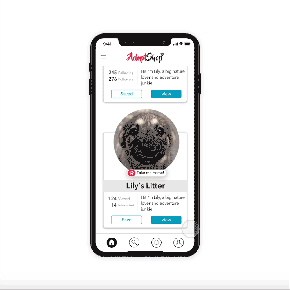
Things I paid attention to, in terms of #interactiondesign and #experience :
1. Ability to allow people to browse through smaller chunks of information quickly in a card based feed.
2. The cards have 2 primary actions - VIEW : viewing the profile and SAVE : saving it for future reference.
3. Consistent #footer element that changes upon #context to maintain visual focus.
3. Small visual elements - letting the users know which #doggo is up for adoption still and which ones have been adopted.
4. Easy #navigation and Laying out information in a logical order to achieve user goal - adopt a pet!
Day 7 : User Settings

For today's topic - Settings
Things I paid attention to, in terms of #interactiondesign and #experience :
1. Choosing an navigation style from the various navigation paradigms for mobile (tabs/hamburger/gestural/full screen).
2. How the user would access settings - I chose to do it via the #profile view.
3. Consistent #footer element that changes upon #context to maintain visual focus.
3. Small meaningful elements - letting the users how they can control the product with the right hints. Eg : choosing a light colour.
4. Easy #navigation and Laying out information in a logical order to achieve user goal - control the settings of this smart product!
Day 8 : 404 Error


Things I paid attention to, in terms of #interactiondesign and #experience :
1. 404 can be an annoying experience. How can we engage users back within the #brand?
2. Striking visual elements (photographs from #googlewallpaper) to make #discovery of new places a #serendipitousexperience.
3. Consistent #links that changes based on screen being viewed to provide #context.
3. Small credit elements - letting the users know who is #photographer.
4. Simple #navigation and Laying out information in a logical order to achieve #usergoals - make 404 suck less!
Day 9 : Music Player
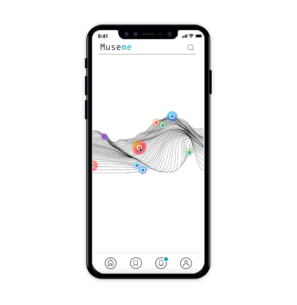
Things I paid attention to, in terms of #interactiondesign and #experience :
1. Making music social : This concept looks at a dynamic #visualization of music in your #social circle. So, every time you interact, there will be a different visualisation and density of the dots : music pulses.
2. The Musicpulse : each dot is a small #snippet of a #song. The color signifies the various #genres. The size reflects how many people are listening to it right now and the #pulse reflects the tempo (I tried animating it but failed🤦🏻♀️).
A user can interact with the visualisation at their own pace.
3. A relatable card elemt to display the song's details and controls for the same.
4. A vertical #marquee lyric roll to add some dynamicity.
5. Consistent #footer elements that changes upon #context to maintain visual focus.
4. Easy #navigation and Laying out information in a logical order to achieve user goal - #socialmusic !
Day 10 : Social Share


Things I paid attention to, in terms of #interactiondesign and #experience :
1. Focus on #shareable content. This concept looks at quotes by famous people that can be shared across a few social media platforms.
2. Letting the users know that they can share the content in an #organicprogressive fashion - on hover.
3. Enjoyable micro animation to make the experience inviting and fun.
Day 11 : Flash message


For today's topic - #flashmessage.
Things I paid attention to:
1. Looking at various types of flash messages, I realised it could be of two types - status indicators (success/failure) or systemic updates (updating/processing) etc.
2. I tried designing for a success/failure scenario in an IDENTITY VERIFICATION scenario in an Apple watch (touch ID). (I also looked into possible voice based explorations, but that's for another day).
3. Small details like the interaction flow, crisp messaging, visual elements to denote #progress etc were looked into detail.
4. Explorations around how the progress would be shown without distracting the user took some grey cell time.


