The Pretentious Guide to Skateboarding
The prompt for this project started with a discussion about pretentiousness and how we define what is and what is not pretentious. For this project, I started by researching the word pretentious and found that google (Oxford Languages) defines it as, "attempting to impress by affecting greater importance, talent, culture, etc., than is actually possessed." My first thought turned to Electric Skateboards and their use of technology to buy into the "coolness" of the counter culture of skateboarding.
The project started as a way to highlight the pretentiousness of electric skateboards and this feeling I had of the riders being posers to the skateboarding community. Posers are defined as, "a person who acts in an affected manner in order to impress". Through the project however, I found electric skateboarders to have a genuine enjoyment of skateboarding and common ground through the freedom felt of being on a board and cruisin' down the road.Skateboarding to me is the thrill of going fast, the danger of make it or break it situations, putting it all on the line for that one moment of utter stokeness and hyping up other riders, not carrying your board around and never riding it or wearing Thrasher gear because it looks cool!
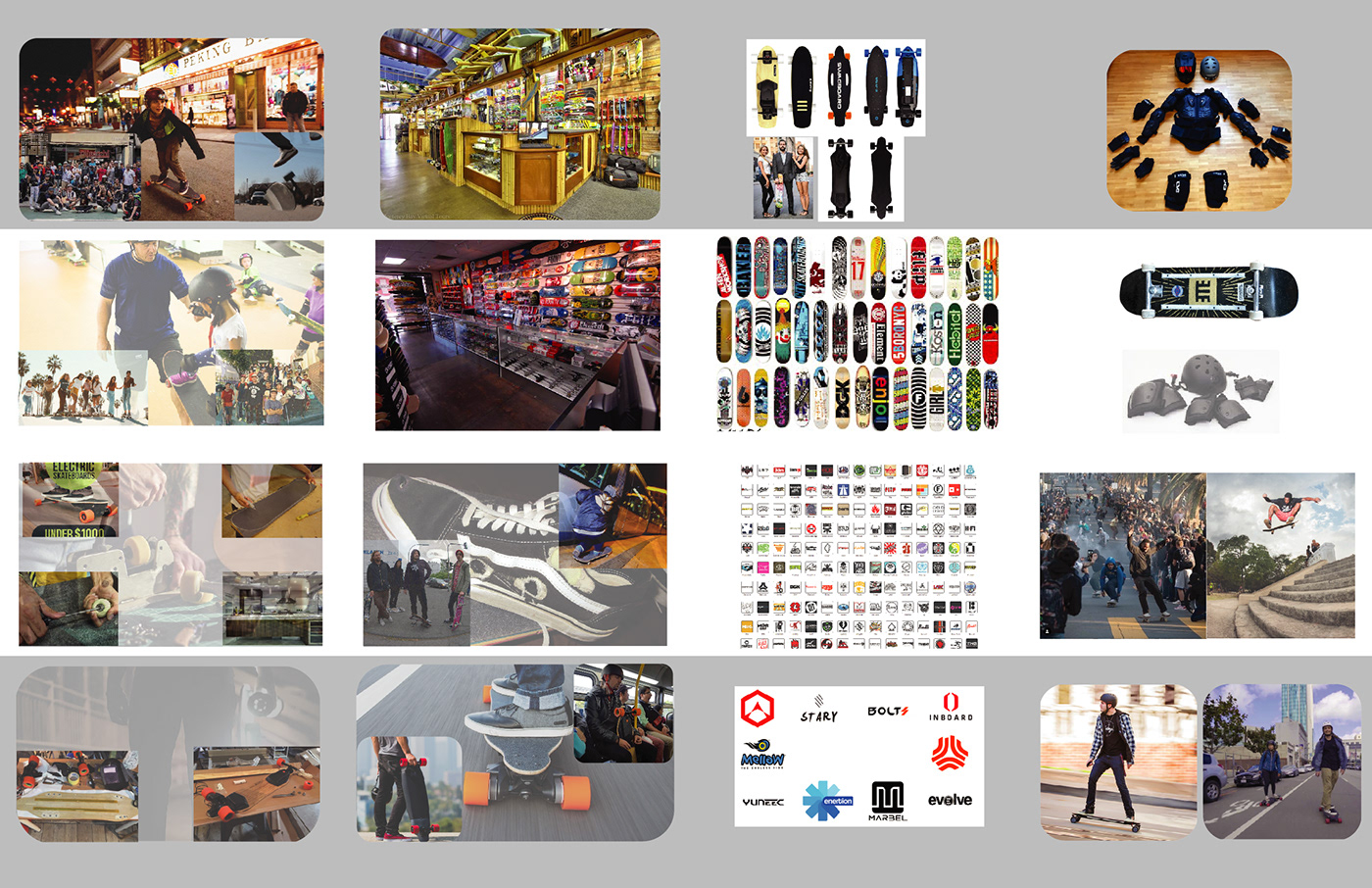
The images below are part of my initial research into images that I found to be pretentious solely based on the definition and how they fit the topic. Patterns in the photographs started to emerge and as they became visible I took notes to capture them like the type of protection or lack of protection they are using, is the photograph candid or does it look like they are posing, are they wearing clean clothes, etc.


My research continued by traveling to local skateparks and skate shops, observing skateboarders in their natural environment. Additionally, I traveled to some local surf shops that sold electric skateboards and electric skateboard parts. Immediately, I started noticing similarities and differences between the two and looked to expand on them visually through the project. The similarities were the enjoyment that comes from riding, the community you can find with a bunch of likeminded people, the ability to customize the board and the different individual style and expressions that are unique to each person. The differences lay in where you had to go to get parts. Everything you need for a complete push skateboard can be found at a local skate shop, however, there are no solely electric skateboard shops. You would need to go into a surf or skateboard shop that specializes in them or order online.


To better document everything I continued taking notes in my sketch book and started creating categories that had overlapping similarities and differences. I was then able to start putting the visuals together and devising a strategy for visually representing them in the magazine through imagery.


I made a few mock-ups and rough drafts for the layout. The prompt required the use of 11x17 paper and having experience making zines I thought this would be a great opportunity to make a flip out informational brochure.


Below you can see the Page Layout Prototypes I created using Adobe Illustrator and InDesign. I created the icons and other vector graphics in Illustrator and then transitioned to InDesign to help with overall layout, body copy, and imagery.

Below is the start of breaking out the categories and defining locational positions of graphic elements as they apply to the whole of the project. It was important to make sure that the categories aligned with the correct images when flipped over and the paper prototypes came in really handy for that. With a physical mock up I was able to double check my work and ensure that the layout was correct.

Final Concept