Brandbook for TANUKI
Tanuki is a network of Japanese cuisine restaurants. The brand exists since 2004. Today in Russia, Ukraine, USA, Kazakhstan, Netherlands and United Arab Emirates there are 70 establishments that operate under the Tanuki brand, of which 54 are in Moscow and in the Moscow region. Tanuki has its own delivery service and mobile application. All restaurants of the network have a pleasant and recognizable interior, large comfortable tables and delicious food, and each guest is greeted with a welcoming gong.
Problem
For the entire 13 years, the network grew and developed without having any well-considered brand style. Everyone used the corporate style as they saw fit while combining colors, illustrations, photos and inscriptions in their own way. New employees copied what they saw on old layouts and mixed it with their own visions.
As a result, the corporate identity has turned into a complete chaos. Those who worked with it every day – marketers and designers, smm and content managers – could not use it. Deadlines were missed, promotions turned out unsuccessful, customers did not notice the ads.
To make the brand visual communication consistent, we had to put the company's corporate identity in order.
Before

Logo tuning
First of all, we put the logo in order: we changed the proportions, made the logo more balanced, and enhanced the contrast by replacing the gray inscription with the black one. Virtually invisible changes, but it is from such details that the general feeling of quality and brand status is formed.

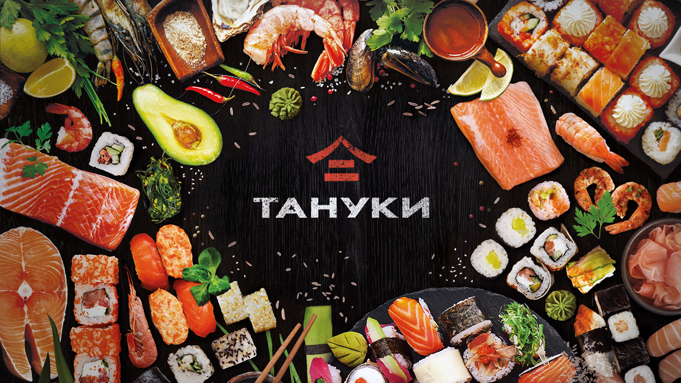
Colors
To streamline the usage of the style system, we reduced the number of primary colors. We got rid of the green for good. The non-contrast combination of gray and orange was strengthened to a noble pair of black and red. In combination with white, the classic Japanese palette is obtained - and the visitors immediately understand that it is an establishment of the Japanese cuisine in front of them. In addition, there are many variables in the style - photographs, drawings, illustrations in different themes. A white background color will make any layout complete.

Character
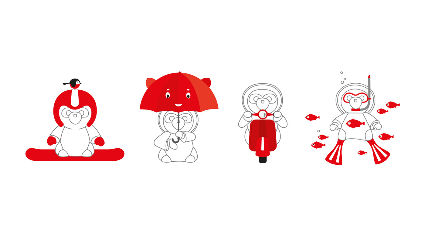
The brand mascot is a Japanese animal tanuki. It is believed that meeting it brings wealth and good luck. Tanuki are usually portrayed as a cheerful raccoon dog, a lover of drink and tasty food. In the old version, it was represented with different color illustrations. We reworked the character, making it look like a large sculpture, akin to one standing in the Tanuki restaurant in Miami.

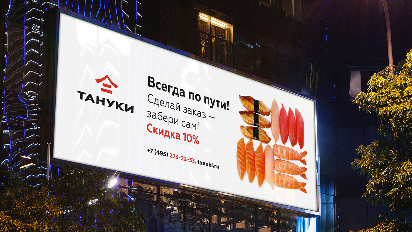
How does the identity work?
White or black background helps to avoid visual noise and focus on the main thing. It's associated with cleanliness and neatness.


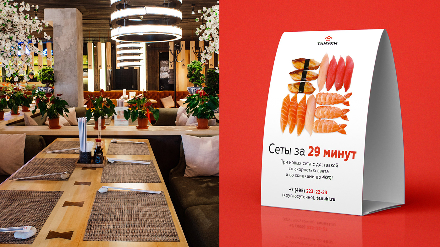
The key element of the layout, bright and juicy, is always in the spotlight. It must contain details in red color. The animal Tanuki appears where you need to add humor or emotionality – in advertising banners, on promotional leaflets.


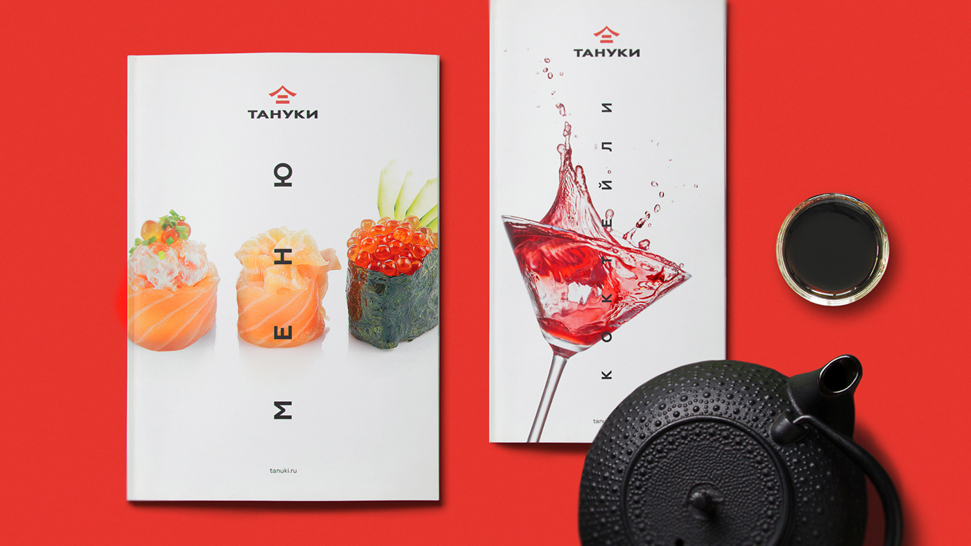

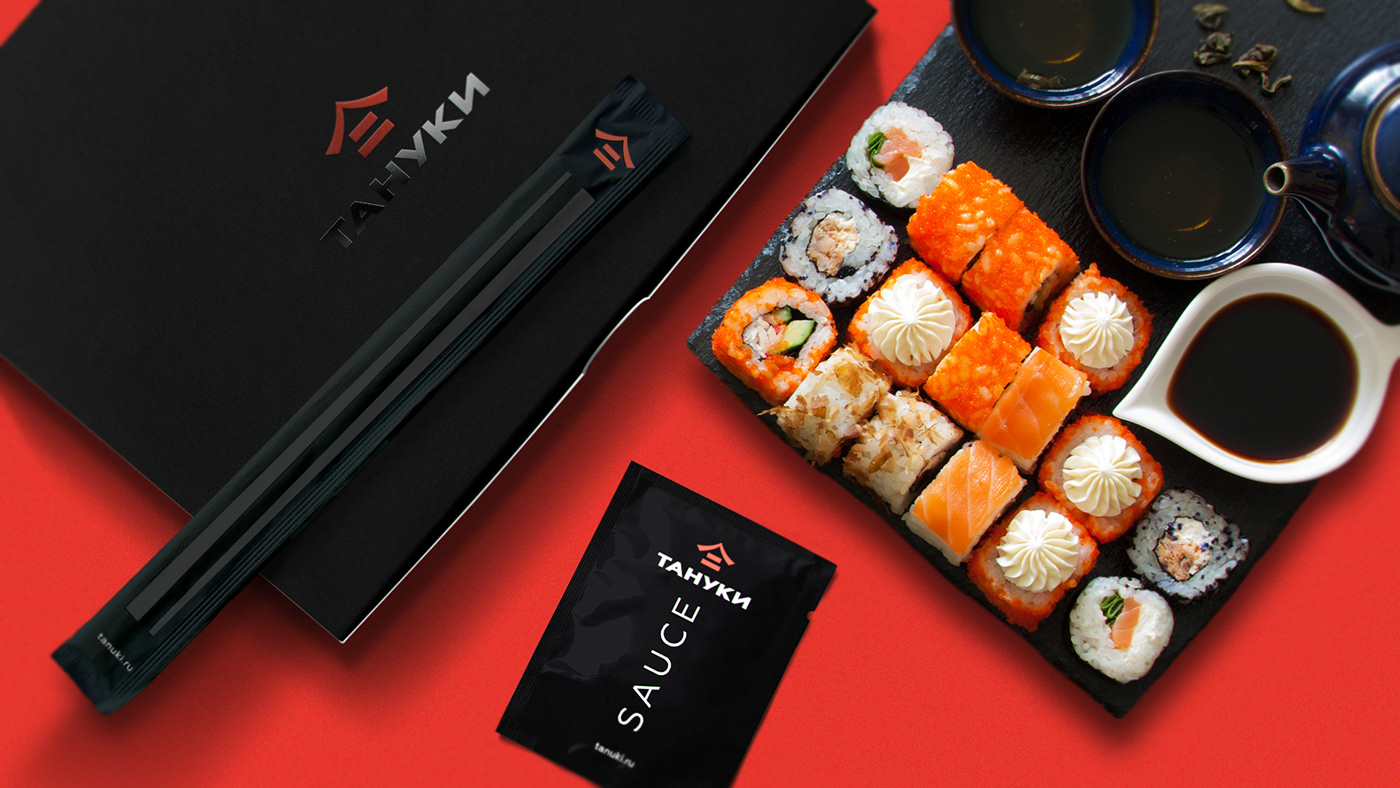
A strict element hierarchy. A logo – a content – an additional message. The content can be a photo, an advertising slogan or an appeal, an illustration. Contacts, descriptions of dishes or promotional conditions are an additional message.
Such a system preserves the identity of the brand, it is convenient to work with, it appears effectively both on a soy sauce sachet and a billboard.
Delivery
The Tanuki delivery is essentially the same restaurant, but without interior, waiters, gong and service. There is only food and its packaging. In this case, the style should be more emotional, to remind the client of the atmosphere of the restaurant. The main character here is the Tanuki, who appears in concise linear illustrations.


The corporate identity system is a reflection of the nature of the brand. To preserve the identity of the company, all layouts must follow the same rules.
The beauty of the style, the convenience of its use, and the effectiveness of the created image in accomplishing the business challenges are the things equally important for the team of the brand. We managed to tame the chaos of Tanuki corporate identity while turning it into a full-fledged work tool.
Русский текст на сайте: http://lvmd.ru


