This is a project that we make own specialty store.
-Store Category
Art / Design Books and collectables store
-Store Concept
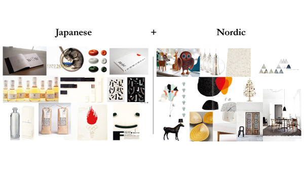
Conjunction of Nordic and Japanese aesthetics.
Those two different cultures, which are located on the opposite side of the earth, share some aesthetic notions; they eliminate loud ornaments from their design and pursue simplicity with humanity. The store introduces several perception of beauty through books and collectables from two similar, but different point of view.
北欧と日本の美意識の融合
-Keywords
Timeless Simplicity
Modest
Humanity
Sophisticated
Playful
Modest
Humanity
Sophisticated
Playful
時代に左右されないシンプルさ
控えめな
人間味
洗練された
遊び心
Software:AI/PS
Logo Development

Final Logo Design
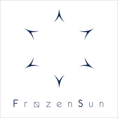
The logo consists of two parts: the sun(figure outside), the symbol of Japan, and a snowflake(negative space inside), standing for freezing climate in Nordic countries. Its typeface and the modified 'o' add a playfulness to entire logo.
このロゴは、日本のアイコンである太陽(外側の6つの鋭角な形状)と、ノルウェーの極寒の気候を示す雪の結晶(内側のネガティブスペース)の2つが組み合わさり成り立っている。ロゴタイプの書体と、変則的な’o'により、遊び心や親しみやすさを出した。
Business Card

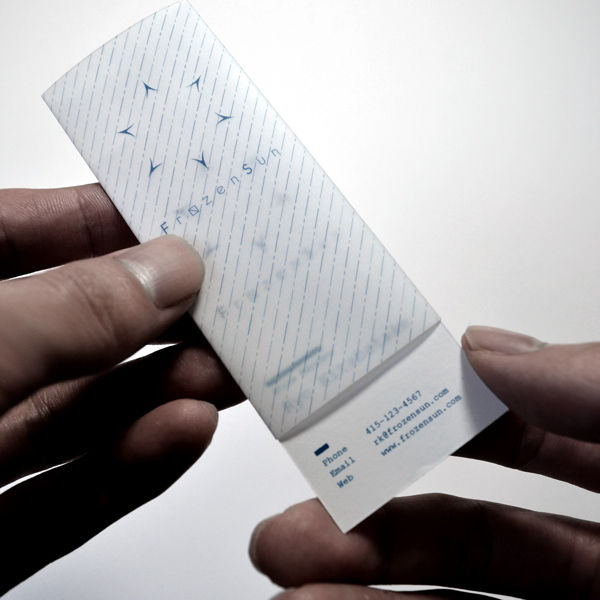
The translucent detachable cover wrapping the business card creates frosty feeling and lets user play with it.
名刺を覆う半透明なカバーは霜のような視覚効果を生み出し、ユーザーが名刺で遊ぶ事を促した。
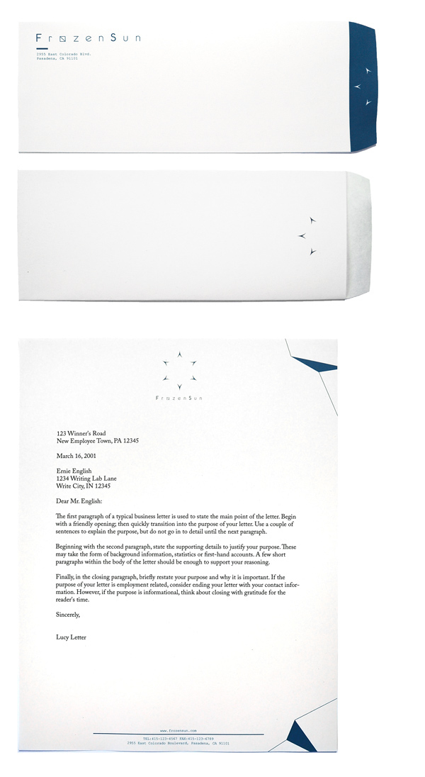
Letter Set
Diary
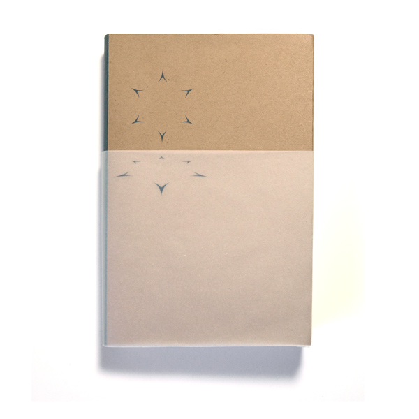

The two logos, one on the cover of the diary and the other on the translucent paper, stand for the sun rising from horizon.
Bookmark
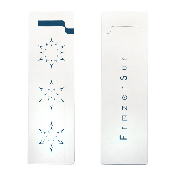
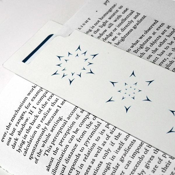
Those vertically-aligned icons represent a transformation from sun to snowflake.
垂直に配置された3つのロゴは太陽から雪の結晶への移り変わりを表した。
