

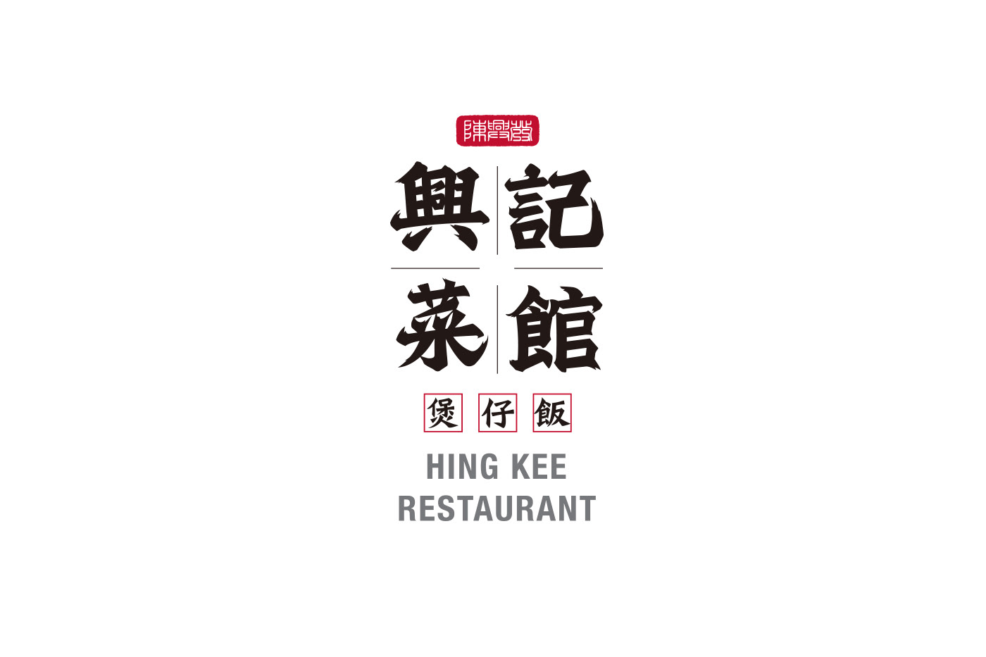
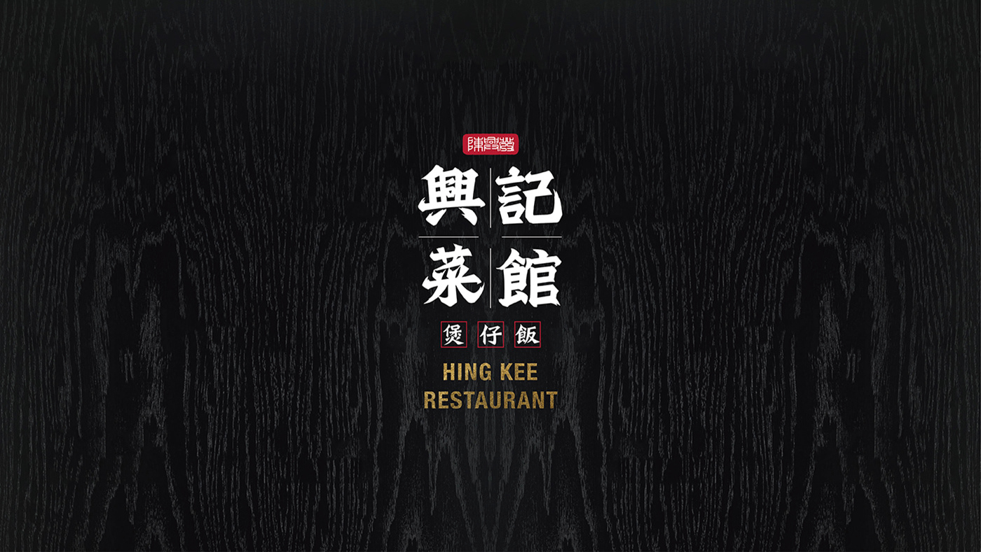
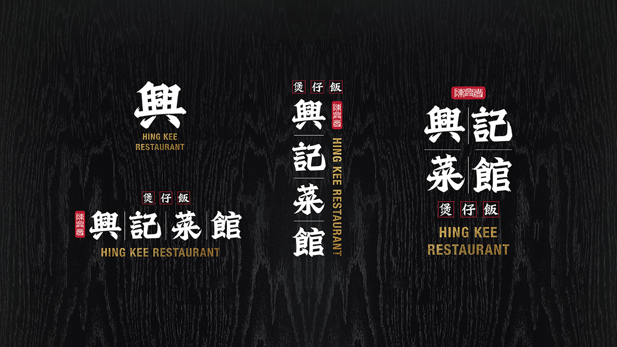
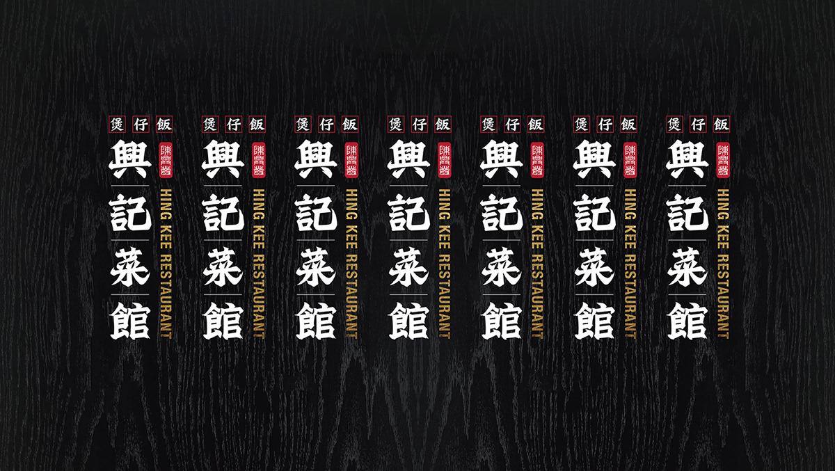
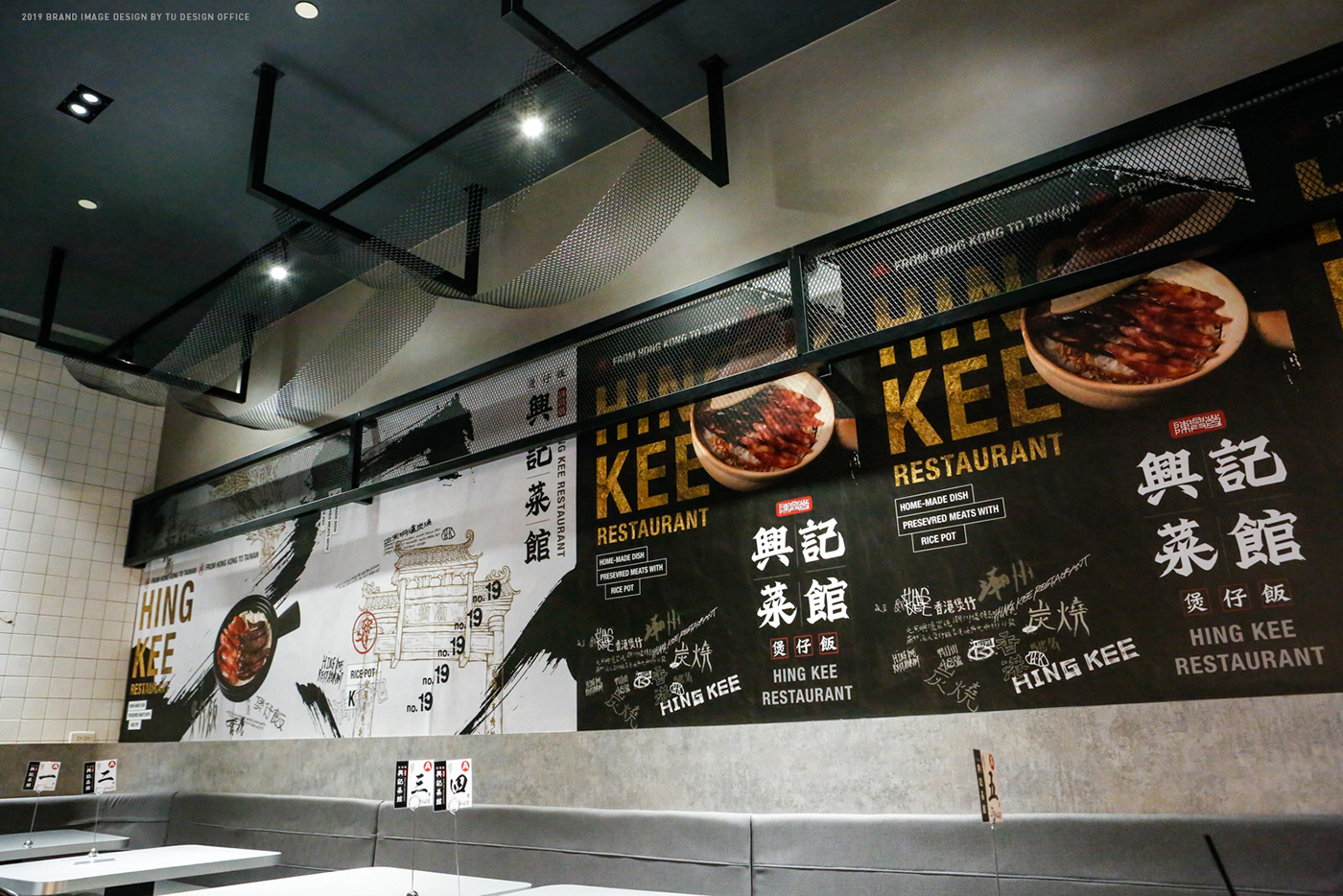
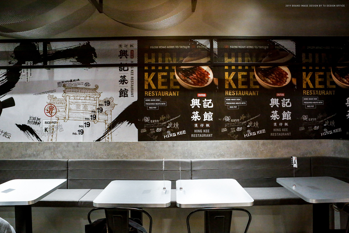
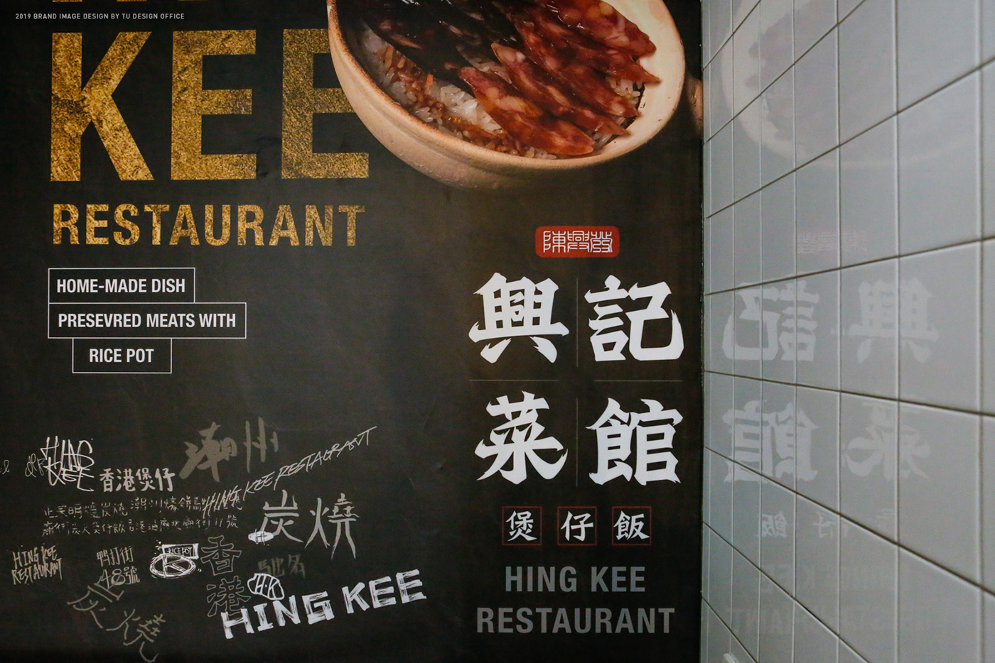
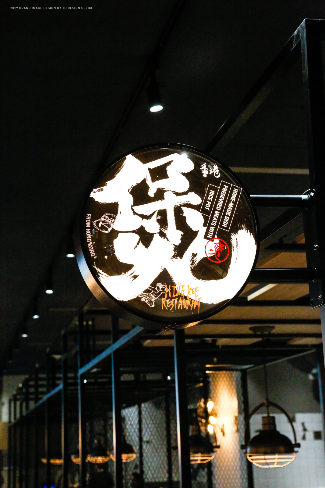
CONCEPT
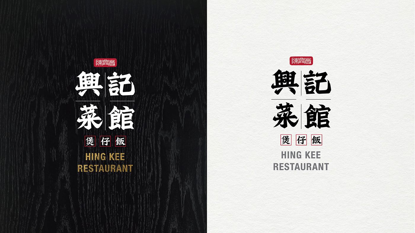
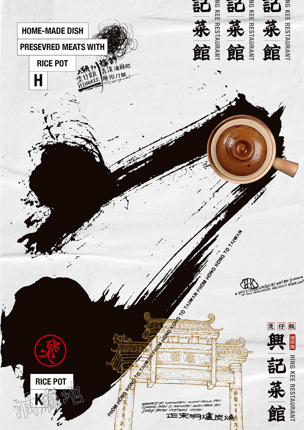
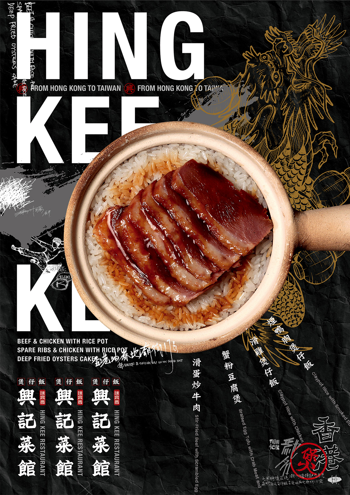
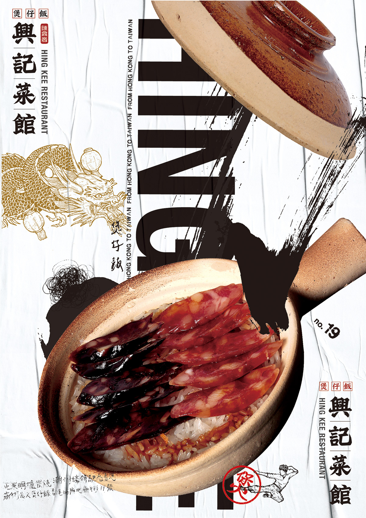
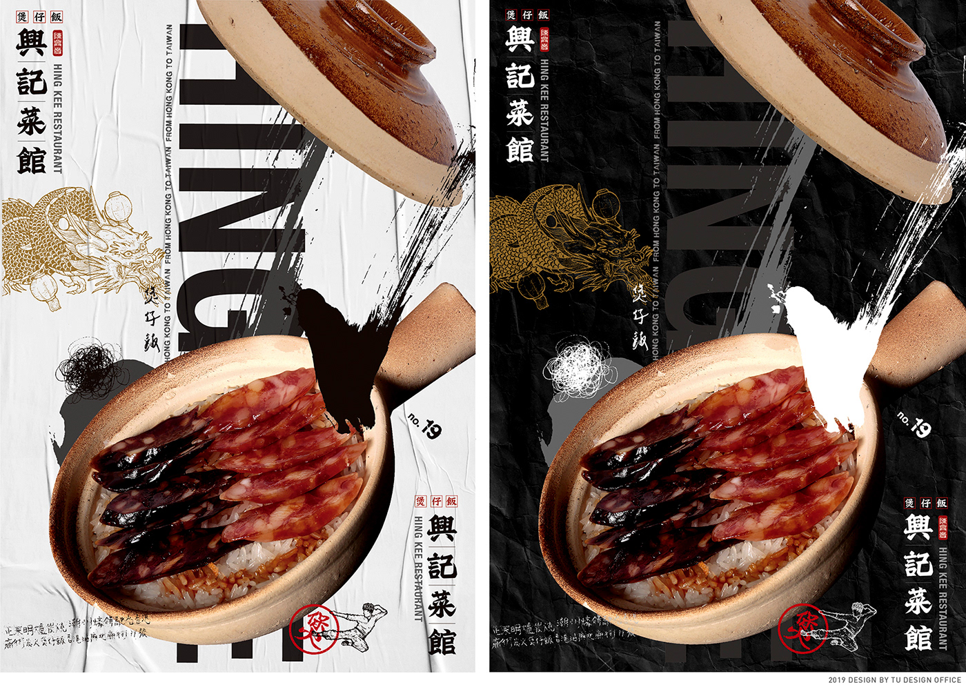
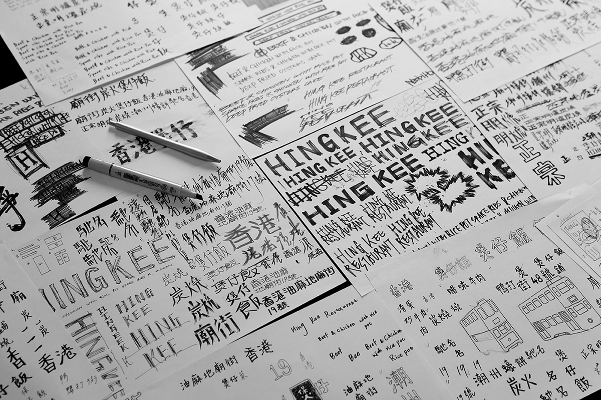
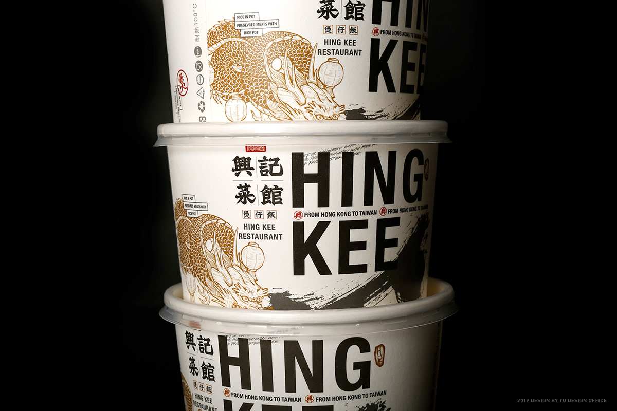
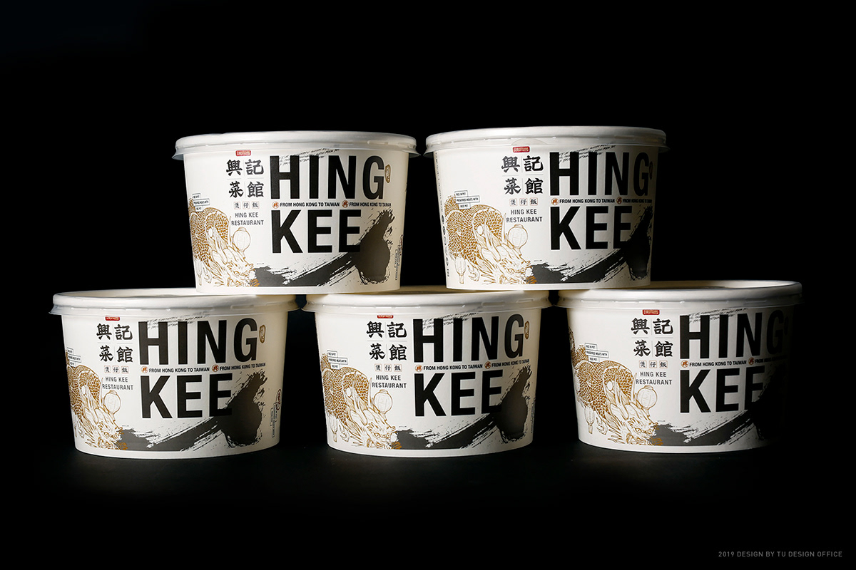
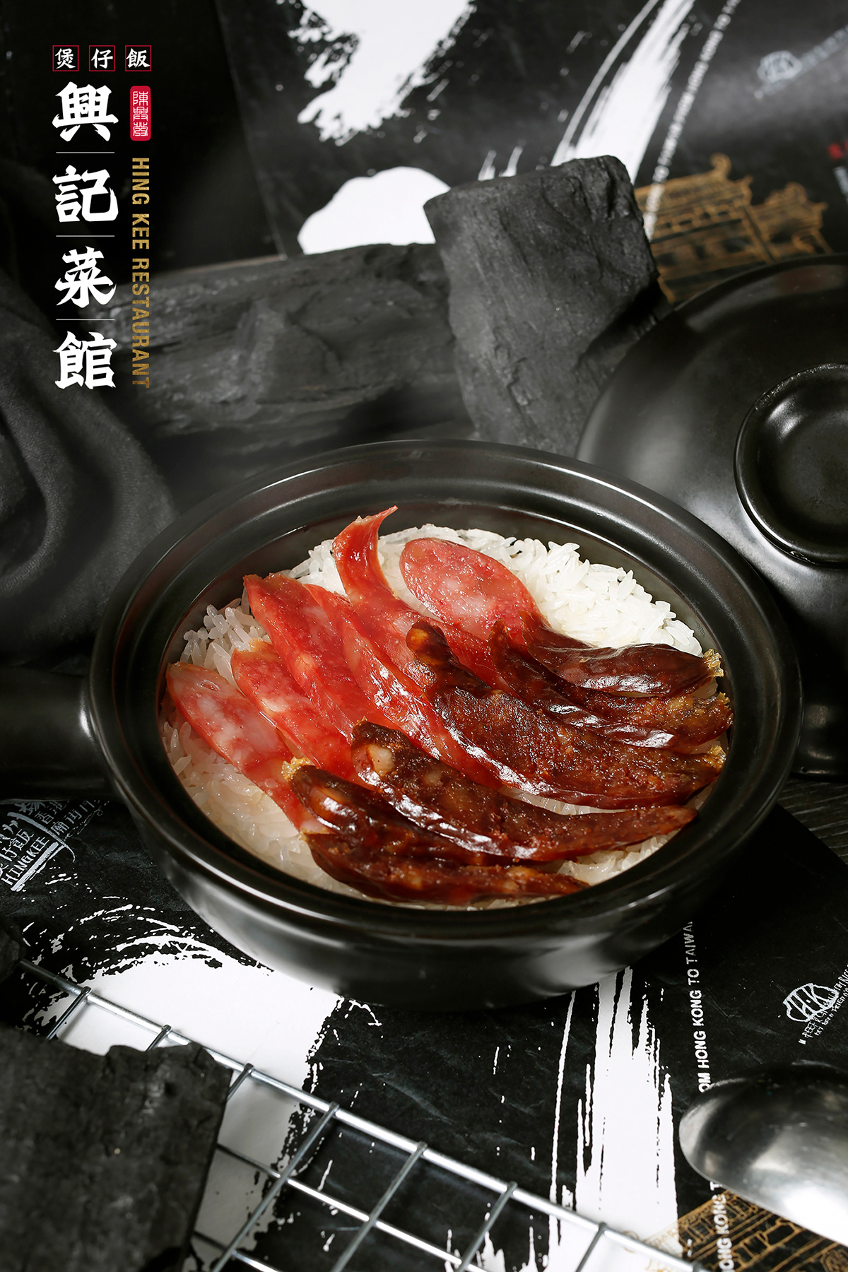
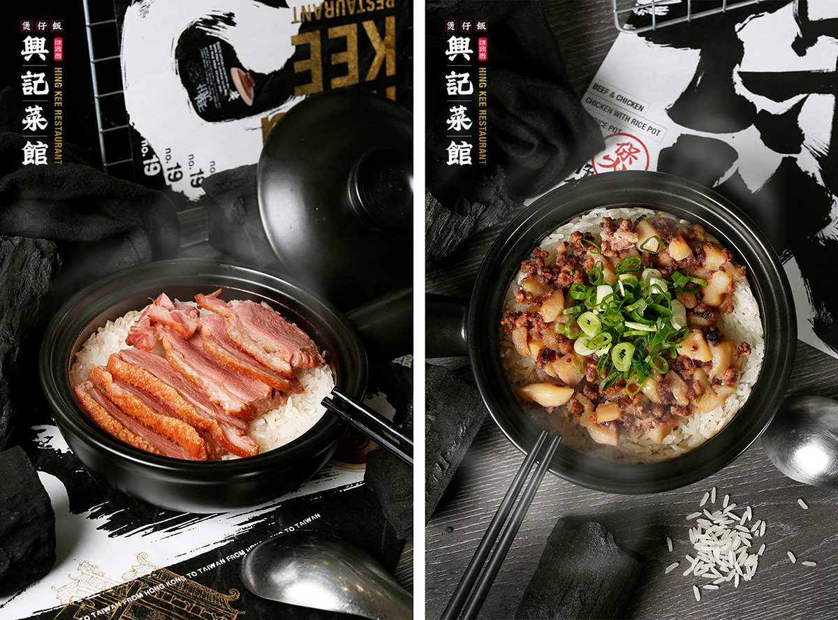
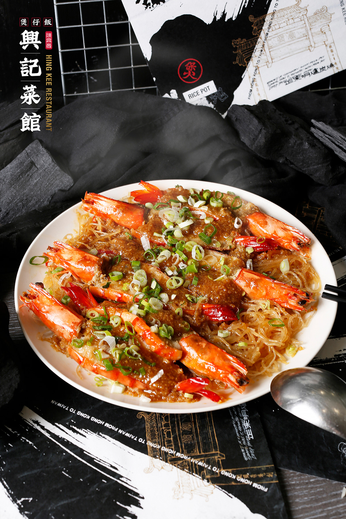
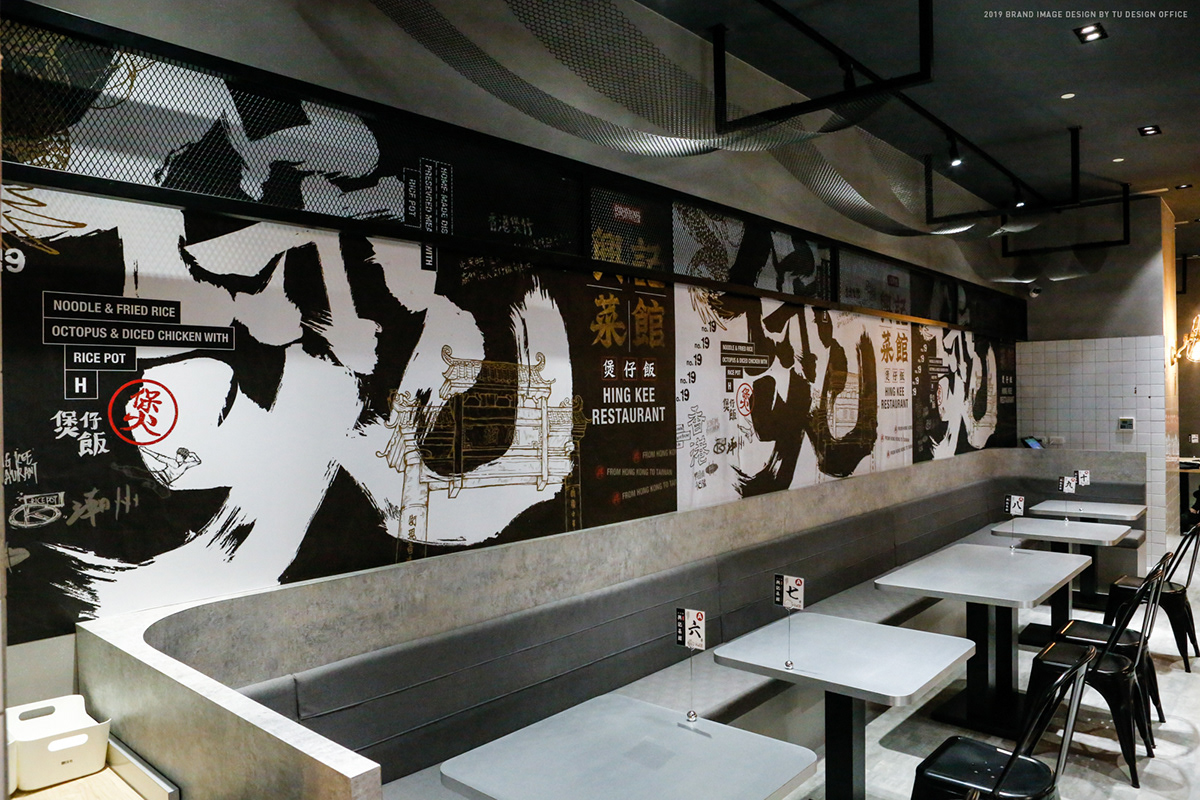
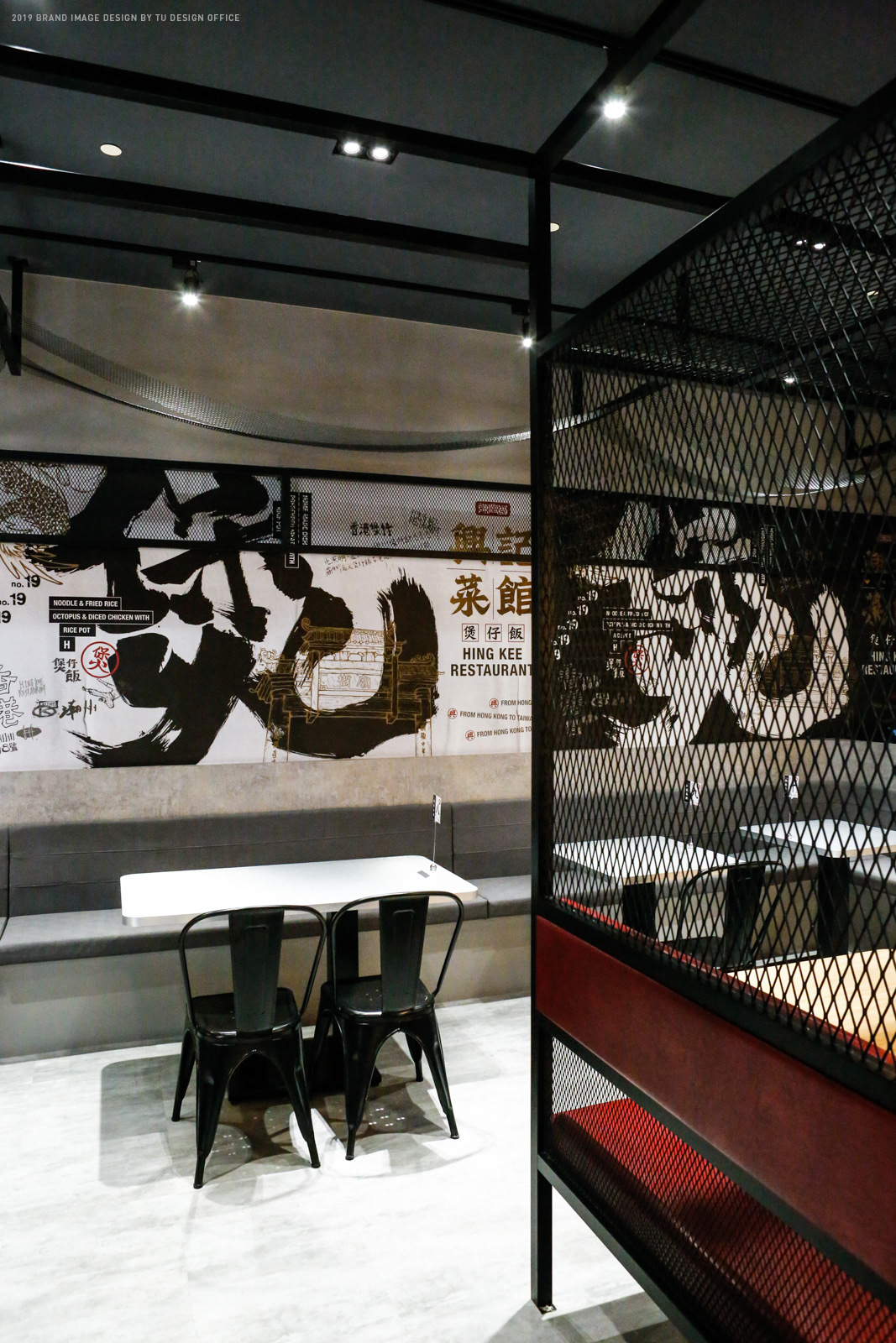
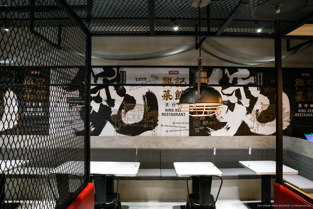
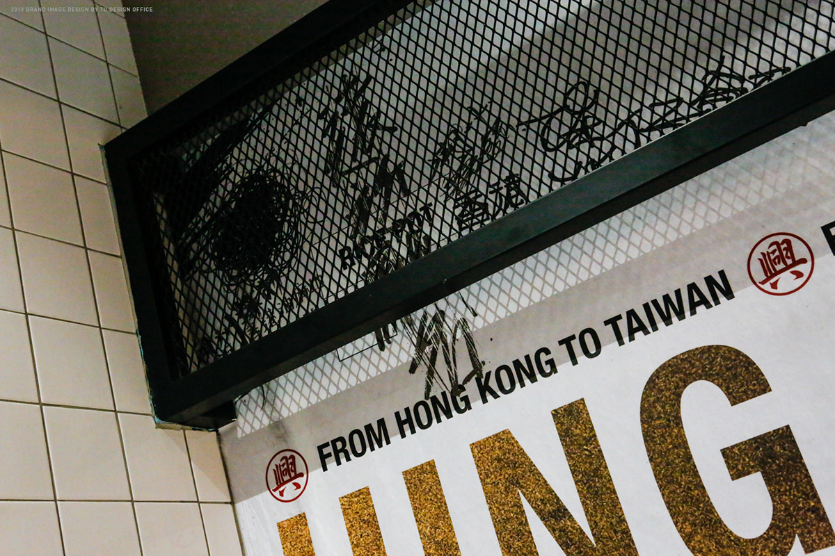
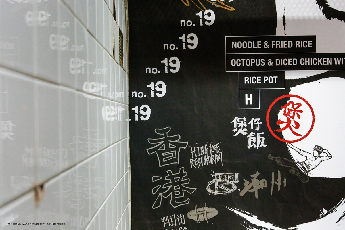
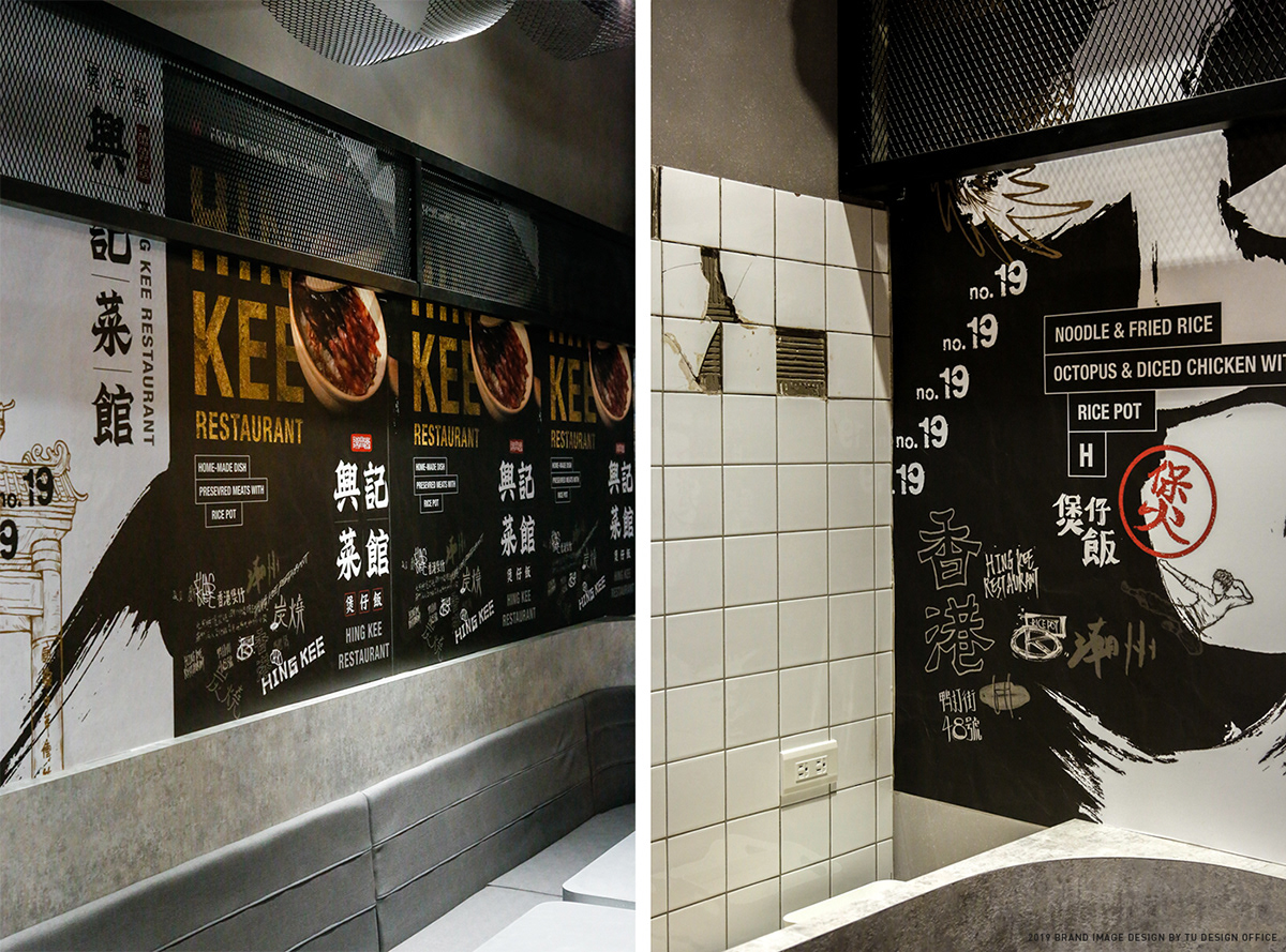
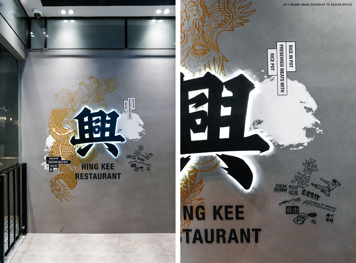
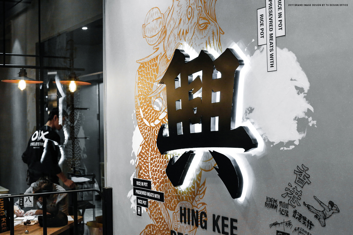
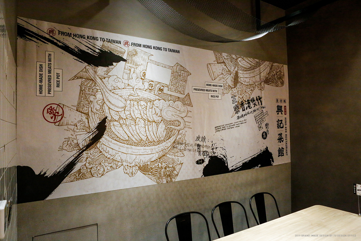
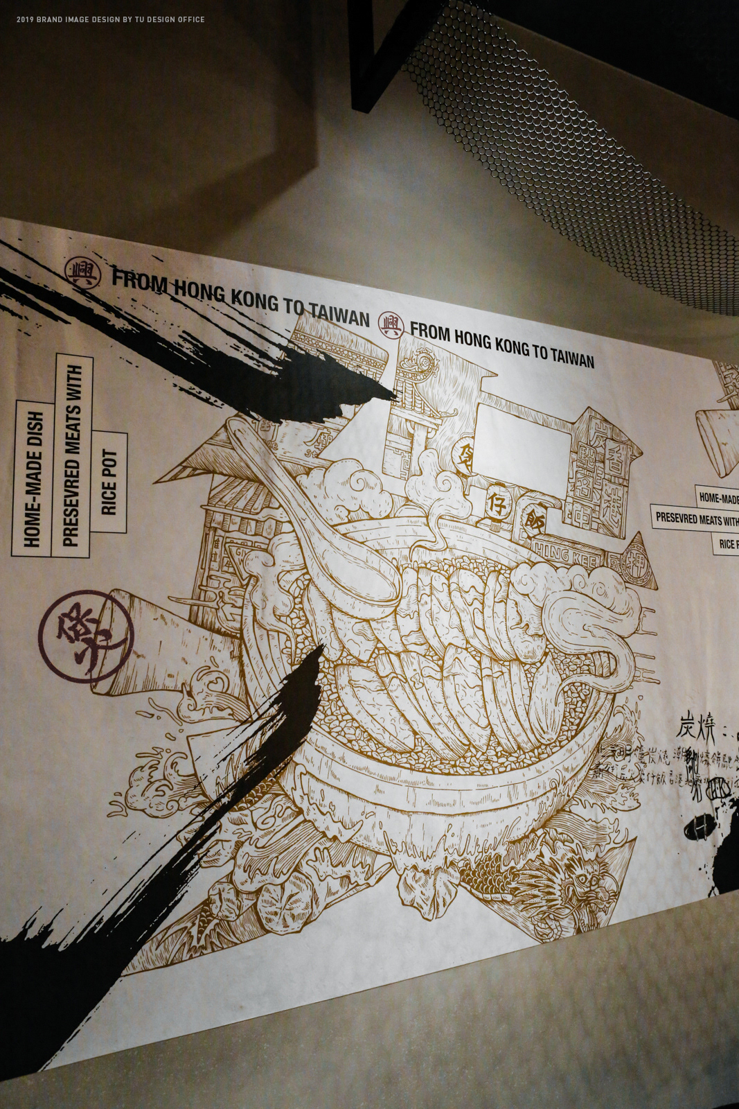
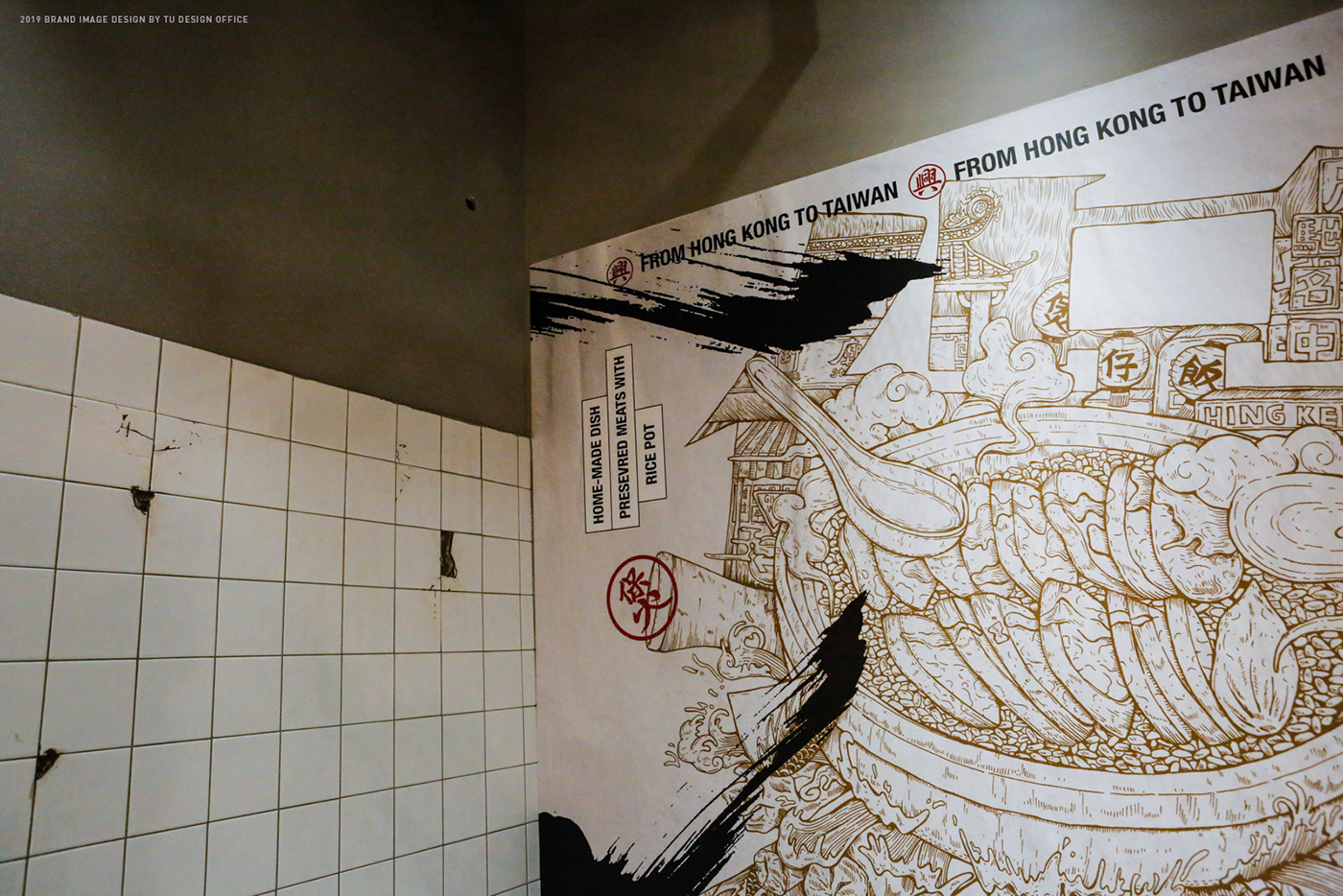
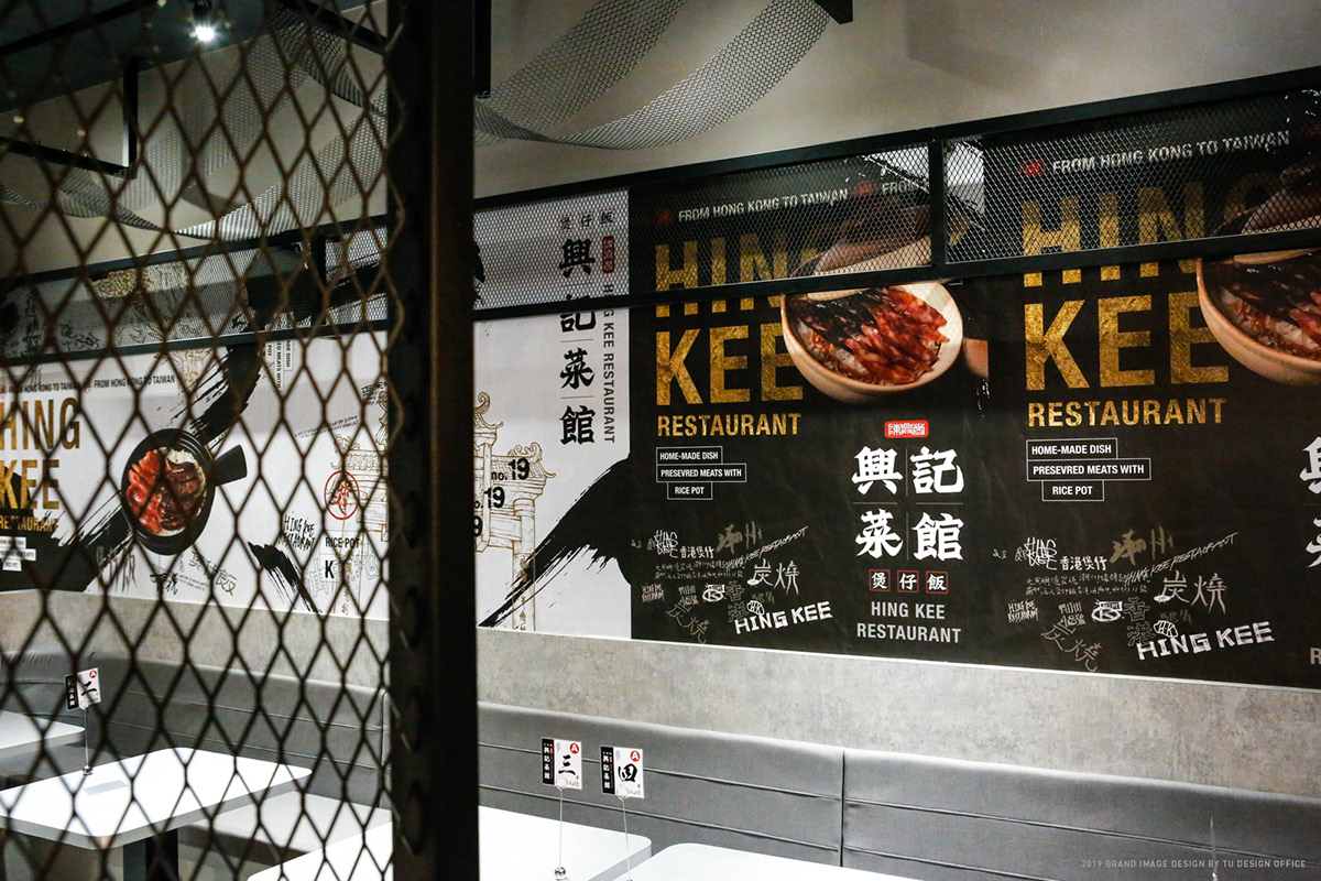
HING KEE RESTAURANT is a well-known Rice Pot brand established in Temple Street, Hong Kong in 1982. It was first introduced to Taiwan in 2019. We reposition the old Hong Kong brand and design a series of brand key visuals for it. We use calligraphic, diverse and casual handwriting and graffiti to create a modern visual of Hong Kong temple street with authentic Hong Kong cuisines. The excitement and bold atmosphere of the visual represent tthe iconic street food.
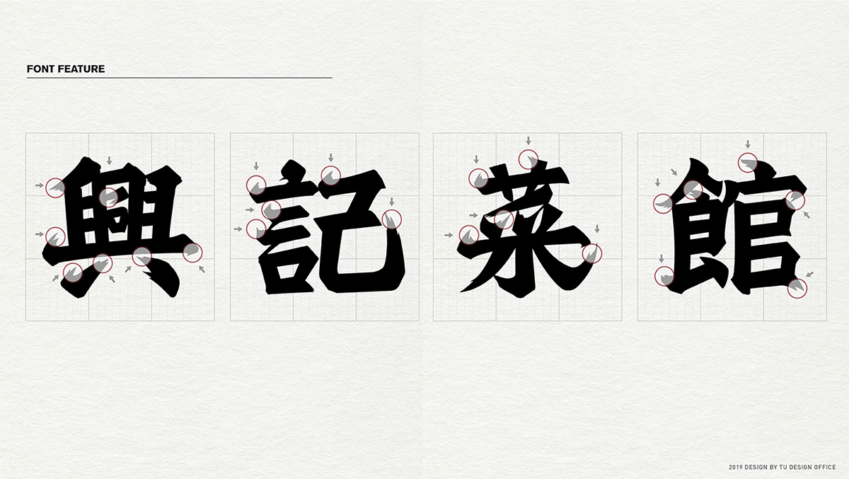
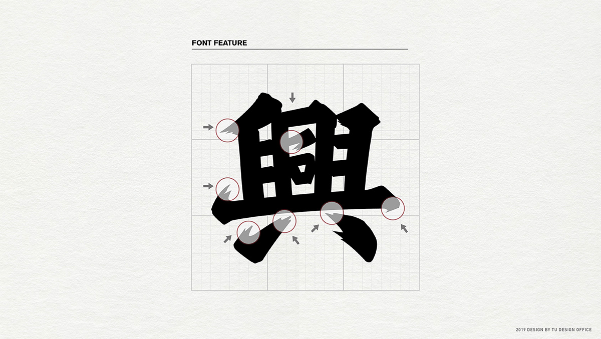
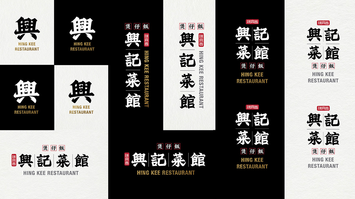
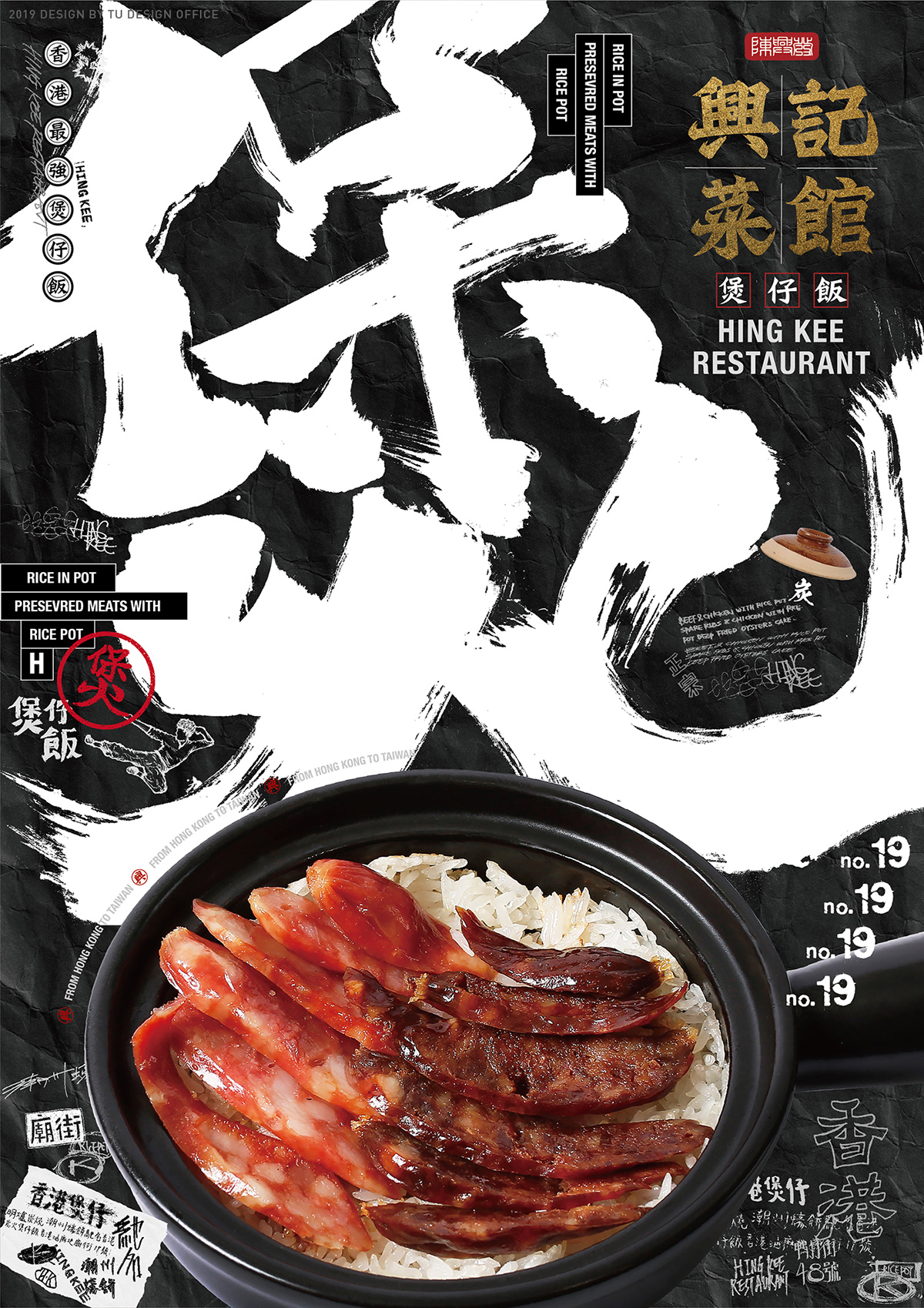
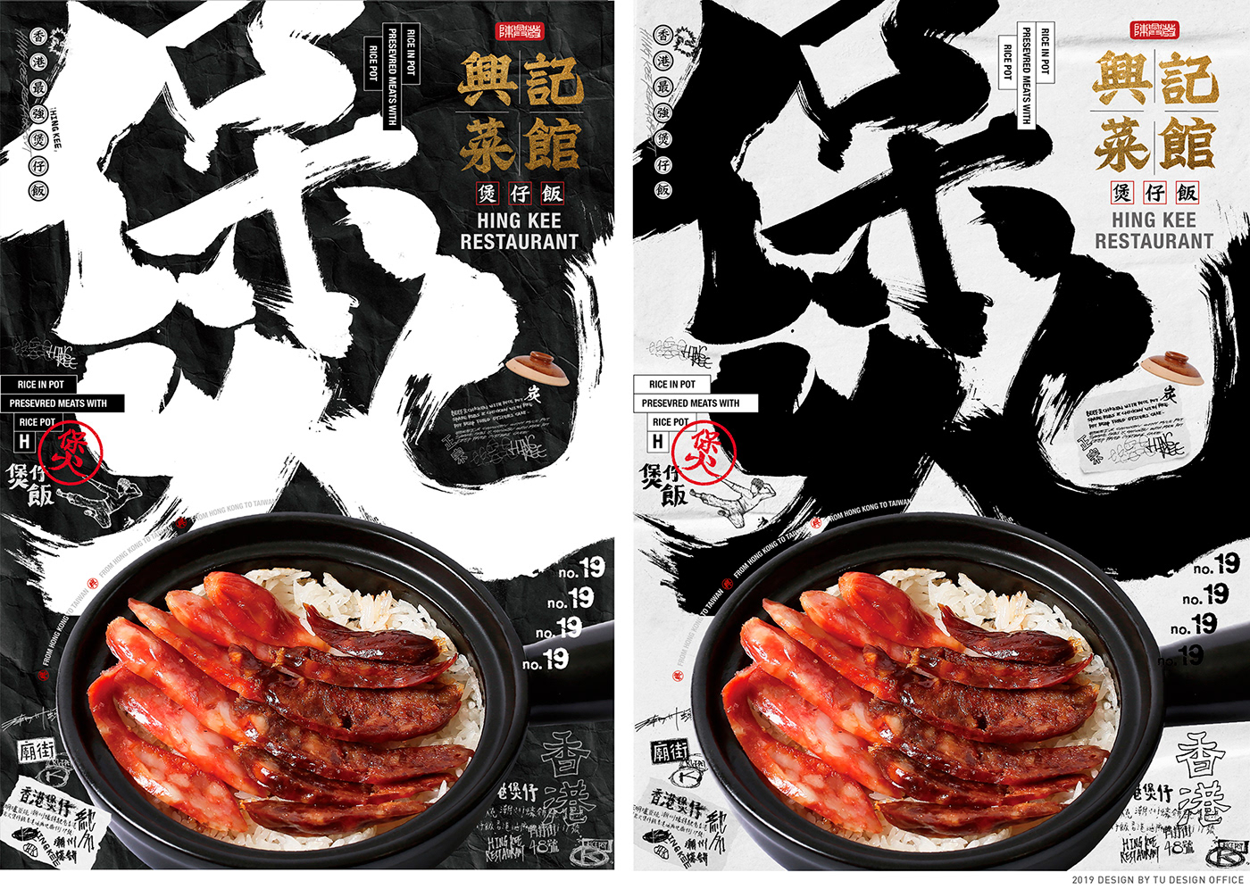
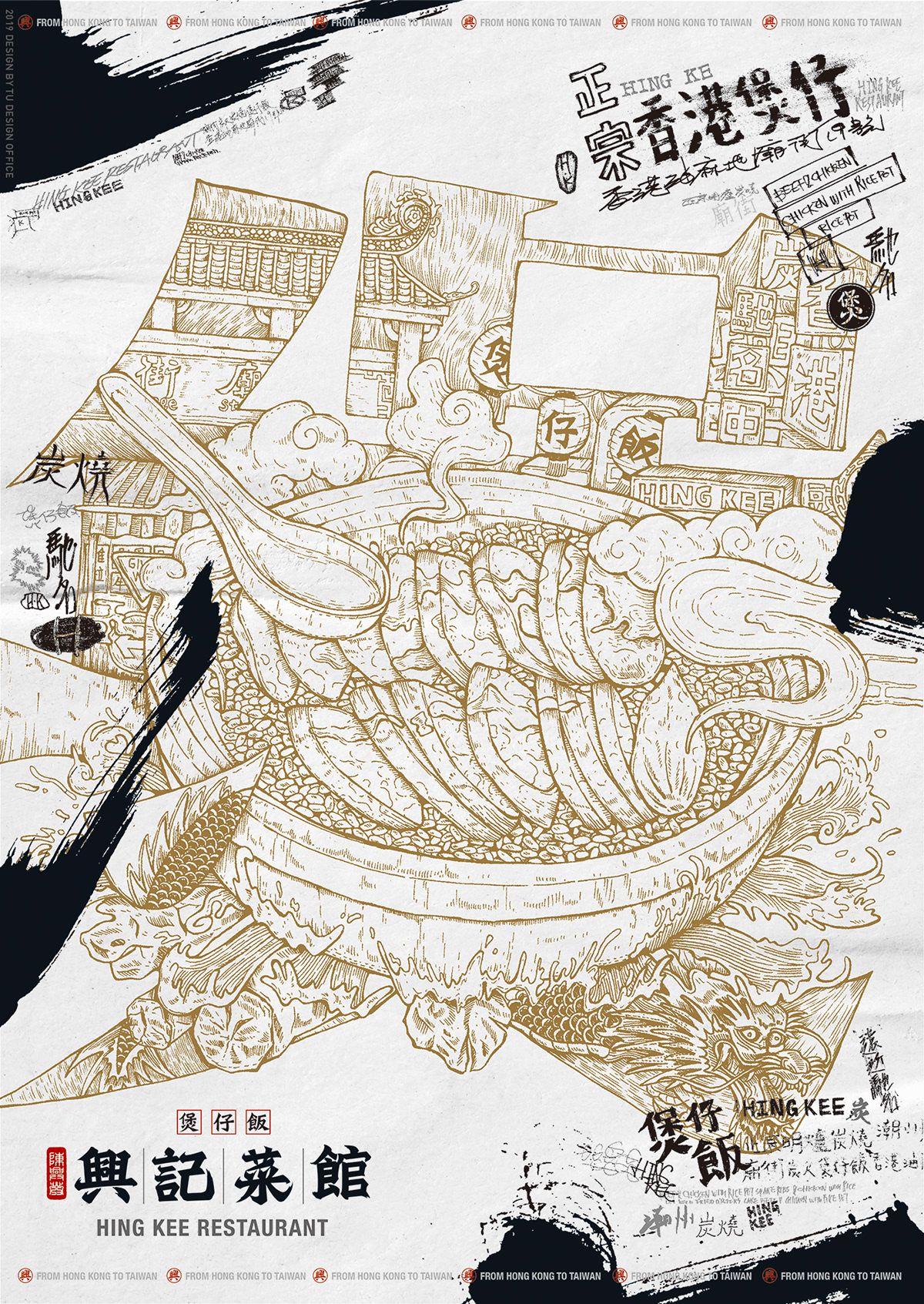
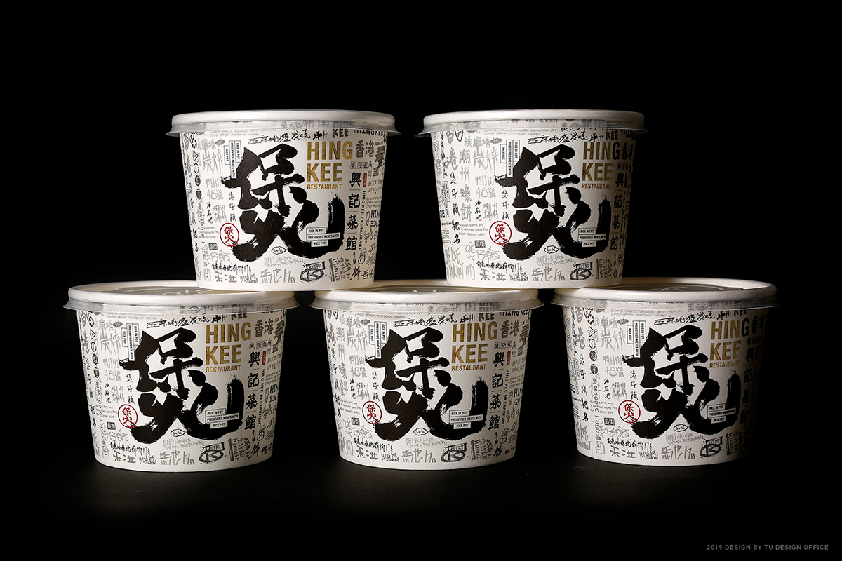
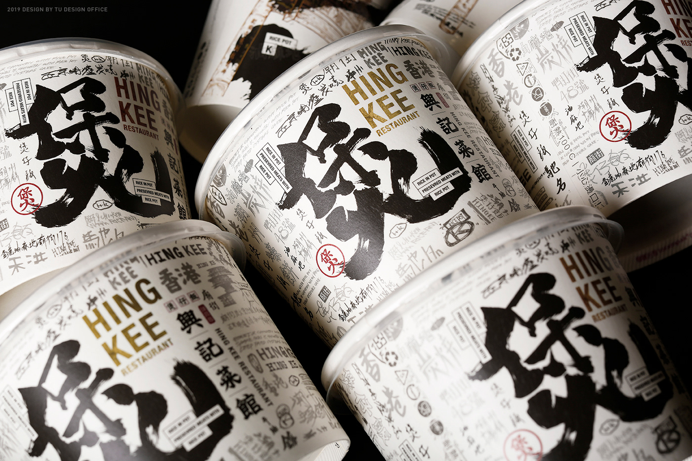
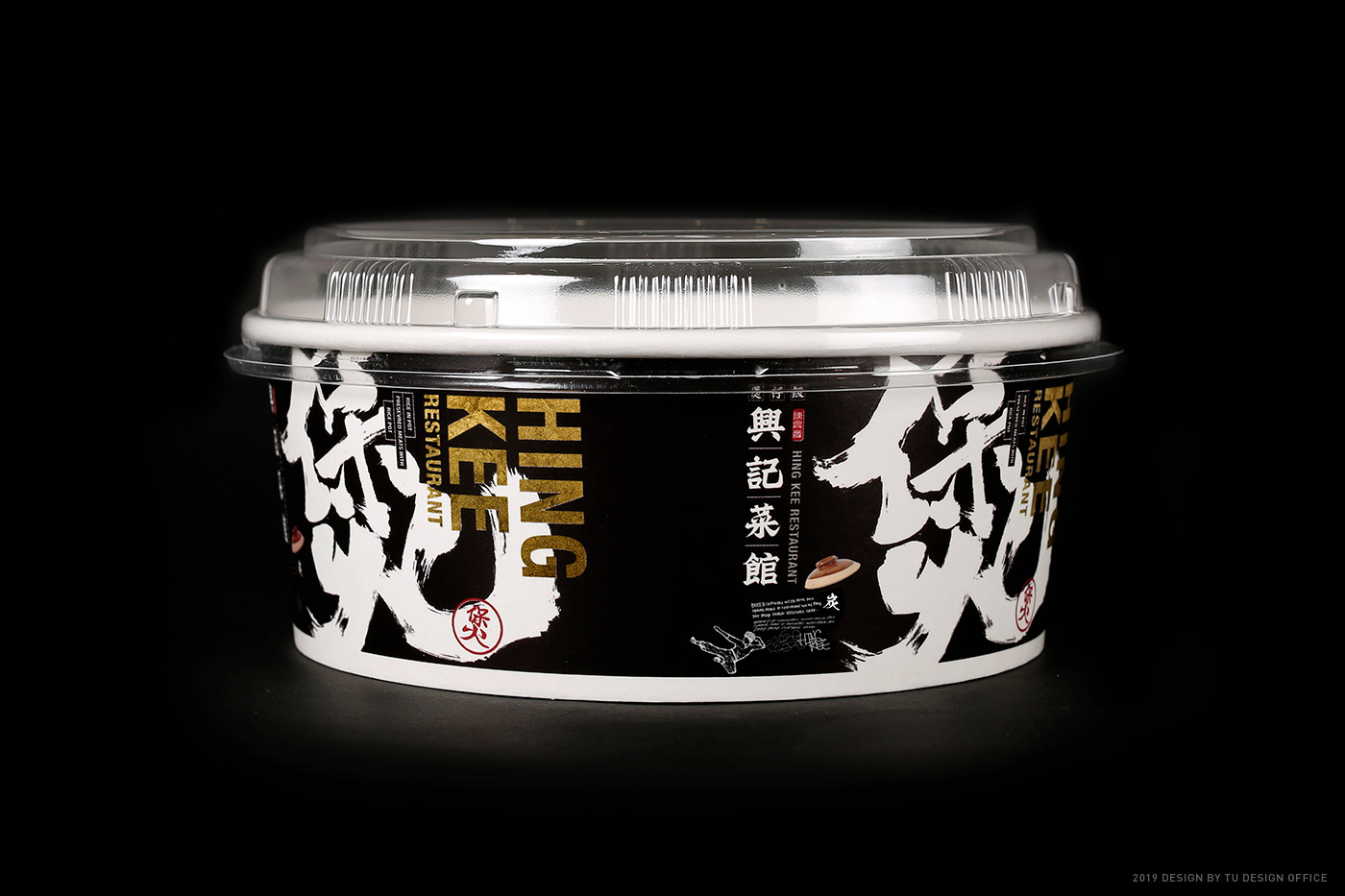
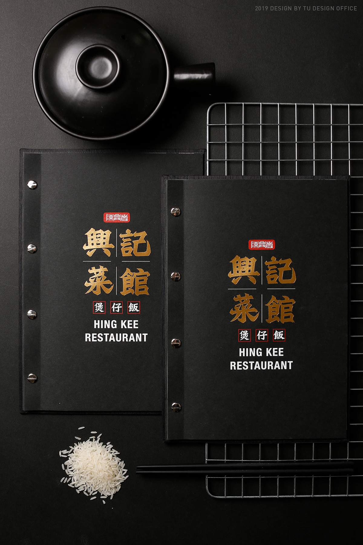
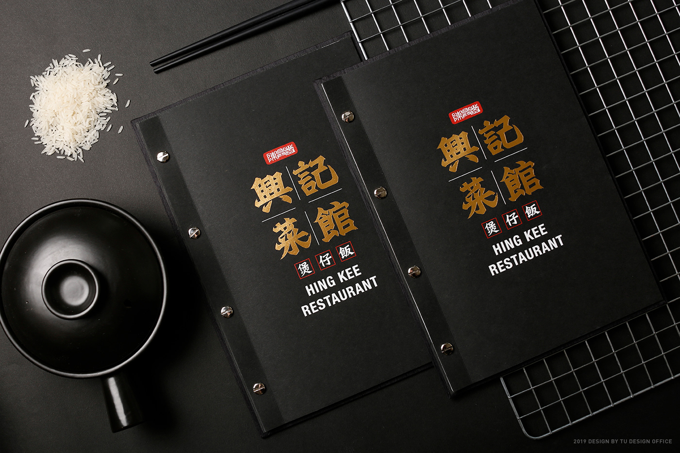
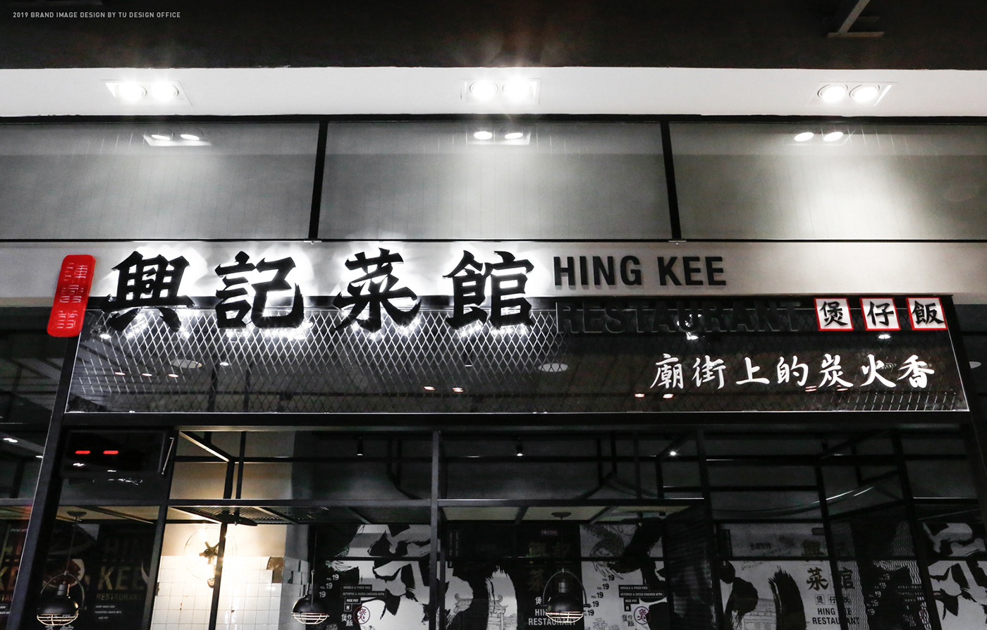
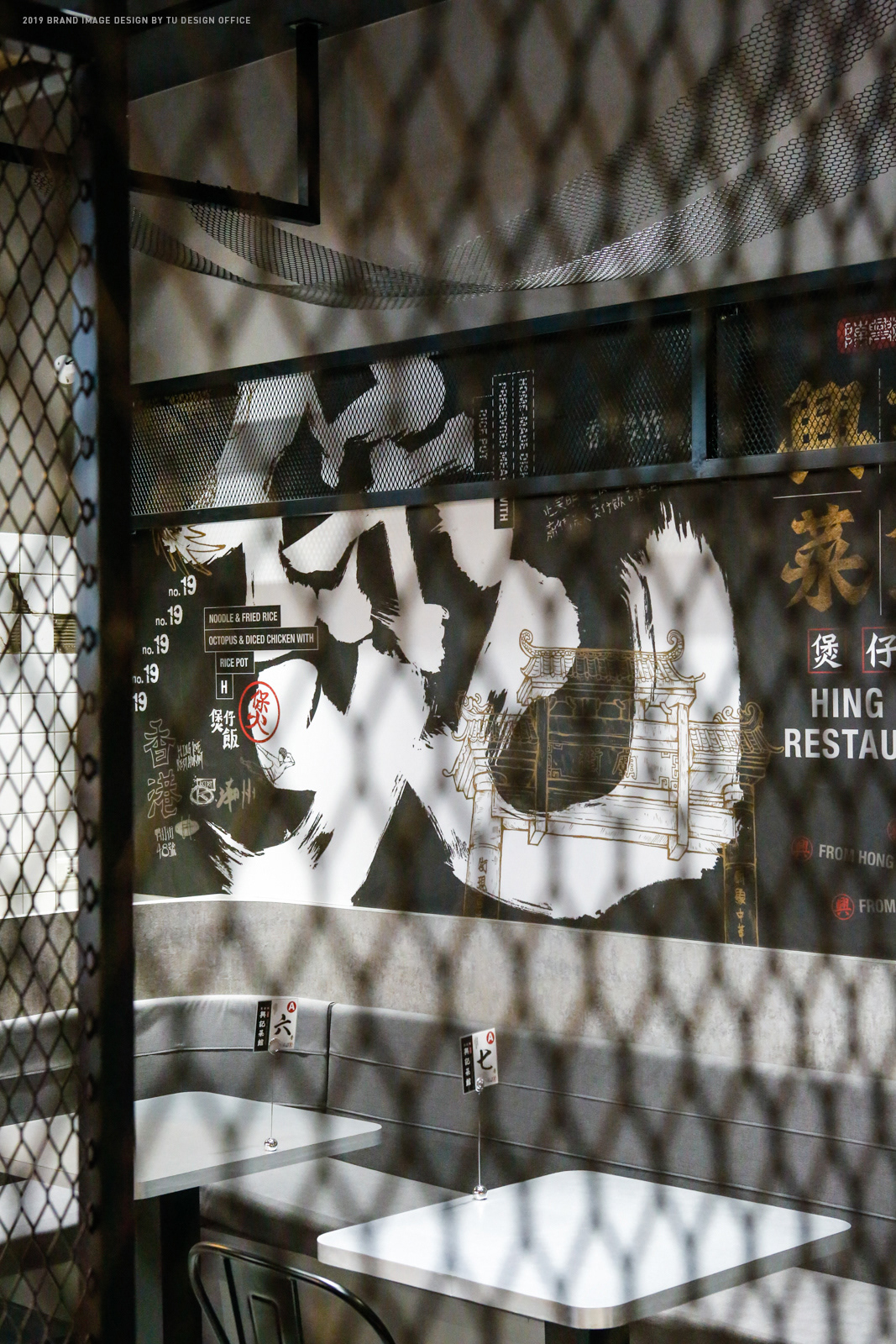
One of the main visuals is the Chinese character "煲", combined with rich image elements, such as signboards, temple street, pot rice. The visual is delicate and bringing out a strong Hong Kong oriental atmosphere. The typography refers to the font "Bei Wei Yi Book", which is the most used in Hong Kong's signature brand. We make every character strokes filled with unstoppable strength, so that the words are immersed with Hong Kong feeling and reproduce the spirit of the local old brand.
設計理念
興記菜館,是位在香港廟街,1982年所成立的知名煲仔飯品牌,2019年首度引進台灣。我們將老字號香港品牌重新定位,將一系列的品牌主視覺,運用書法字、多樣且隨性的手寫字、塗鴉,以現代的設計語言,營造出在香港廟街上,吃著正宗港式料理的熱鬧與豪邁氣氛,呈現街頭庶民美食的豪邁、霸氣與隨性。
而其中一款主視覺,我們以漢字「煲」字,結合豐富的圖像元素,如招牌、廟街、煲仔飯來設計「煲」字體,畫面精細豐富,帶出濃厚的香港東方氛圍。 商標字的設計上,我們參考了香港招牌最長使用的「北魏楷書體」的字體特徵,設計出帶有剛勁力道的筆畫,讓標準字更有濃厚港式的風味,重現道地的老品牌精神。


設計公司 |Designed by TU DESIGN OFFICE
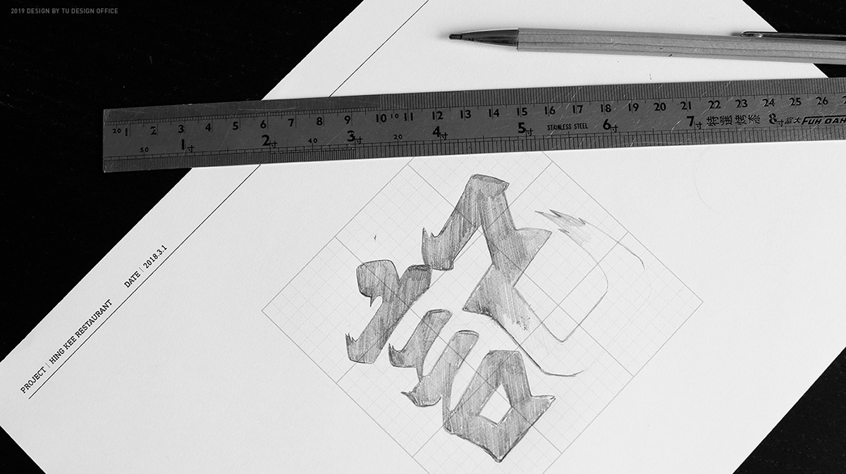
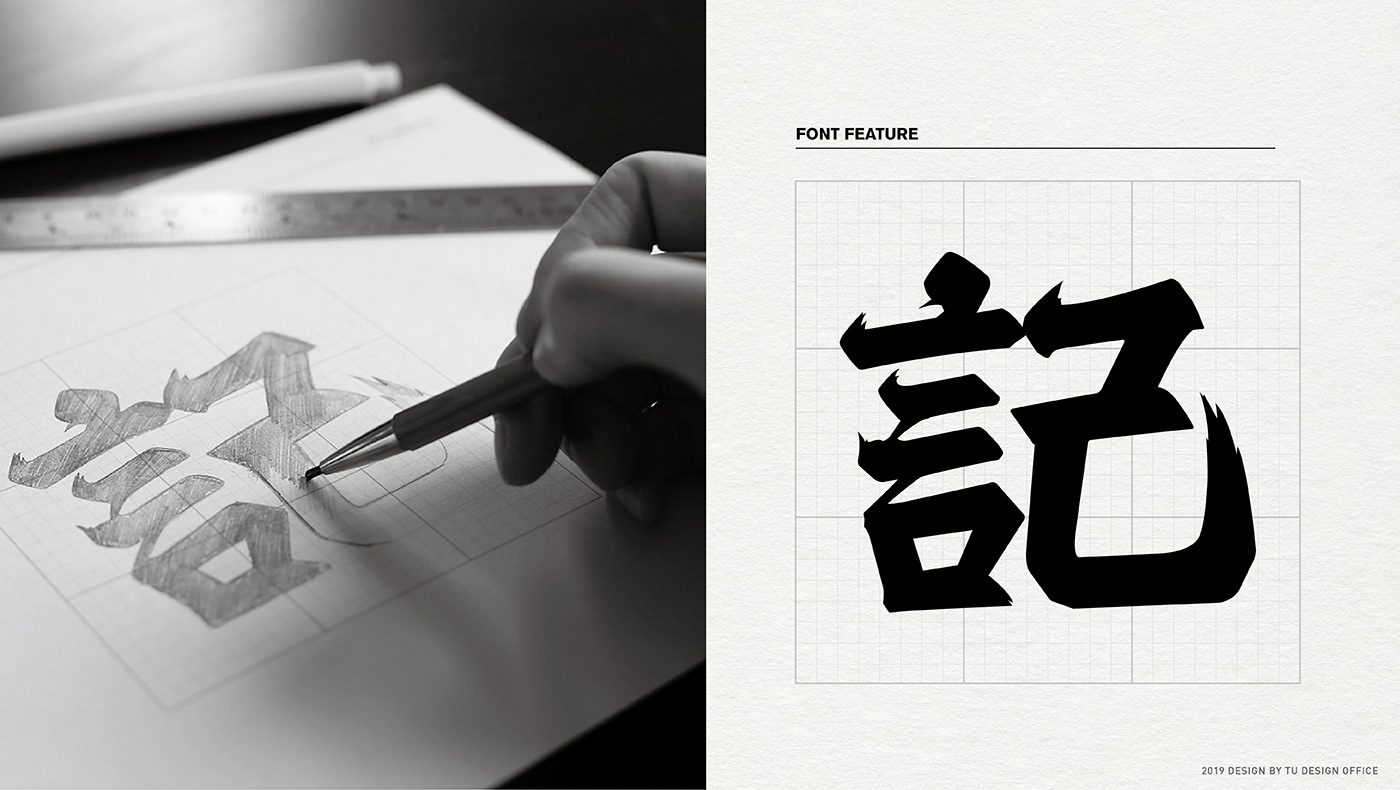
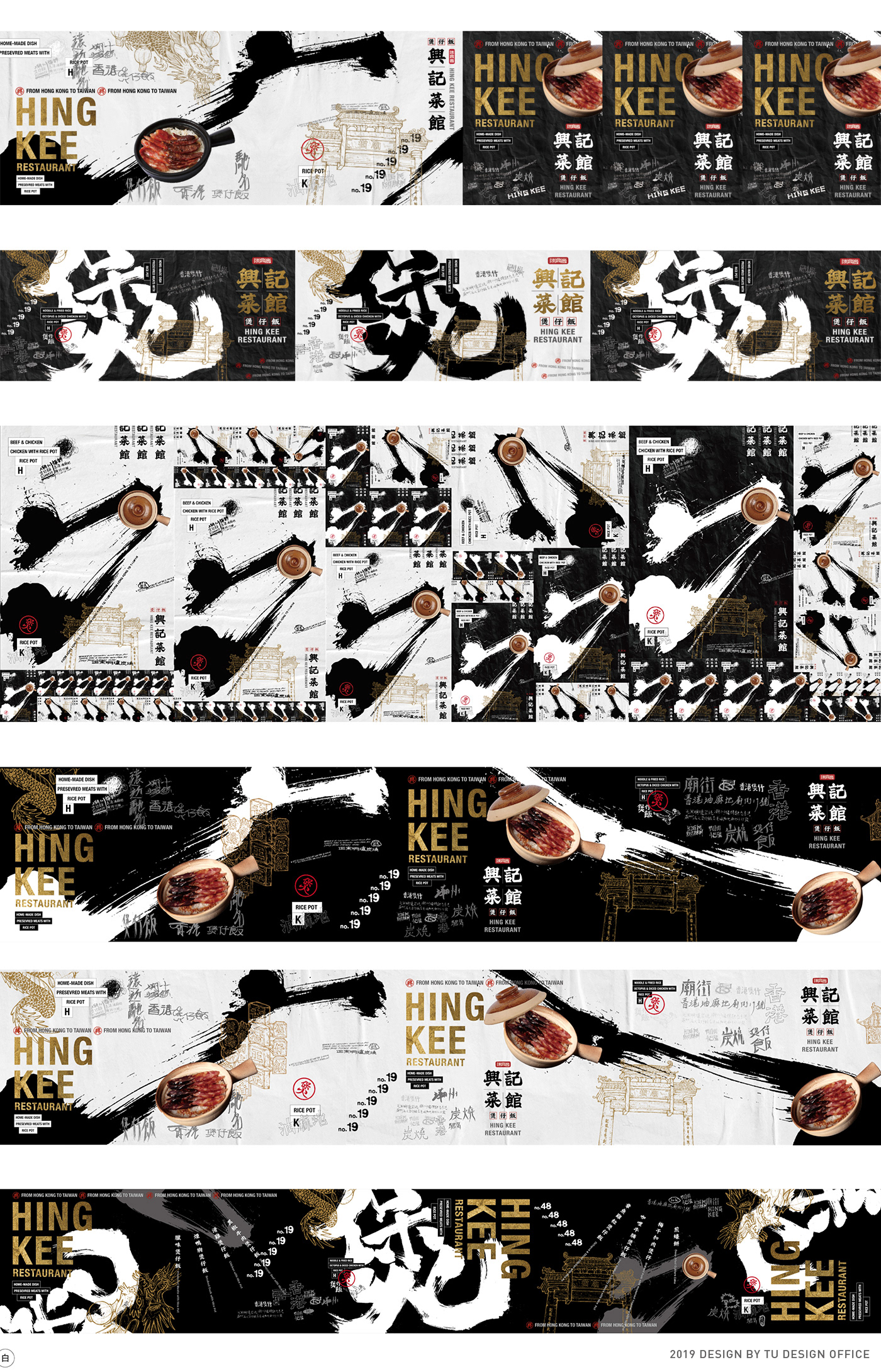
幕後製作過程|Making of HING KEE


