Bibeloty
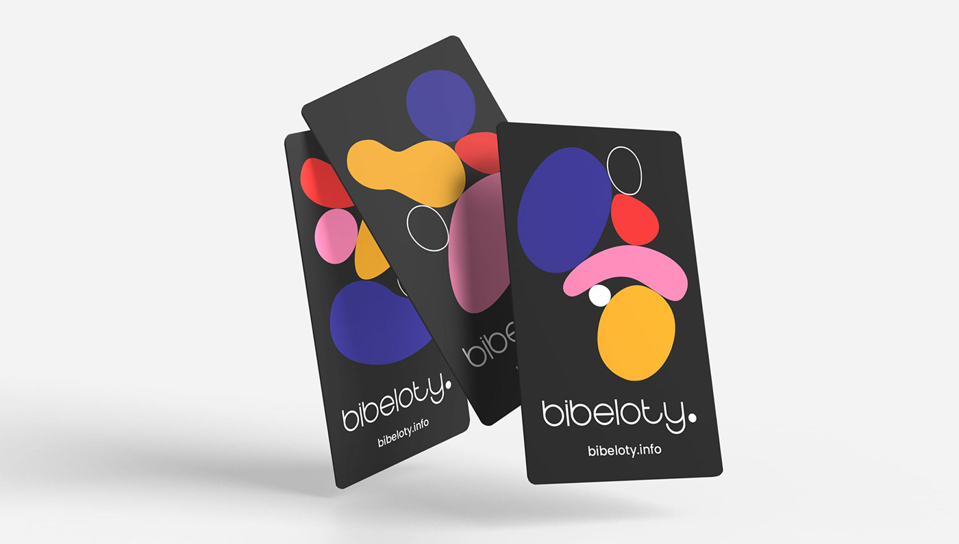
Polish Advertising Agency specializing in guiding gadget advertising and design. The challenge was to integrate their existing logo with a new brand identity emphasizing innovation and creativity. Retaining the black-and-white theme, I introduced contrasting colors and created a set of versatile shapes, akin to Lego pieces. These shapes, representing Bibeloty's diverse aspects, can be rotated, scaled, and colored to craft dynamic compositions. The four primary colors and monochromatic tones, balancing intensity and ensuring a visually striking design across various applications.
Deliverables: Branding, Website Design, Print Materials, Digital Design