The Creative Direction
While discussing about which direction the logo is going to be, I took inspiration from the key things the brand gave to me and from there I go deep to find things that people associated with it, while at the same time maintaining the boundaries so it don’t go too far from what’s best for the brand.

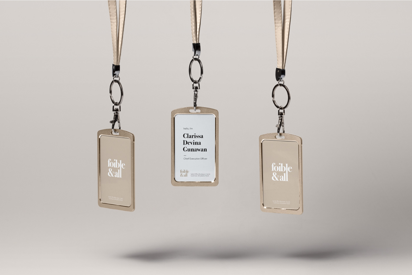
The Color of Imperfection
The main corporate color of the brand is PANTONE 7530 C, or as we call it “Nude - Beige” is the diamond in the rough of colors, it’s not as bright as Cherry Red, Ultramarine or Tangerine even, but that hasn’t stopped us to still admire the delicacy of this color. Just like the concept of embracing imperfection, this color itself is not perfect it has flaws here and there such as it wouldn’t work much in a low light environment but it has some of its own perks too such as it looks neutrally calming and elegant in all well lit environment.