

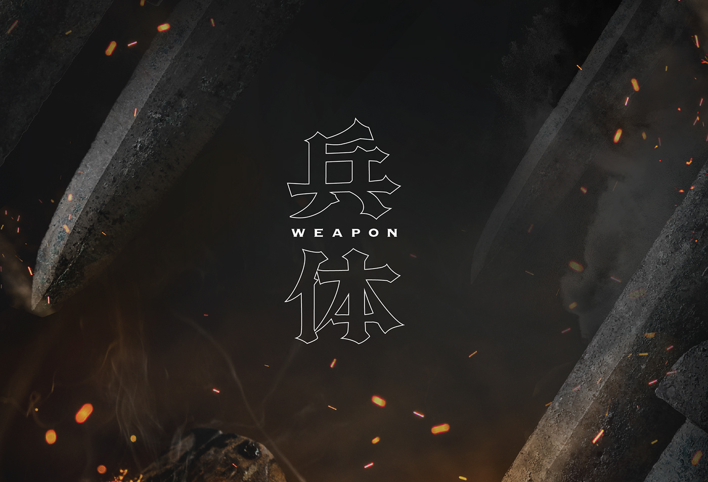
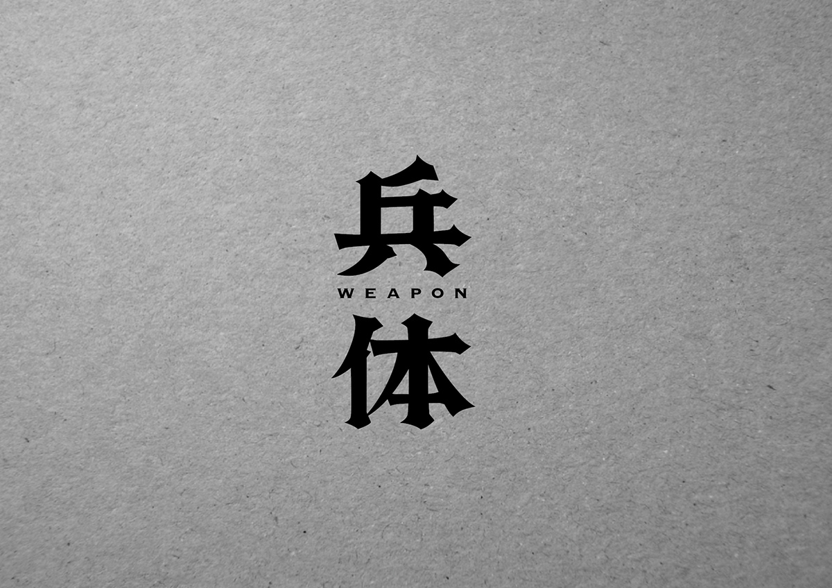
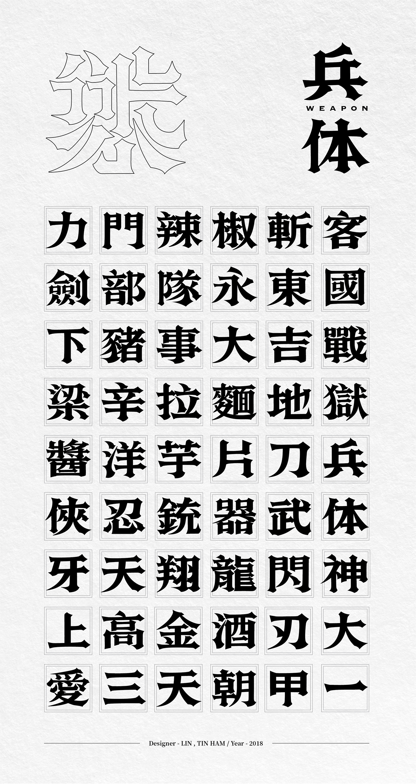
兵体|Weapon Font
Designer:Lin,Tin Ham
-
-
June, 2019
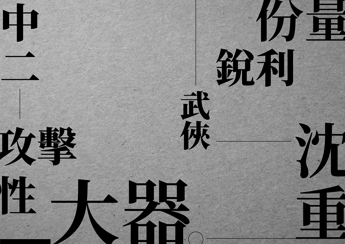
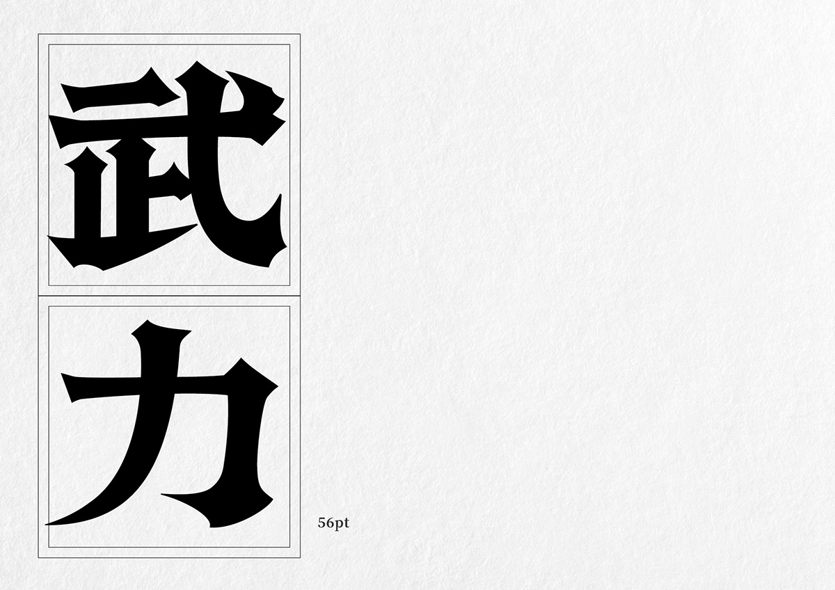
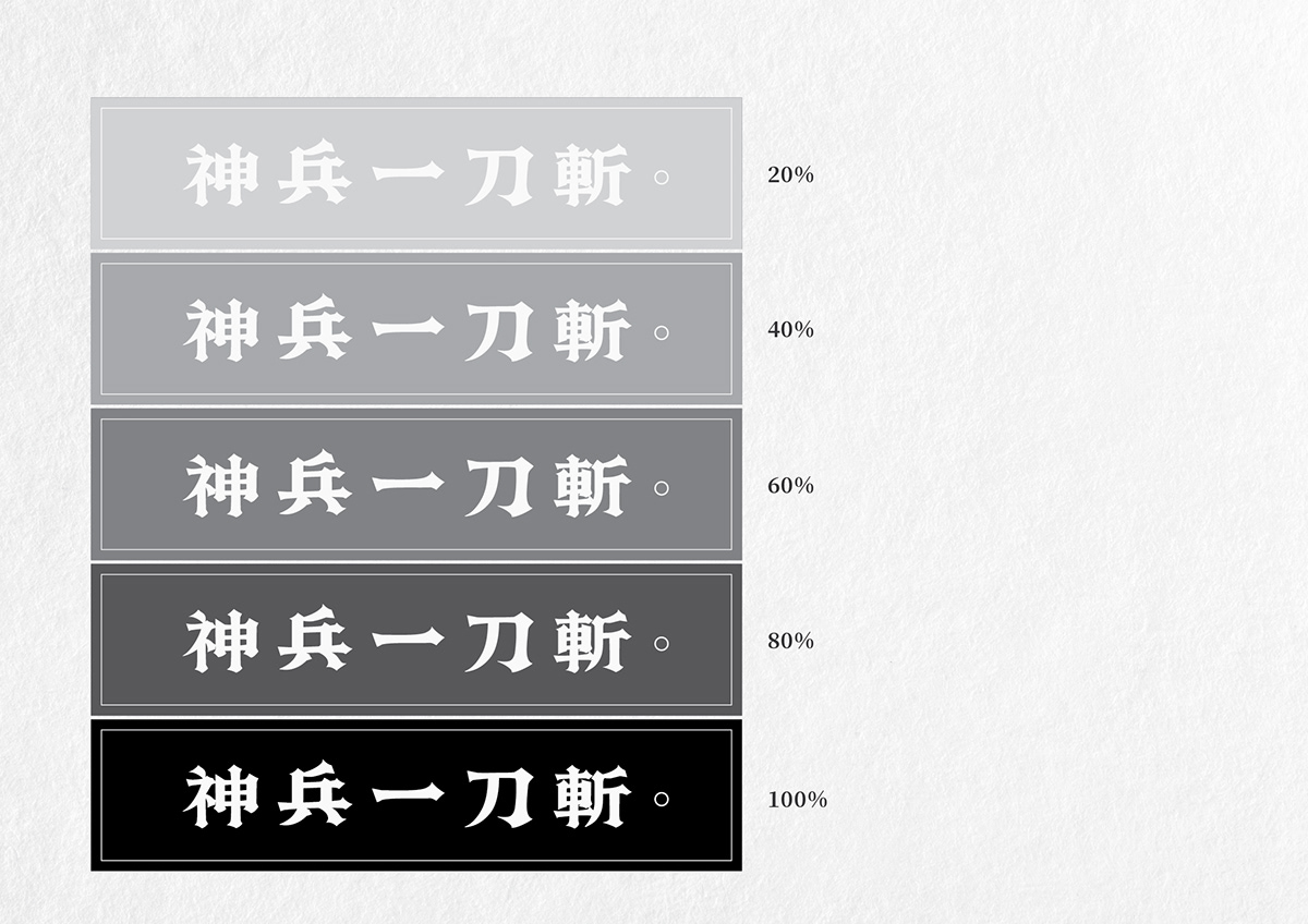
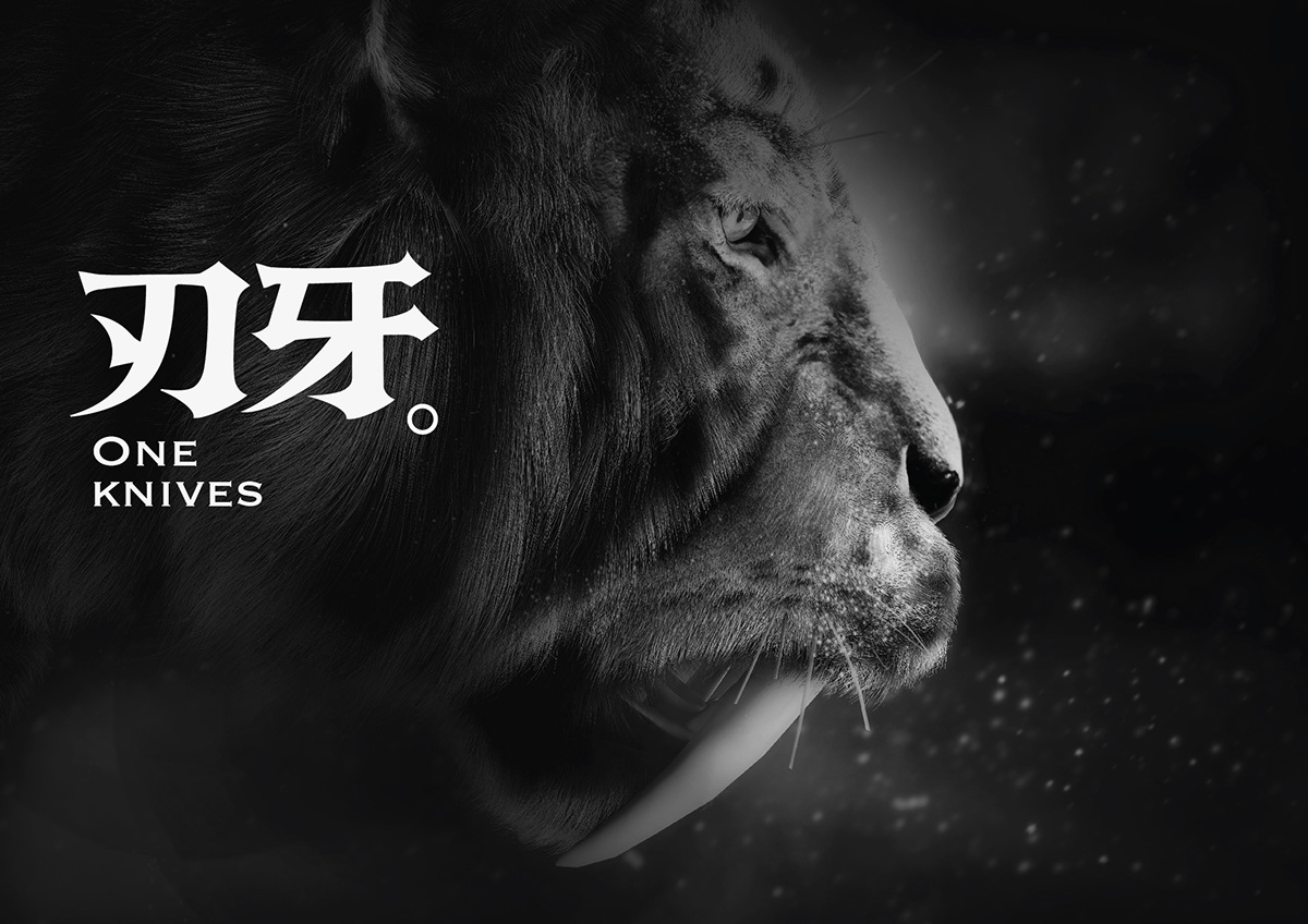
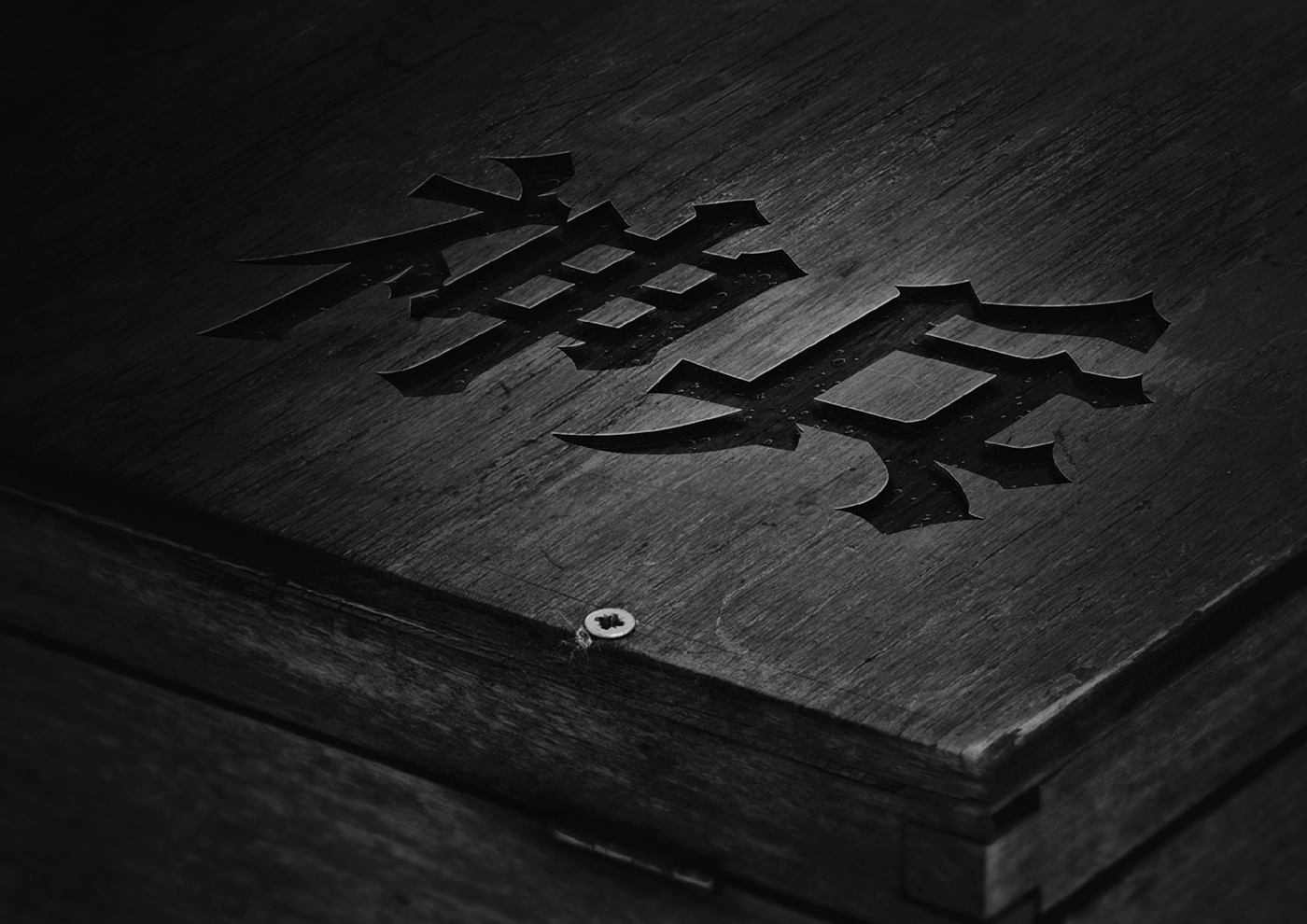
兵體的創作靈感是來自於中國春秋戰國時代的古劍。這個時代所鑄造的劍,外觀厚實,尖端鋒利。也因此起初先打造了「劍」這個字,作為整個專案的開始。但是在製作過程中逐漸發現字體脫離了古劍所能夠詮釋的範圍。部分筆畫既像刀,又像戟。甚至隱含許多不同的冷兵器造型在細節裡面,因此最後更名為兵體。兵體的結構穩重,中宮開闊,筆畫細節銳利,應用在畫面標題上顯得存在感十足。而在實際運用上,兵體適合使用在氣味濃厚,辛辣的食物包裝。又或是烈酒酒標,氣勢滂礡的電影海報,...等等。歸納起來,兵體適合用在需要「熱血、權威、震撼」感覺的視覺傳達上。最後,期待兵體能成為一個媒介,融合日本動漫的熱血與中國兵器的震撼。讓看見兵體的人,能感受到它的重量與細節。為台灣的字體市場增添新色彩。
The idea of Weapon Font comes from ancient sword of Warring States Period back in ancient China.
Swords made in this time are massive and sharp; it’s the tool to open a new era at then, therefore, I chose the word “SWORD”-as the beginning of the project. But the image of sword becomes blurry as the project progressing; some parts of it are like knives, some like halberd, or even more different shapes of cold weapons are hidden in the detail, so the font is officially named “WEAPON FONT”. In usage, Weapon Font is perfect for strong flavor and spicy food package, or heavy liquor, agitating movie posters...and so on.In conclusion, I recommend to use Weapon Font on visual requires “Passion, Power, Agitating” design situation.Ai last, I look forward to make Weapon Font an intermediary for Japanese passionate anime and Chinese blades, for those who sees Weapon Font can feel its weight and details, and a new color for Taiwan’s font market.


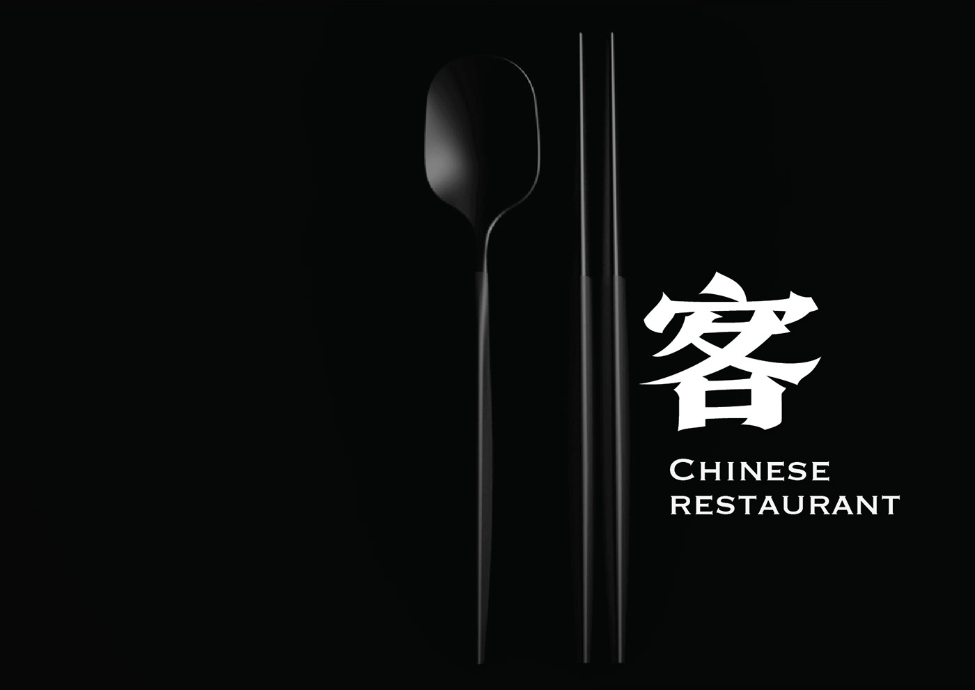
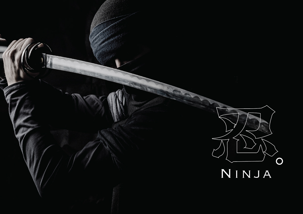


繼續觀看:兵體2019修訂版 / 商品應用案例
註:兵体目前屬概念性創作,尚未進行字庫開發,目前僅能以客製方式製作


