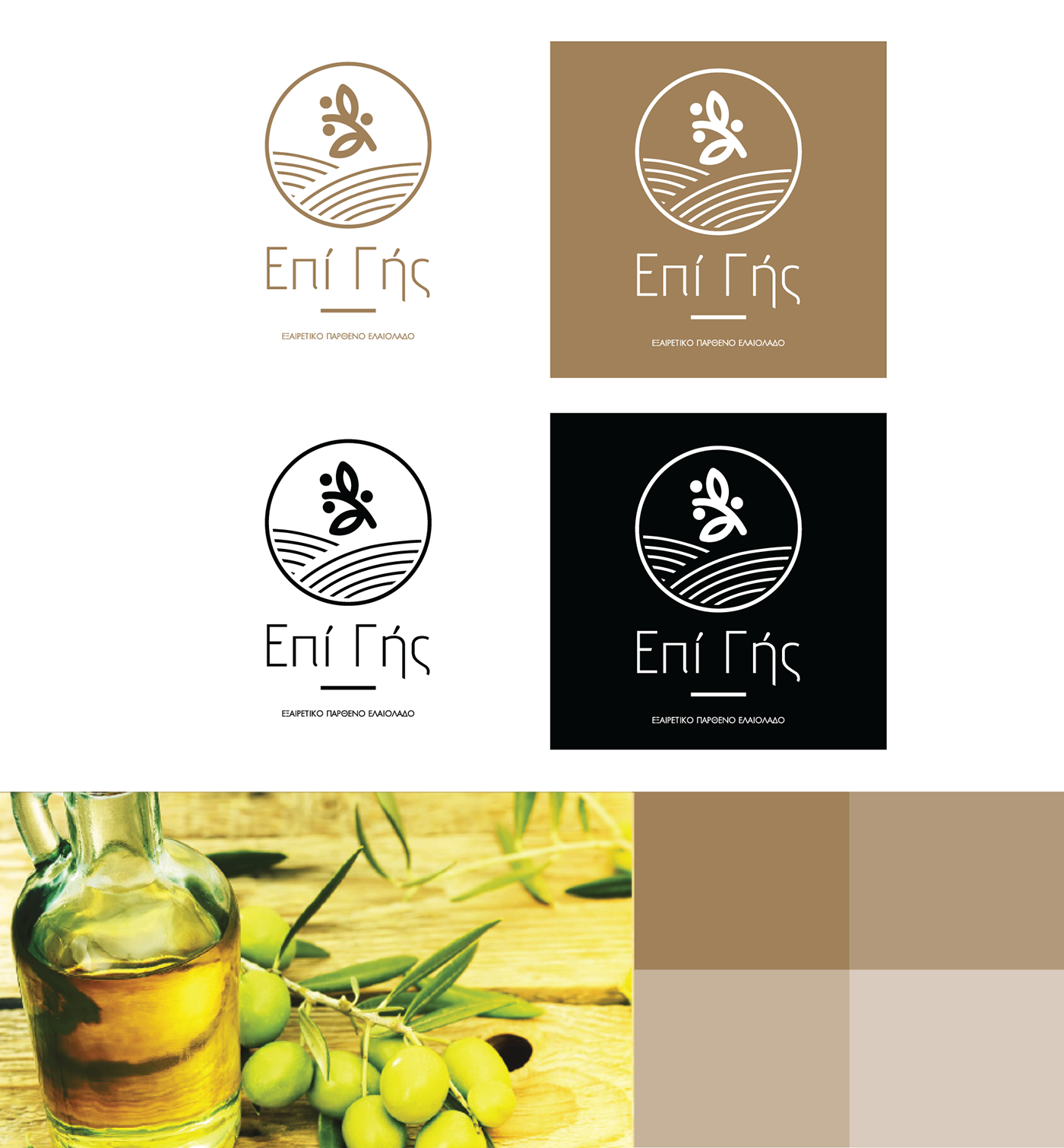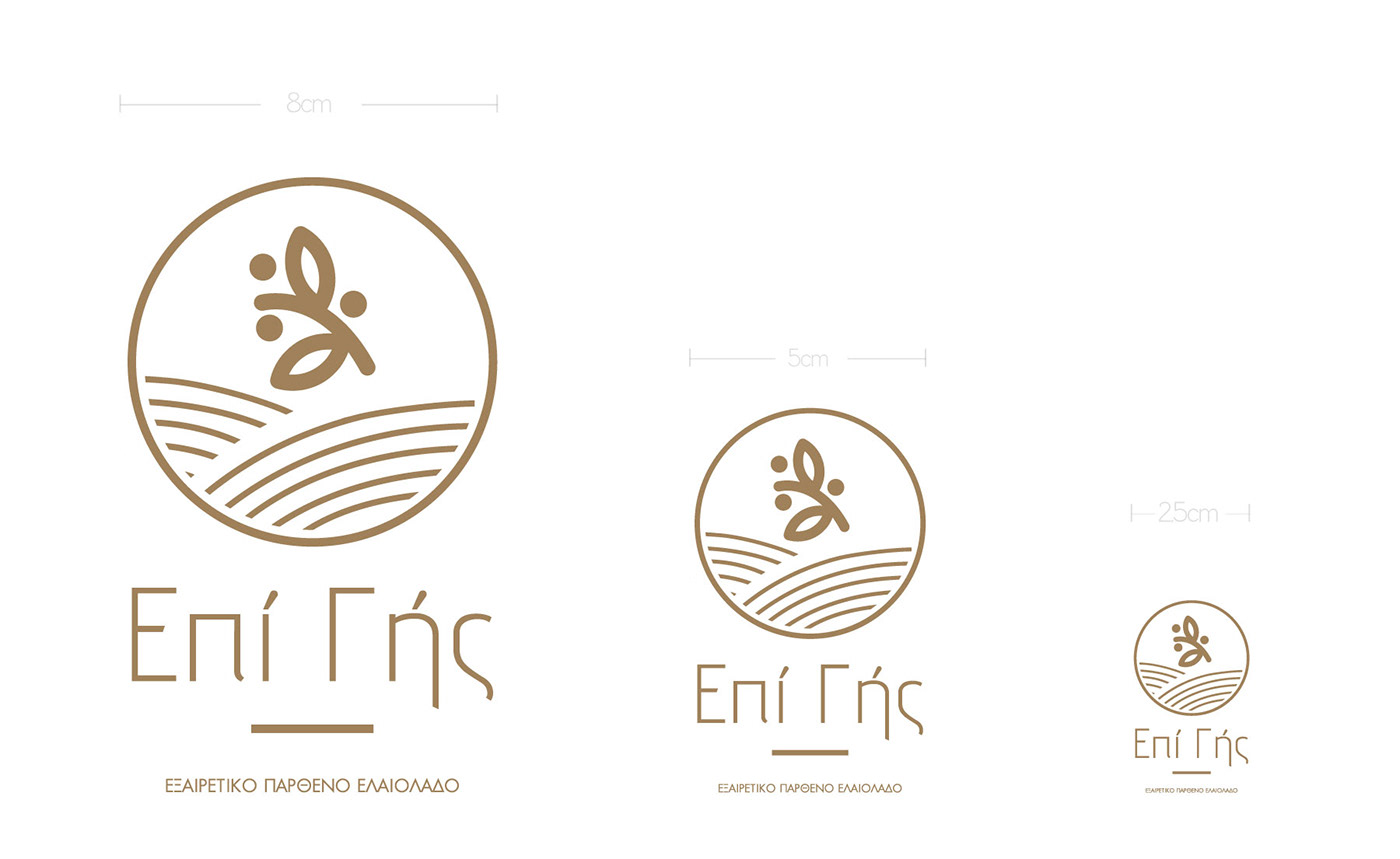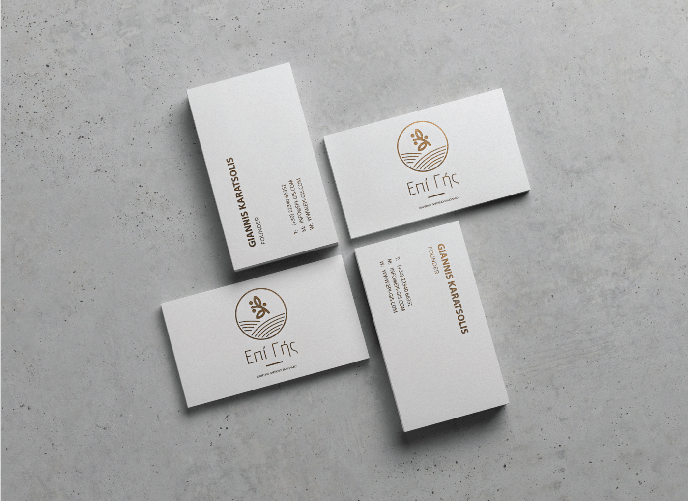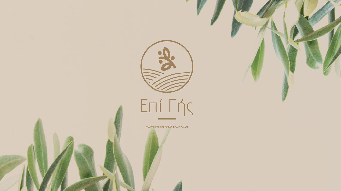
Logo and packaging for Epi Gis extra virgin olive oil. Epi Gis means ¨Upon Earth¨ in Greek. A clean design with three symbols, the land and an olive brunch full of olives in a circle. The circle means nature and motherhood. These three elements can communicate exact to the point of the product. Clean, pure and traditional as well. The typography is a mix of minimal and a little bit of old style represents exactly the product’s message.