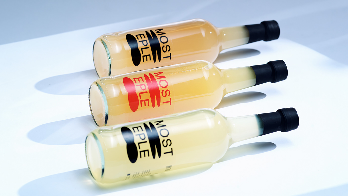
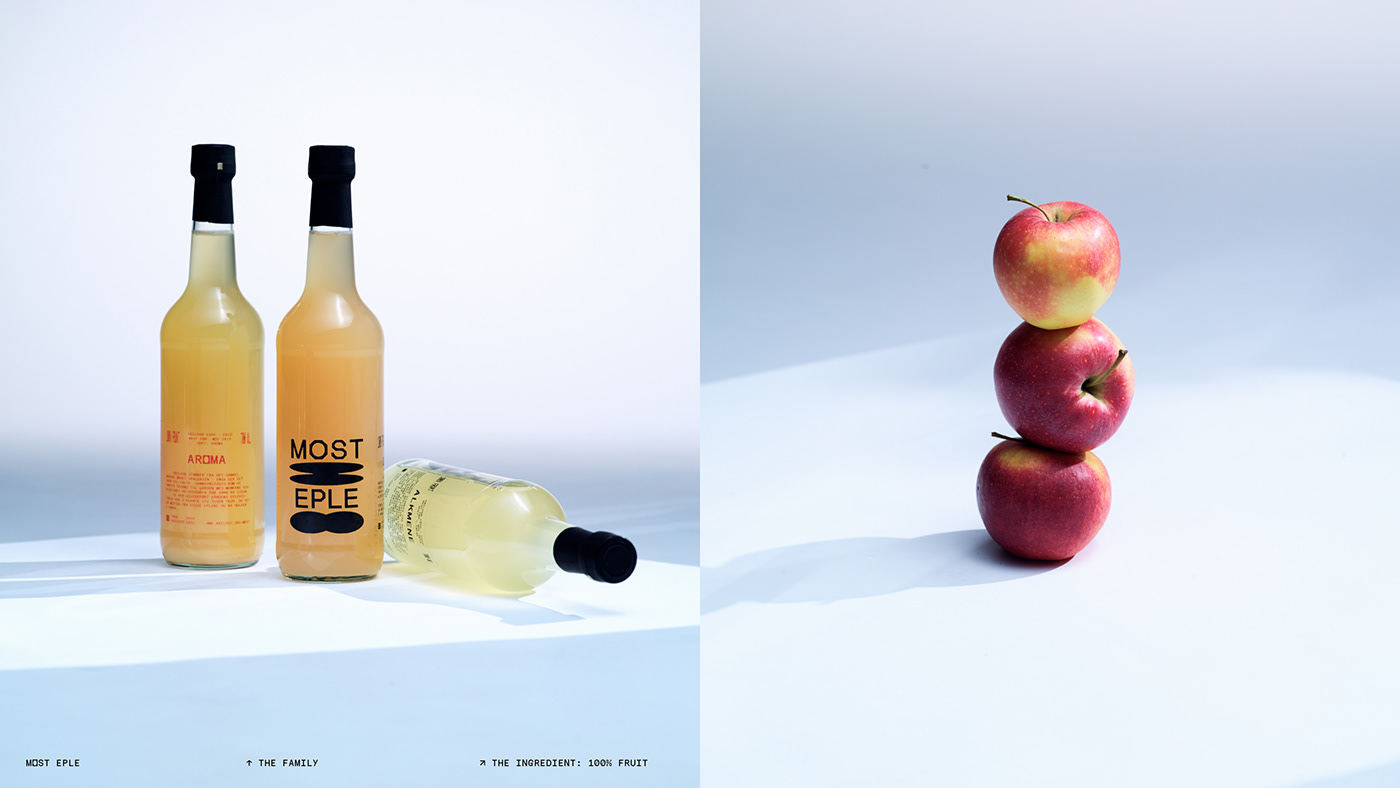
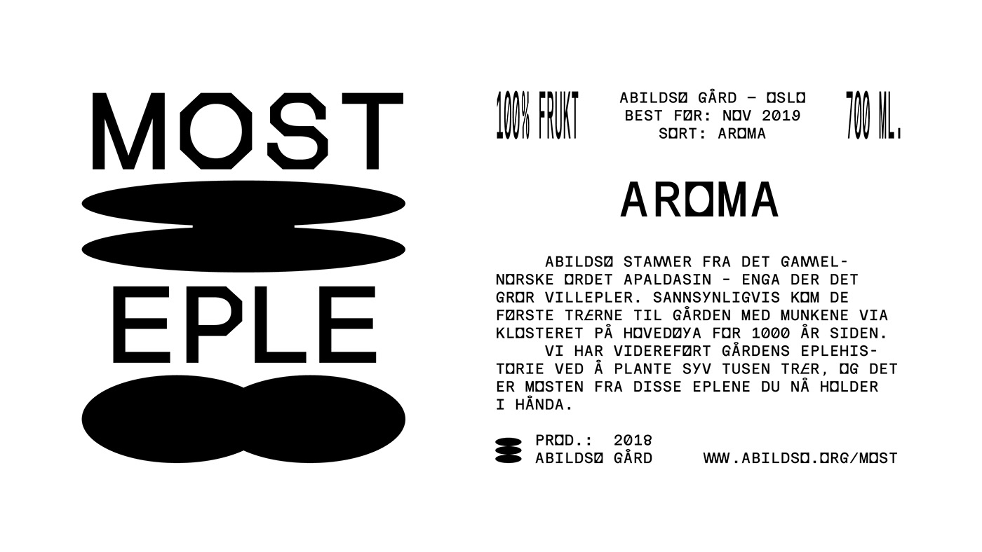
Most Eple
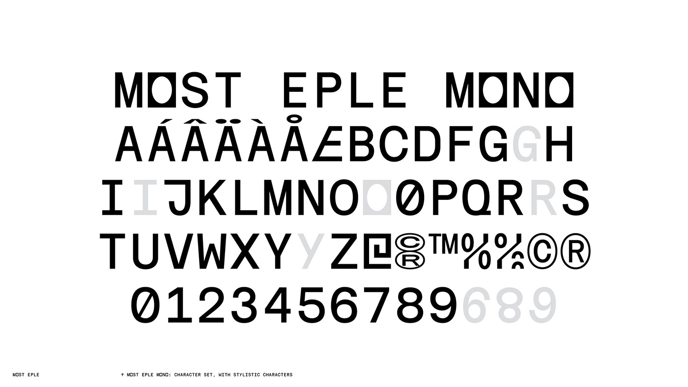
The design is based around a play on the Norwegian name for apple juice; ‘Eplemost’,which translates to the juice of crushed apples. As a main component we’ve drawn two apples being crushed by the logotype, supported by an eclectic custom monospaced typeface, alluding the contrast between a natural product and the semi-mechanical process of converting it into juice.