.________________.
What Kind of Project is tiho
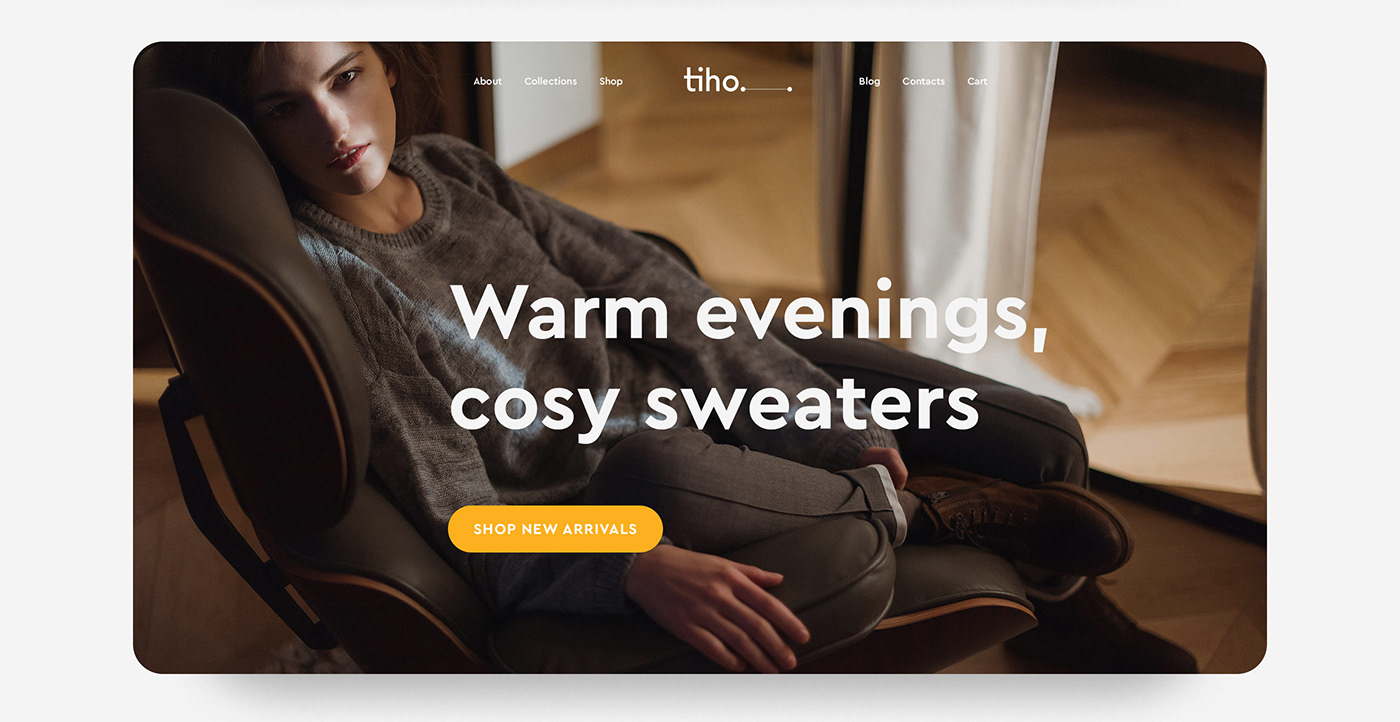
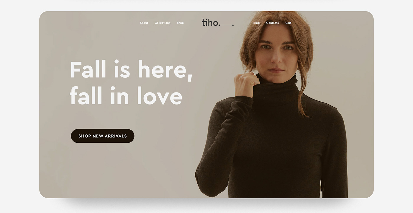
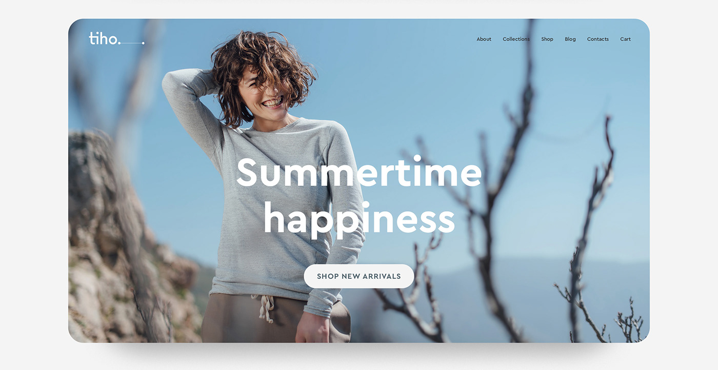
I'm excited and proud to introduce to you the results of my work while I was the creative director of fashion brand called tiho. It is a Russian brand of women clothing, based on the principles of conscious life and self-love.
It all began with developing the brand's logo, which reflects the philosophy of all brand's products: simple and beautiful clothes with lots of details inside it. The logo is simple too, but on the inside, it contains clear contrast, the right balance of forms, harmony in proportions. And It even could be recreated in simple text symbols: tiho._.
Tiho's emblem is line, connected by dots.________________. It means communication and collaboration between people, who share common values. Moreover, there is an additional version of the logo — custom ligature "ti". It contains all letters from the name of the brand and serves as a simple tag for the brand's attributes.
I was responsible for the all brand's visual communications developing and every clothing collections art direction and promo campaigns.
What I was doing
Research
Strategy
Brand identity
Art and creative direction
Visual communications
Clothes design
Content strategy
Material sourcing
E-commerce direction
Strategy
Brand identity
Art and creative direction
Visual communications
Clothes design
Content strategy
Material sourcing
E-commerce direction


CREDITS
Client: tiho
Pattern cutter: Nadezhda Koltsova
Photography: Oleg Tokmakov, Maxim Baev
Illustration: Katya Vakulenko
Thanks for watching.
Don`t forget to appreciate this and follow me on INSTAGRAM


