This was the presentation of my Typography Skills Unit split in three sections. First part was to express the feeling yet explain clearly the seven deadly sins through the art of typography. We were free to pick up any typeface that exist on web, we thought best describes each sin. Talking about sins I decided to choose a black and white colour scheme, which I think best visualised my work.


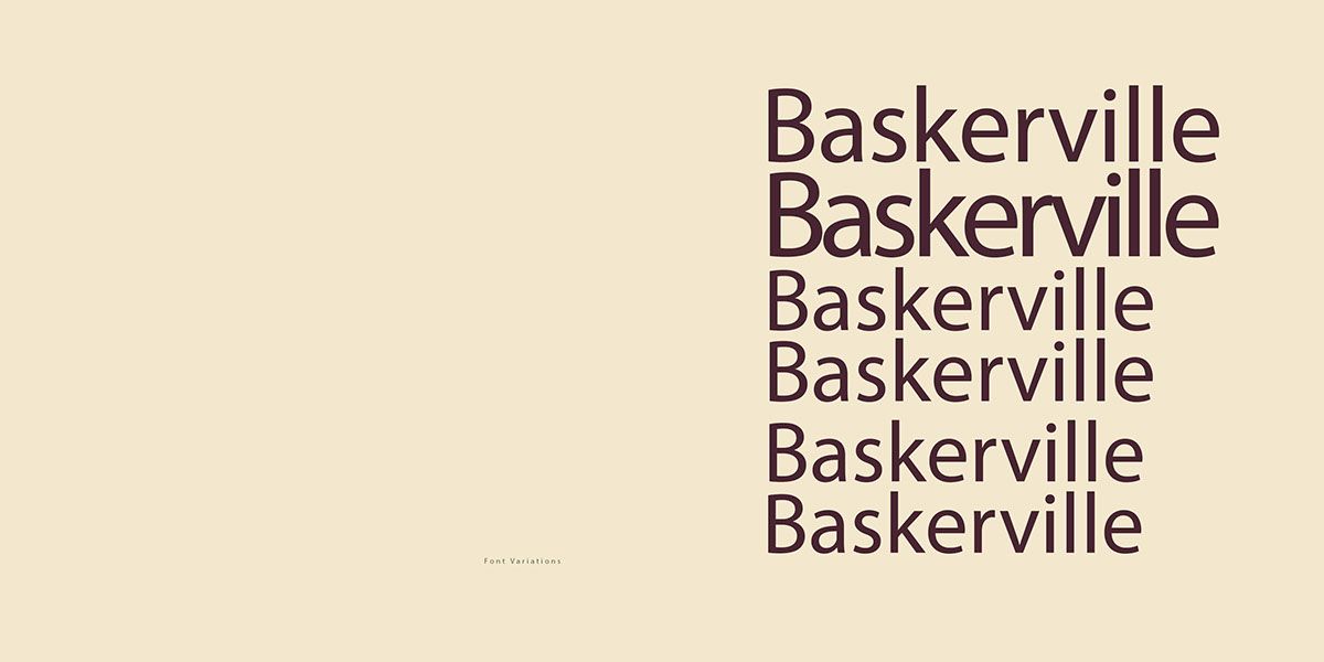
Second part of the unit was to create a font book using one of the premium fonts. We were free to be as creative and elaborative as possible, make our font book unique and clearly visualise the various uses of our selected font. Here I chose a classic font and decided to create a contrast with a contemporary design using a relatively safe colour option which compliments my selection of font.


Last Part of the Typography Skills Unit was to create our own typeface. With a passion for hand-drawn illustrations and fonts, I decided to design my own typeface inspired by various genres, including different weights and patterns and I also opted for having each letter with its own character / style. Therefore I included slab, serif, sans and script in my typeface.


