
Intro to Graphic Design -
Project 1: Symbol/Number.


I decided to take a graphic design course to try to help improve my graphic design skills and have a better understanding about graphic design. I don't really have any background in graphic design, I have only done graphic design projects for myself.
The first project we were given was to design a sign for a museum that represents the floor number and the exhibit for that floor. Specifically we had to use at least one of the Gestalt techniques.
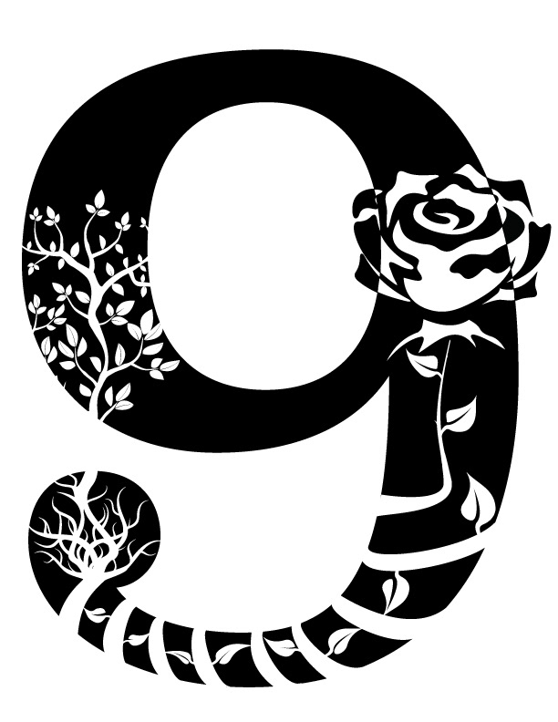
I was given the 9th floor, flora.
For the 9 I had chosen Superclarendon typeface from the list our teacher gave us. This typeface had more arcs and flowers are very curvy and not square. I chose the technique similarity and continuation and had the flowers lead from the "tail" of the 9 around the inside of the 9 to form a 9 as well.

Draft 1 of the 9th Floor, Flora.
The feedback from my classmates on the first draft was mostly negative. They first said they couldn't tell that they were flowers, most of them thought that they were stars. They advised to put something else in between the flowers, make the flowers bigger, and to use different flowers. One classmate suggest to use the closure technique with the flowers.
For my second draft I took their first advice and made the flowers bigger and used different ones. With bigger flowers I decided to only do 3 - 4 flowers. For this draft the vine uses the Continuation and Similarity technique and the rose uses the closure technique.

Draft 2 of the 9th Floor, Flora.
Unlike my 1st draft, we didn't do any group feedback but I showed it to some of my co-workers, one of them being a graphic designer. I was told this one was to busy. The graphic designer suggested that I keep the rose and tree, and get rid of the other two flowers. She then suggested I make the rose bigger and then to combined the rose and tree together.
As suggested I removed the two flowers. I decided to extend the rose to the tree by extending the vine further along the "tail" of the 9. Then around the ball of the tail have the vine's roots expand up to connect to the trunk of the tree. I did that to add a Closure technique, while the rose's vine does the Continuation technique.
Draft 3 of the 9th Floor, Flora
I had to decide which draft I wanted to use to present to the Museum board. I choose to take all three but tried to sell them the third draft. I told the Museum board members that the third draft works best because:
1 - It solves the problem of that user sees a 9 and flowers. Which indicates that they are on the 9th floor and the exhibit is flora.
2 - The high contrast between the flowers and 9 helps you easily identify the number and symbol.
3 - Both the rose and the tree can grab the viewers attention to which they can follow through to see the whole design.
Feedback was mostly positive. I had one student who said she would not accept my work because simply the drafts were so different. I mentioned to her that in my experience, (even though my background is IT work and not graphic design) it's always best to give your clients options. Majority of the students (or "museum board members") thought the third draft was the best. The teacher said she liked the first draft the best. The teacher also said I need to work on my explanation and selling point.
What I've learned from this project:
Having an IT background I found this project harder then expected. I have a very logical thinking process.
I was given a project where I had to make a sign that visually showed someone they are on a floor with a specific exhibit. So I draw a 9 with a flower next to it. If this was the engineering world, I would of been done because I solved the problem. That doesn't seem to be the case in the graphic design world. You also need to explain your design to your client, why it works, and why it's the best. When I'm fixing someone's computer (solving a problem), they don't care why I fixed it a certain way, why my fixed work, or why it was the best way to fix it. They just want the problem fixed.
Another example is, in the graphic design world, design A and B both solve the problem. However A might solve the problem better then B with explanation. IT world, if computer A and B are now both turning on and load the OS just fine, both problems have been solved but one is not solving the problem better then the other.
So this project has taught me, if I want to become a better graphic designer, I need to think more outside the box instead of just yes it works, and no it doesn't work.
Extra work:
This wasn't part of the assignment, but one thing I would add, since the museum didn't specify how large they wanted the sign or how they wanted to print the design. I took a photo of the "museum" with 3 different examples of how to put it on the wall.


