Homer Concierge Delivery Tablet App
This product enables retail clients to offer expedited shipping services to their in-store customers at the point of sale, allowing users to send delivery requests to Homer, print scannable shipping labels, and monitor and manage their deliveries. The application includes a customer-facing flow in which users submit their address and personal information and agree to terms of service. The product is targeted at retailers in areas with high tourism traffic where customers are more likely to rely on public transportation, such as New York and Disneyland.
My Responsibilities:
• Product Management
• User Research
• UX and UI Design
• Font End Development
The Opportunity:
We determined that there was an opportunity to remove limiting factors to average transaction value and conversion rate for retailers whose in-store customers are less likely to: a) plan on going directly home (or to their hotel, etc.) post-purchase, and b) have access to personal transportation at the time of their purchase. Customers who don’t want to be encumbered by their purchases are less likely to fill their baskets and more likely to avoid shopping altogether


The Challenge:
Many of our clients are heavily invested in their brand/in-store CX and require that any touchpoint for their customers feel like an extension of the existing brand/experience.
Store employee users are less likely to promote the service–and end-consumer users are less likely to opt into it– if they don’t perceive the interface to be easy to understand and use.
A large segment of end-consumer users are tourists with a wide range of English language skills. These users are also less likely to know the address for where they are staying.

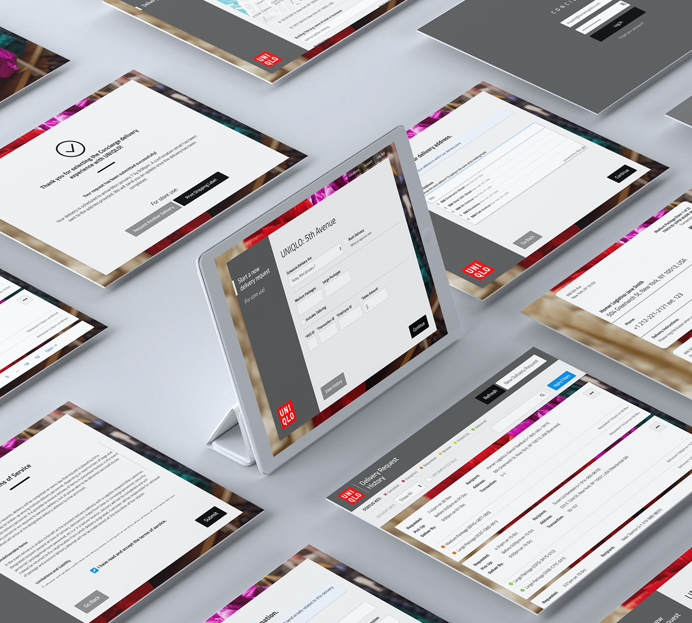
The Solution:
I devised a white-label design that accommodates clients’ branded assets without impacting the usability (or perceived usability) of the interface. I used an otherwise neutral design system, allowing the product to function as an extension of the existing in-store shopping experience. I avoided the use of color and icons as much as possible on customer-facing screens, relying on intentional placement and grouping of elements to suggest their function. I used the Lato typeface, which is mostly neutral but, at larger sizes, subtly suggests a premium, tech-driven theme. I used rounded corners sparingly, only to clarify the functionality of buttons and and form inputs.
To optimize for conversion, I paid particular attention to the earliest moments in the user experience. I hid the complexity of the delivery submission flow, breaking the task of requesting a delivery into several screens, each with only a few inputs. In addition to reducing cognitive load, this also makes it easier for users to identify and remedy validation errors at a given stage of the flow and makes it easier for the product team to pinpoint where users are most likely to abandon the task. I used large target areas (buttons and form inputs), high contrast, and simple, direct language to create an inviting user experience and minimize feelings of stress or frustration.
We had consumer-facing content professionally translated to several major languages and allowed the language to be configured for consumer-facing screens and emails. We also prompted users to find their shipping address by entering the name of their building/hotel.


