

Rebranding for a Spanish design and architecture studio, KUTARQ.
The studio is known for its innovative but timeless designs
and the use of unique and memorable details.
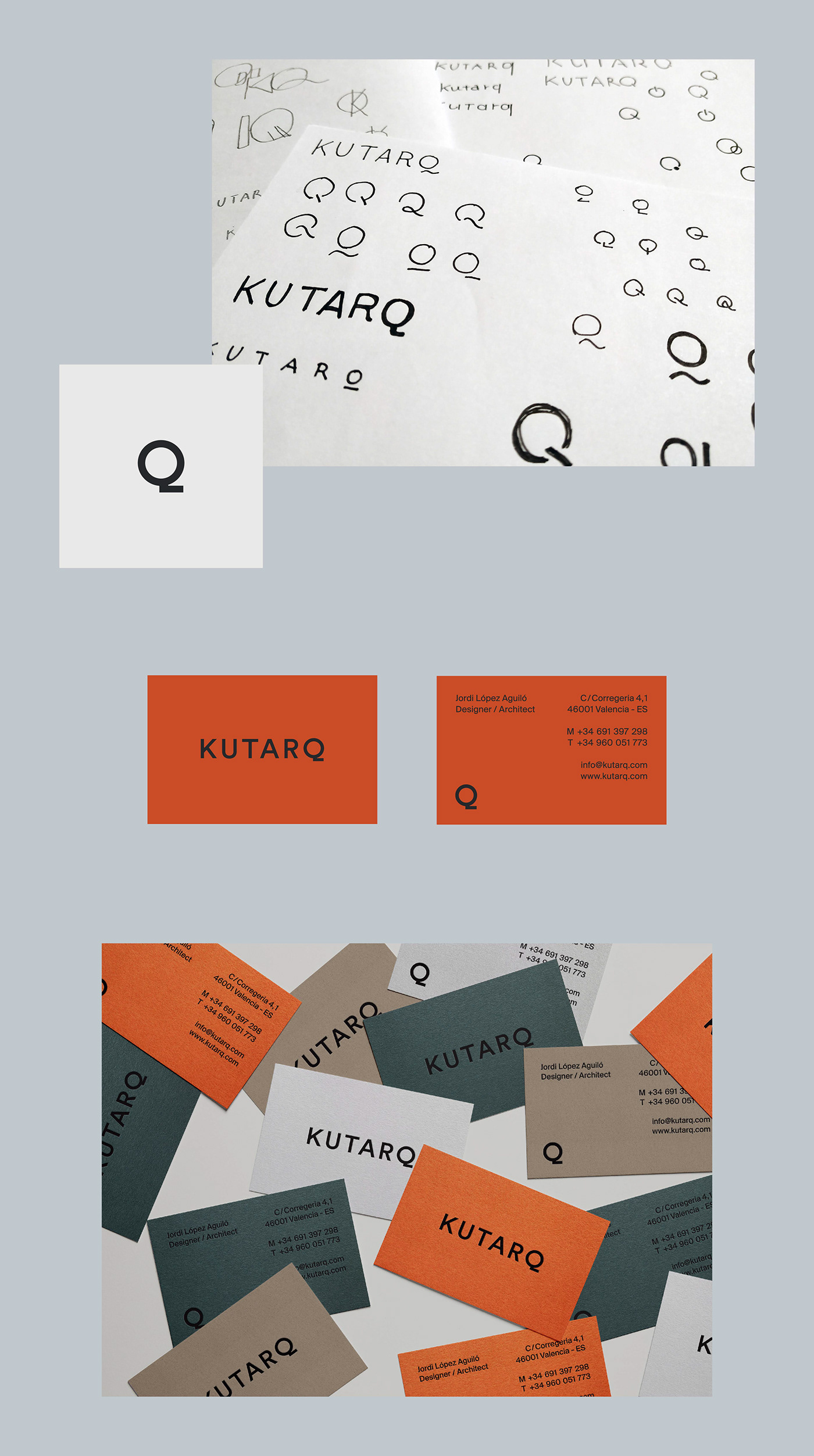
In order to visually express the characteristics of the studio,
I explored the shape of a simple word-mark with a small twist.
I explored the shape of a simple word-mark with a small twist.
The logo as a whole has a modest look which gives
the brand an approachable feel, while the unusual shape of the letter Q
works as a hook to make the brand standout.
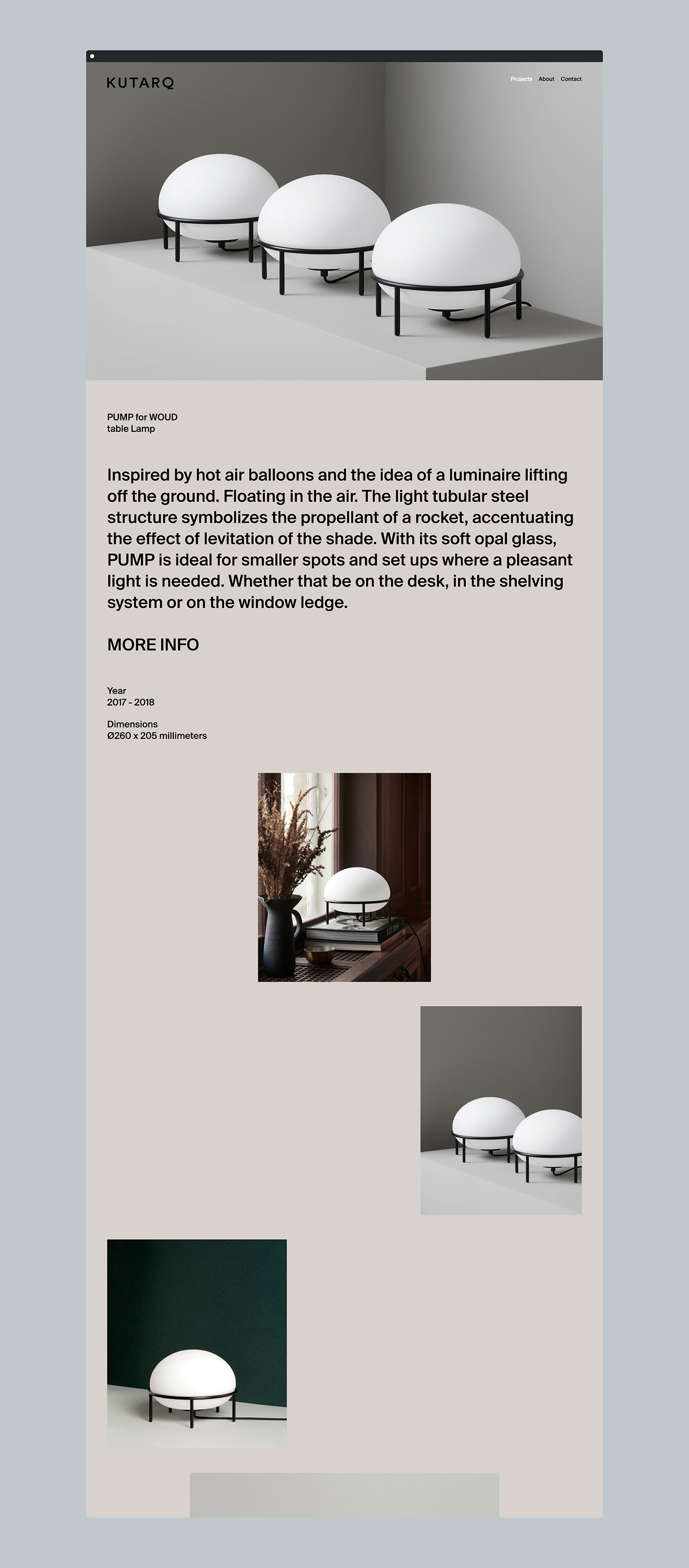
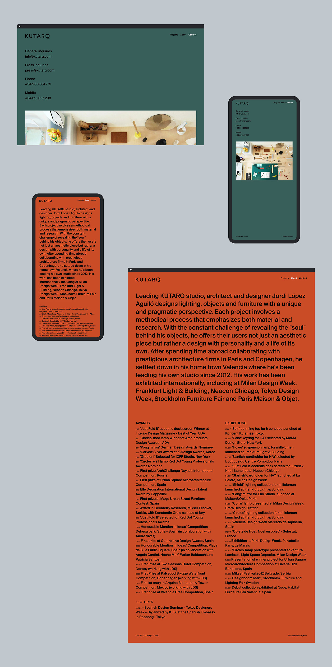
The web design also represents the characteristics of the studio,
through a balance between calm and playfulness in the layout and colours.
through a balance between calm and playfulness in the layout and colours.

☟Check the website☟
http://kutarq.com/
http://kutarq.com/
Year: 2018
Client: KUTARQ
Photos: KUTARQ
Photos: KUTARQ
Web Development: Manuel Pinazo


