
SafeAmerica Credit Union
A complete website overhaul to refresh the design, reorganize information, and modernize the underlying framework.
CLIENT
SafeAmerica Credit Union
Pleasanton, CA
Pleasanton, CA
SERVICES RENDERED
Information Architecture
Website Design
Development
Website Design
Development
PROJECT DURATION
July – October 2017
LINK
SafeAmerica is a credit union based in Northern California, with headquarters in Pleasanton and 5 local branches in the area, as well as partnerships with other credit unions across the country.
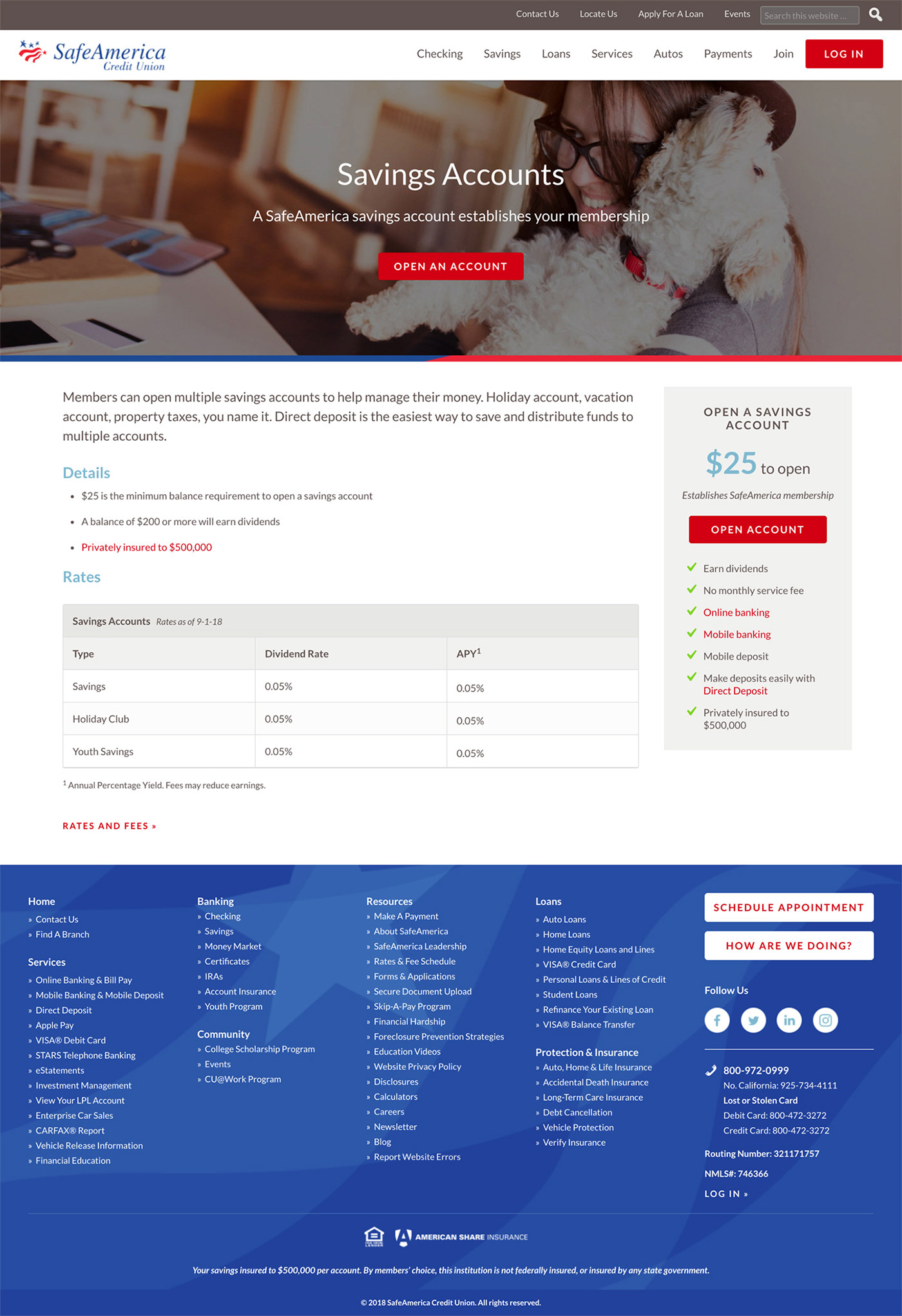
I was approached by SafeAmerica with an exciting opportunity to redesign and rebuild their website to bring it into the 21st century. The goal of the new site was to provide an engaging experience to both new and existing customers by allowing new users to find information about SafeAmerica’s many different products and services, while always giving existing users easy access to online banking. Along with being user-friendly for front-end visitors, the SafeAmerica team was looking for a system that would allow them to easily make regular updates to the site, whether that was publishing new blog posts, adding new slides to the homepage, or updating rates and fees tables.


The Design System
A main goal for the visual design was to breathe life into the financial industry and reiterate that SafeAmerica was a credit union that works for its members. Hero images are used throughout major areas of the site to provide a visually stimulating foundation for the content. Many, if not most, pages include a sidebar that includes quick, “at-a-glance” information about the product or service, along with a call-to-action to easily apply or learn more.
For secondary pages that didn’t have enough content to warrant a full hero image, a blue banner shows the page title and visually anchors the content within the page.
Line icons are used throughout the site to accompany sub-sections or secondary pages in order to break up the visual monotony and add a small touch of personality.
Information Architecture
The first phase of the redesign involved an extensive content inventory of the old site in order to find ways to organize and combine content into logical groupings. This gave us the opportunity to ultimately cut down on the number of pages, but only by a few! SafeAmerica offers such a wide variety of different banking products and provides many helpful services to their customers, so it was crucial that the structure of the site and the content on each page was organized, easy to follow, and had a clear call-to-action.
I conducted a site audit and kept everything organized in a giant Google spreadsheet. The spreadsheet not only let me catalogue every single page of the site and group them together, but kept me on track for mockup progress, asset exports, development, and audits.

Accessibility
Another core requirement of the redesign was to ensure that WCAG accessibility requirements were met, as it’s more important than ever that the internet is an equal place for everyone. Keeping accessibility at the forefront of this project was a humbling reminder that each visitor deserves a good user experience, no matter their level of vision or mobility. Accessibility audits were regularly conducted throughout the project by using a combination of Chrome’s Lighthouse tool, the WCAG audit browser extension, and the WAVE browser extension.

