


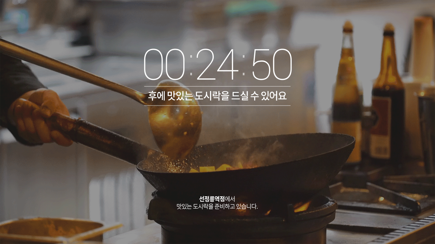


Hansot order app
UX Development
UX Development
Hansot l 2019.01 l UI/GUI
-
App Research & Analysis
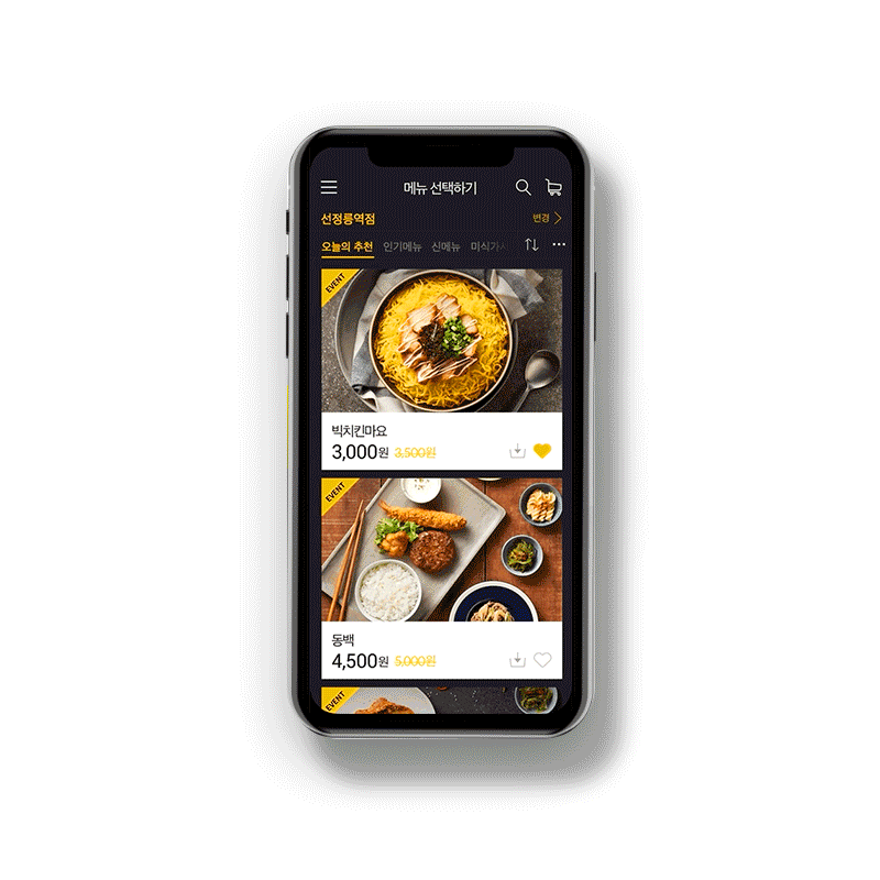
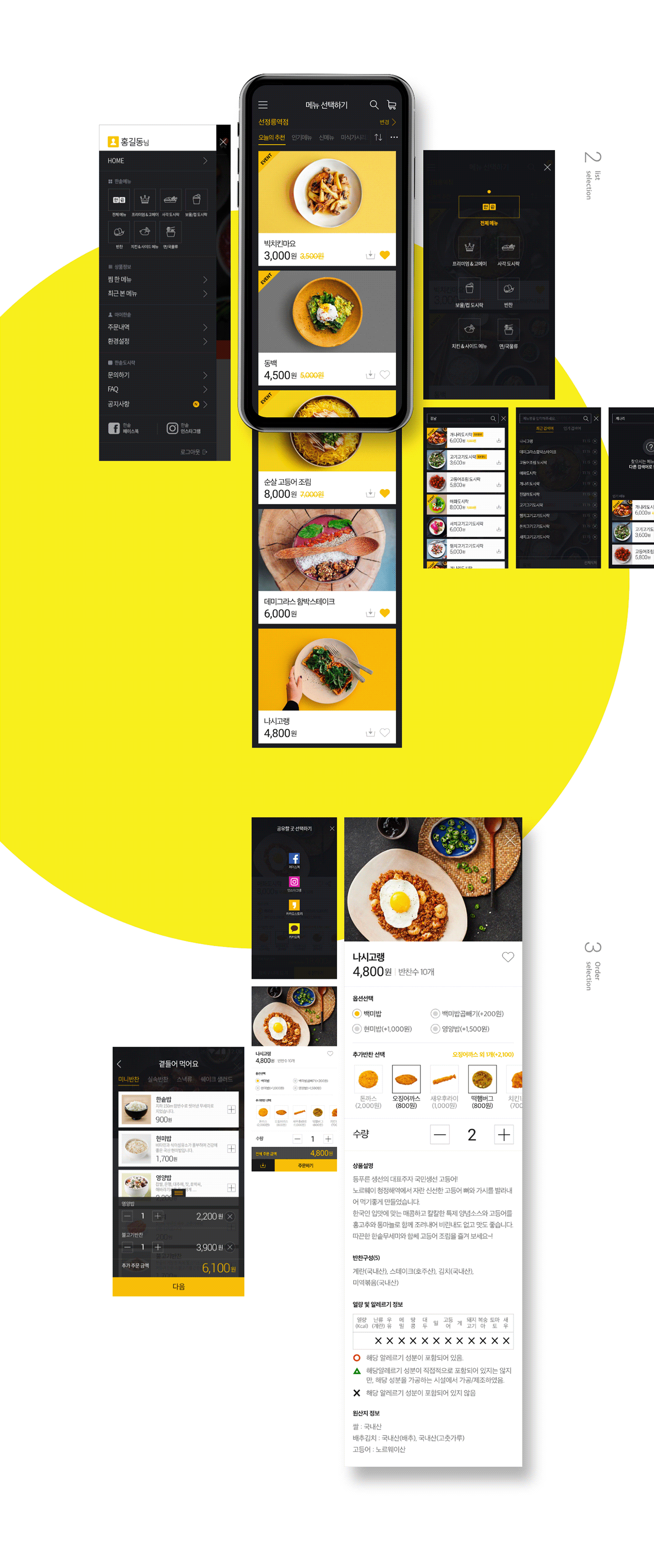
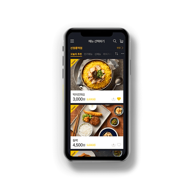
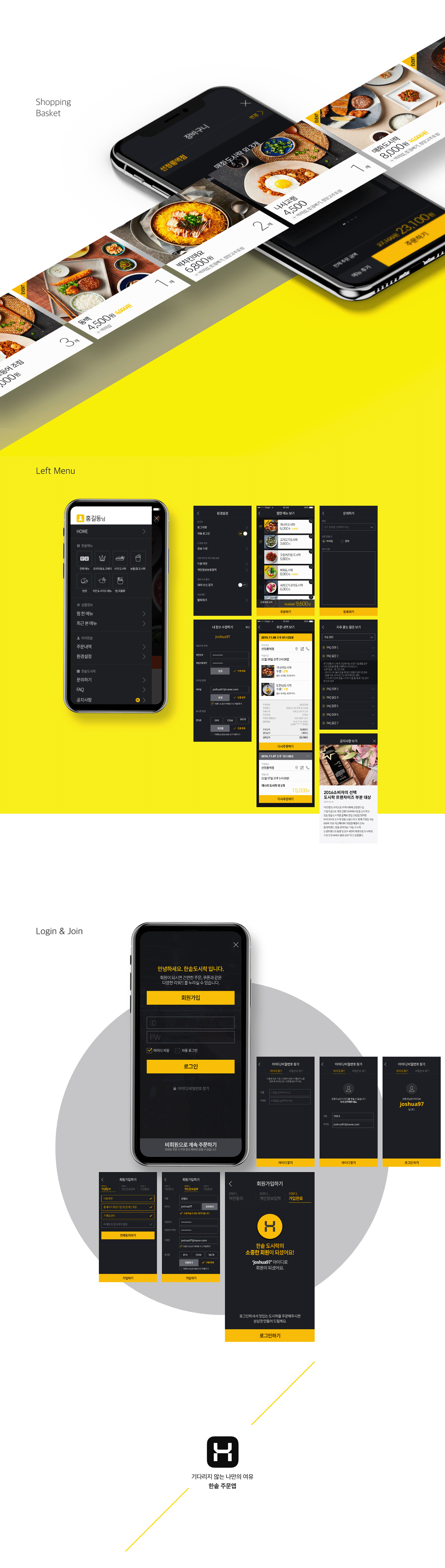
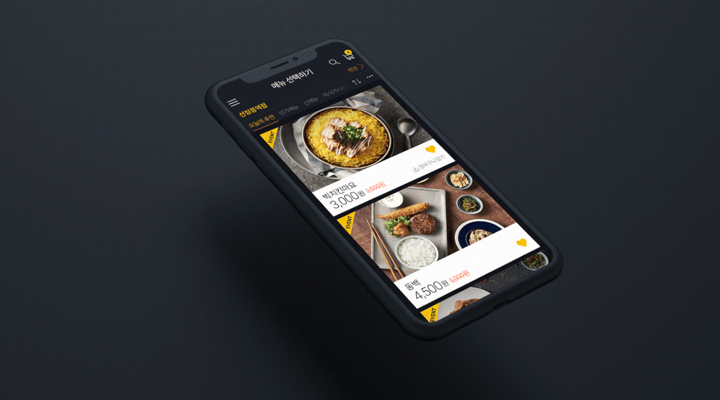
타일형태의 그룹핑적용, 동일한 컬러톤을 사용,
상품이미지를 강조하거나 효과적인 인터렉션을 사용
올바른 방향은 앱은 현대 Hmall, Sweetgreen, Maple, 배달의 민족 을 참고.
플랫디자인, 카드기반 레이아웃, 대비가 강한 컬러사용, 큰 서체 사용, 인터렉션 사용, 오프라인과 일관된 브랜드경험 제공
반응형 웹디자인, 플랫디자인, 머터리얼 디자인등의 트랜드는 모두 사용자에게 어떤 환경에서든 같은 경험을 할 수 있게 만드는 방법들이었습니다.
이 방법들은 디바이스, 브라우저에 상관없이 일관된 아이덴티티를 제공하여 사용자들은 웹이나 모바일에서 같은 경험을 하게 됩니다.
이러한 트랜드는 옴니채널이라는 이름으로 모바일 앱에서도 그 흐름을 같이하고 있습니다.
옴니채널로 고객들이 온-오프라인에서 같은 서비스를 제공받으면, 고객들은 편리를 위해 일관적인 디자인과 경험(UX)의 제공은 더욱 중요한 요소로 활용됩니다.
-
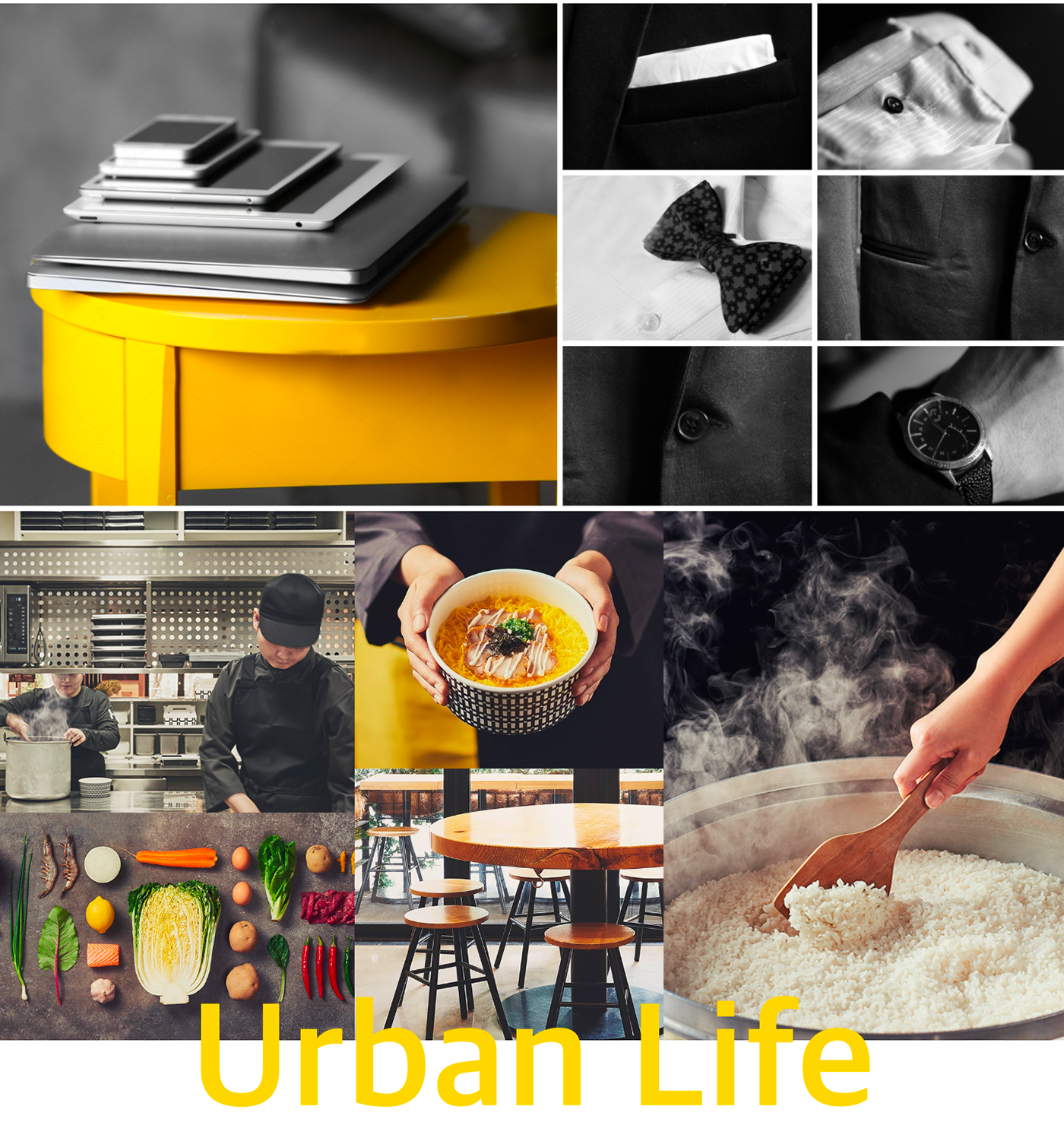
Image KEYWORD
Yellow.Orange.Red. + Familiar + Classy
-
DESIGN DIRECTION
타일형태를 활용.컴퍼넌트 요소에 동일한 컬러톤 사용.
텍스트보다는 상품이미지를 강조. 오프라인과 동일한 경험 제공Research & Analysis
타일형태를 활용.컴퍼넌트 요소에 동일한 컬러톤 사용.
텍스트보다는 상품이미지를 강조. 오프라인과 동일한 경험 제공Research & Analysis
Yellow,Orange,Red 컬러사용.
원형쉐입의 컴퍼넌트 & 아이콘 활용 친근함강조.
직영점의 컬러톤 & 세련됨 강조.
원형쉐입의 컴퍼넌트 & 아이콘 활용 친근함강조.
직영점의 컬러톤 & 세련됨 강조.
-
DESIGN Concept
" Urban Life ' - 도시속에서 살아가는 세련된 라이프
-
Download
-
Review
한솥도시락은 착한 기업으로 '가성비가 좋다'라는 기본 브랜드 경험에서
좀더 발전된 형태의 '가격도 좋으면서 고급스럽게 즐길 수 있다'라는 브랜드 방향성을 전체 디자인 톤에 담아내고자 하였습니다.
그리고 브랜드 컬러인 Yellow Color만 쫓아 오다 보면 손쉽게 주문까지 이루어질 수 있도 룩 UX 경험을 전달하고자 하였던 프로젝트였습니다.
오픈까지는 오랜 시간이 걸린 프로젝트였지만 클라이언트부터 UI&GUI까지 좋은 의사결정으로 진행됐었던 것 같습니다.
고생한 담당자 팀원 모두 모두 감사하고 고생하셨습니다.
그리고 브랜드 컬러인 Yellow Color만 쫓아 오다 보면 손쉽게 주문까지 이루어질 수 있도 룩 UX 경험을 전달하고자 하였던 프로젝트였습니다.
오픈까지는 오랜 시간이 걸린 프로젝트였지만 클라이언트부터 UI&GUI까지 좋은 의사결정으로 진행됐었던 것 같습니다.
고생한 담당자 팀원 모두 모두 감사하고 고생하셨습니다.
Hansot order app
UX Development
UX Development
Hansot l 2019.01 l UI/GUI
-
App Research & Analysis
Apply tiled groupings and use the same color tone.
Emphasize product recognition and use effective interaction.
Flat design, card-based layout, color with strong contrast, large typeface, interaction, and transits consistent brand experience offline.
-
Trends in reactive web design, flat design, and mechanical design were all ways to make users experience the same thing in any environment.
These methods provide consistent identity regardless of device or browser, resulting in users experiencing the same experience on the web or mobile.
The trend is also in mobile apps, named Omni Channel.
When customers receive the same service on-off line over Omni Channel,
Consistent design and the provision of experience (UX) should be utilized as a more important factor for the convenience of customers.
-
Image KEYWORD
Yellow.Orange.Red. + Familiar + Classy
-
DESIGN DIRECTION
Utilize tile form.
Use of the same color tone for component elements.
Emphasize product recognition rather than text.
Provide the same experience as offline
Use of the same color tone for component elements.
Emphasize product recognition rather than text.
Provide the same experience as offline
Use Yellow, Orange, Red.
Utilize the Components & Icons of
a Circular Shoe a friendly tone
Direct store color tone & refinement emphasis.
Utilize the Components & Icons of
a Circular Shoe a friendly tone
Direct store color tone & refinement emphasis.
-
DESIGN Concept
" Urban Life ' - the sophisticated life of living in the city.
-
Download
-
Review
"Hanpot Doshirak" is a good company that has developed from its basic brand experience of "good price."
We wanted to capture the brand's direction of 'good price and luxurious' in the entire design tone.
And I wanted to convey my look UX experience, even though I could easily order it if I followed the brand color Yellow Color.
Although it took a long time to open the project, it seems that the decision was made from the client to UI&GUI.
Thank you all for your hard work.


