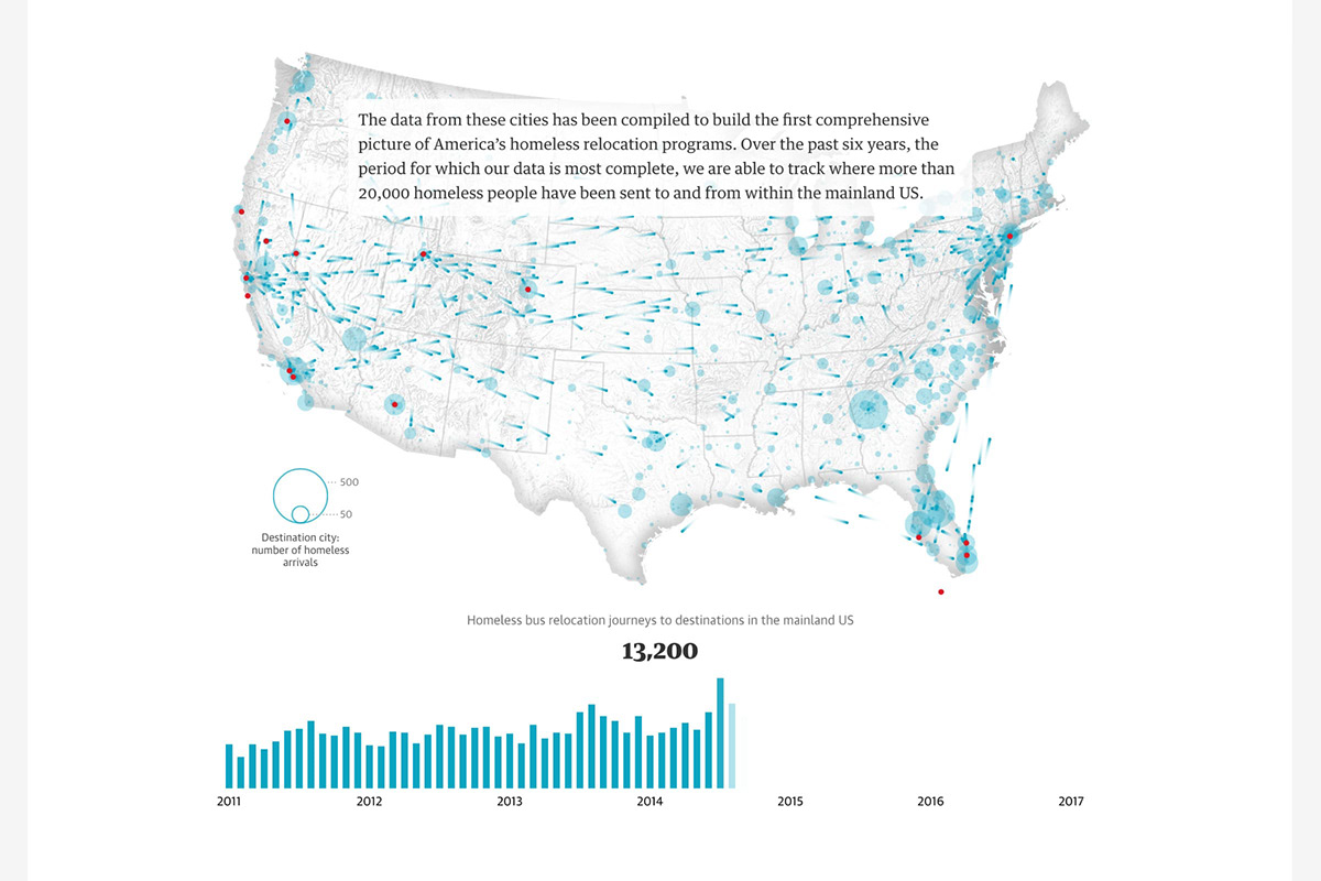
How America moves its homeless | Each year, US cities give thousands of homeless people one-way bus tickets out of town. An 18-month nationwide investigation by the Guardian reveals, for the first time, what really happens at journey’s end.
There are several data visualizations in this article, either created by me or Shirley Wu. Many of the visuals feature a scrollytelling style, where scrolling down the page will trigger animations in the data visualizations. Through these visualizations, video, photography, and of course, text, the article explains the impact of the homeless moving around the US. Both from the perspective of the homeless and the cities that are sending them away.
Client
- This interactive dataviz-driven story was published on the Guardian US website on December 20th, 2017
Awards
- Gold in "Politics & Global" at the 2018 Information is Beautiful Awards
- Best Data Visualization at the 2018 North American Digital Media Awards
- Silver in "Features" at the 26th Malofiej awards for best dataviz & infographics published in print and online
- Best Investigate Data Journalism at the 2018 Online Journalism Awards