
Here is my process as to how I went about ideating different creative approaches for a tourist agency in the Netherlands. I researched traditional graphic design elements throughout the Netherlands. The majority focused on typography, overlapping vivid colors, and bold layouts. I also researched photography in the area and chose photos that had interesting angles that showed the overall environment and color picked from the photos as well. I want to use all of these elements when designing for my persona.

Here is a mindmap that describes possible persona directions for the netherlands tourist agency
based on some the positives the country has.
based on some the positives the country has.

I decided to go off of the "art history buff" and focus it towards someone who is passionate about learning.

I created a mindmap based off of Dutch-Modernist design as the basis for how I want the look and feel of my branding to appear.

I did more research into the modern and sleek type that is well-known throughout Dutch-Modernism.

For my orginal color palette, I was inspired by the rustic colors seen throughout the landscape and architecture.

For my original logo sketches, I experiemented with various styles, but I wanted to dive deeper into the Dutch-Modernist style.
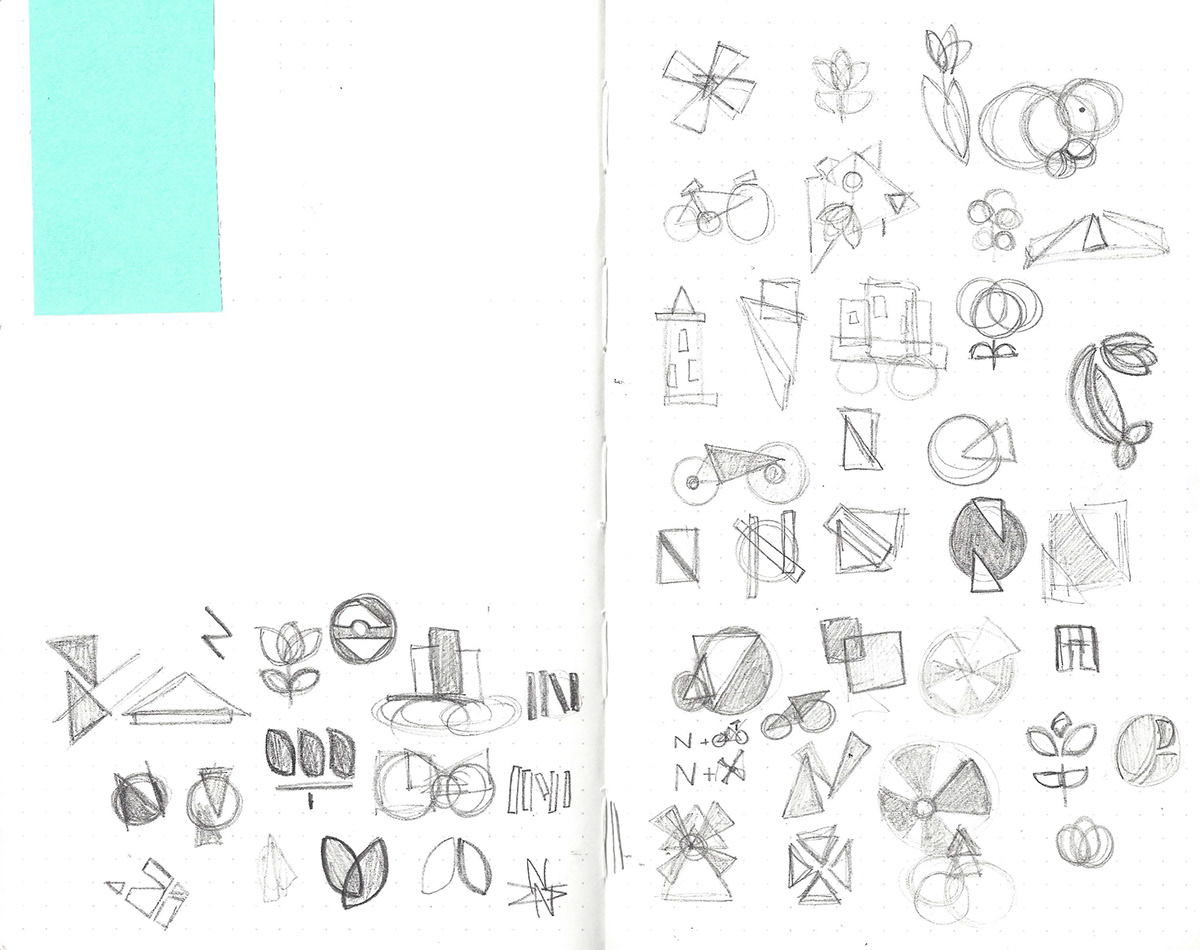
In my second round of sketches, I experimented with geometric shapes and well-known symbols throughout the country.

I took a few options from my second round of sketches and constructed them out of construction paper for a more abstract feel.


I decided to go with the one that resembled a windmill. It fit the Dutch-Modernist approach I was looking for perfectly.
I paired it with an all lower-case sans serif font.
I paired it with an all lower-case sans serif font.


I created some thumbnail sketches of grid layouts for the brand guidelines. I wanted to stick with the simple clean look.

I took my thumbnail sketches and started to lay them out on indesign in black and white.

My brand colors weren't quite what I was looking for. They were too dull and muted and so I decided to revisit it.


After picking new colors, I decided to go a little more vibrant. For the logo I chose an orange since it is the national color.

Here are the final spreads for the netherland's tourist agency brand guidelines.

