

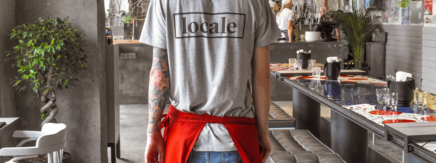
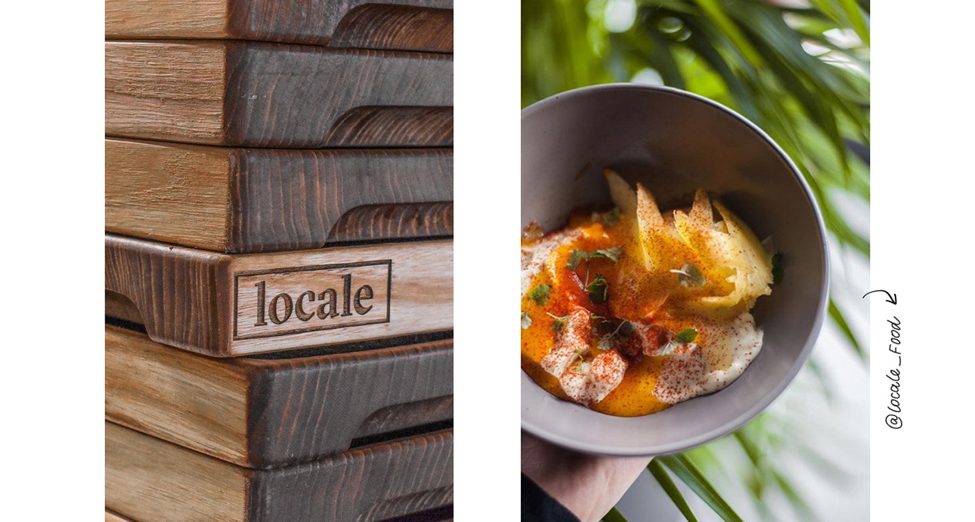
In summer, Italy Group together with Dreamteam launched the Mercato Locale Project. We have developed the logo, the corporate identity, the printing and packaging design, navigation and exterior solutions for it. The summer was over, and the food market moved from the back yard of Vladimirsky Passage into the building to occupy two floors. Locale today is not merely an osteria (an Italian home-style cooking restaurant), but also a bar.
ENDY________2019
How to bring attention to a new location and to keep the summer mood in winter? We have preserved corporate colors and the Mercato Locale logo, but the nature of graphics was slightly changed.We left a quiet green park and moved to a dynamic graffiti-painted street.
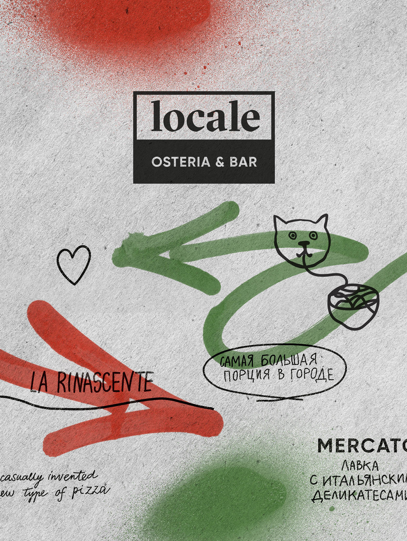
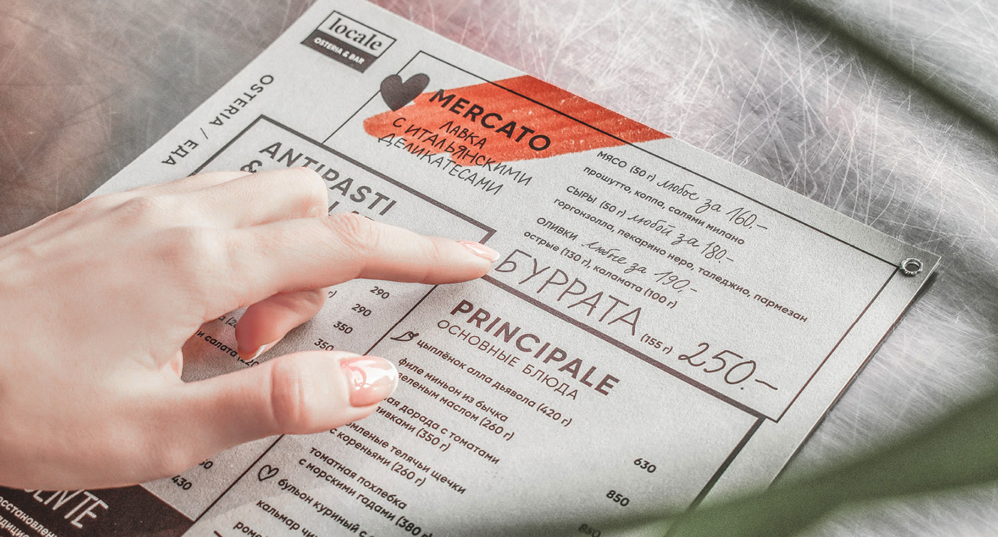
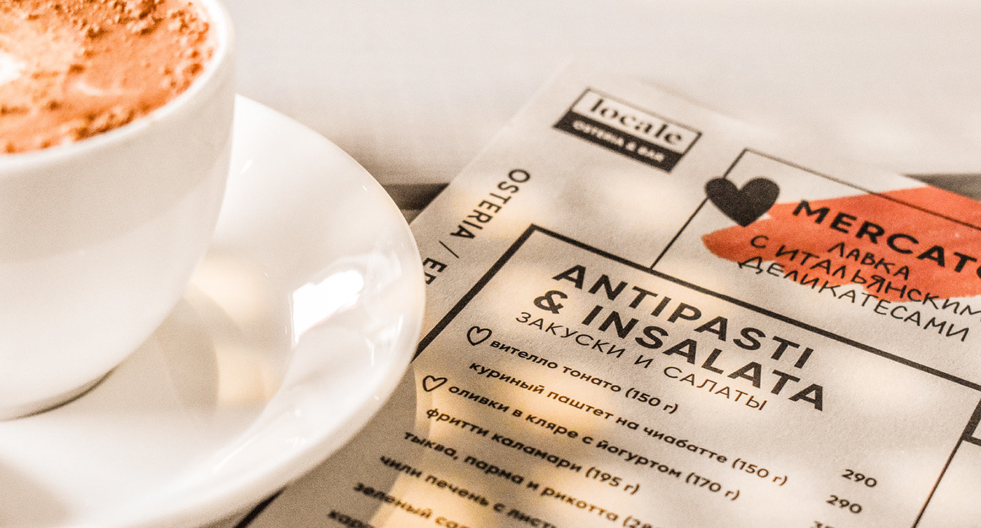
We transferred the graffiti theme and bright colors to dixie cups and bags. Random lines and strokes emphasize rebellious spirit. Bright arrows on the menu and the pride of the restaurant — the mosaic tabletop draw attention.


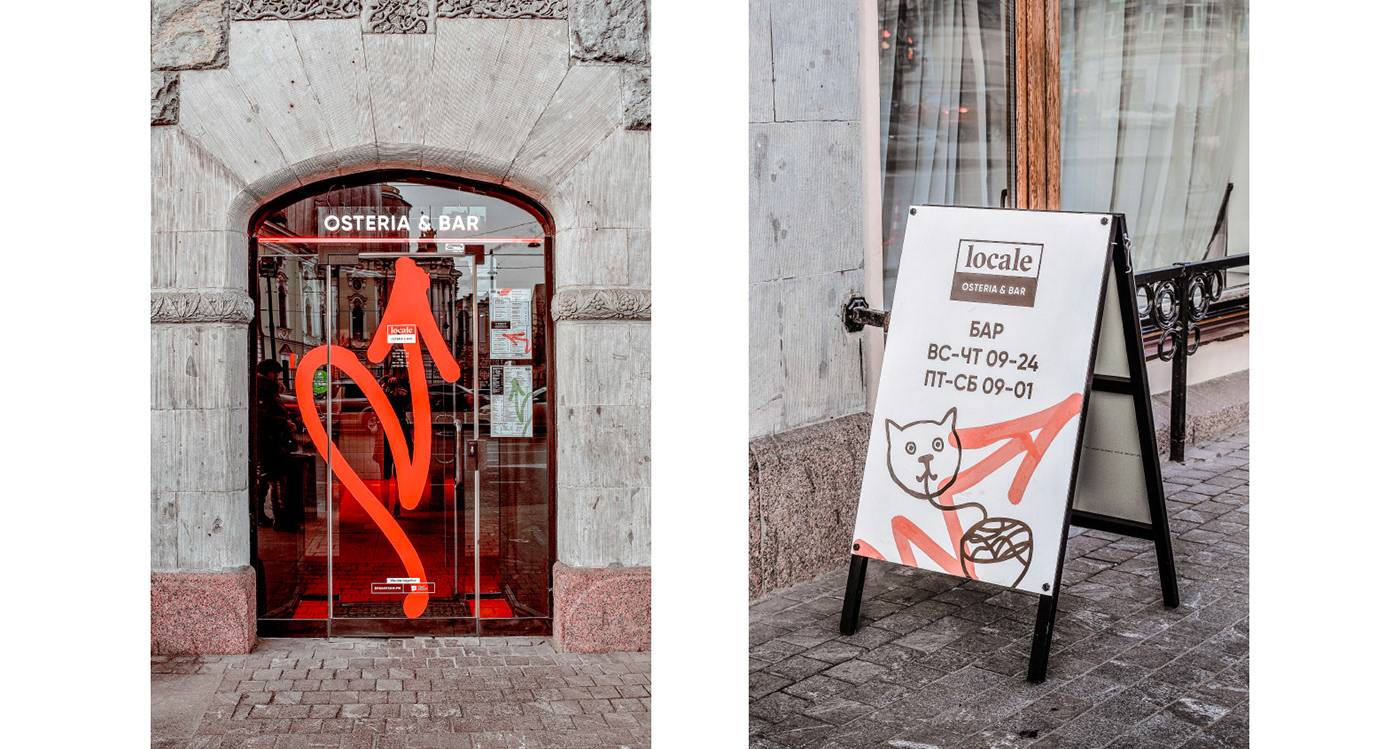
The sign board, windows and doors are neon-illuminated to single out the location from neighboring restaurants and shops.


When paying the bill, each guest receives a souvenir — stickers with key elements of the corporate identity.


