BRIEF
Construct a brand and products for an Urban Beekeeping Company.
CONCEPT
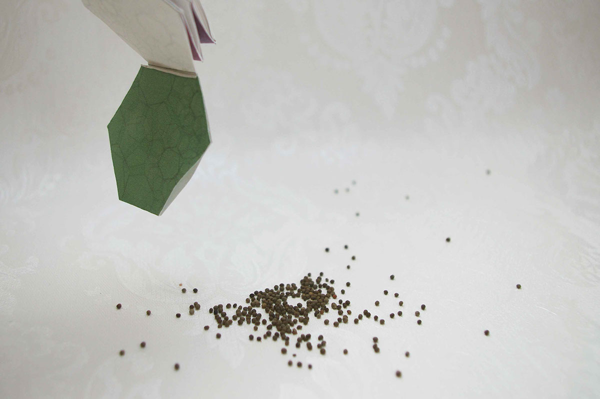
Looking into how honey is made and where from I realised that pollen from flowers is vital for the creation of honey and without them it wouldn’t be possible. The idea with this product is that as a giveaway you get a packet of seeds with the product which is promoting the growth of flowers in city and urban environments where this honey is sourced from. The booklet explains the story behind our product, how honey is made, what the customer can do to help and the seeds are contained in a packet at the back
The packaging of the product is very simple and stylish focusing on the giveaway booklet as the main ingredient and focus in the packaging. The labels on the back of the bottle come in different colours dependant on the flavour of the seeds you get in the booklet. The honey doesn’t fill the whole bottle it sits in a droplet shape which almost looks like a love heart.


The logo design for this is very simple, classy and stylish, portraying the essence and promise of the brand. The text is the main marque for the brand and can be applied to numerous different backgrounds and shapes and works in both black and white.

The web-site I created is easy to navigate, stylish and clean reflecting the rest of the brand and products. Clicking on different subheadings in the hexagon shapes lead to different pages and information.


