Richard Sweeney
Vent Graphics
I was asked to Pitch for the Branding of a Wakeboarding attraction in Burton Upon Trent, below is my process and final proposal.
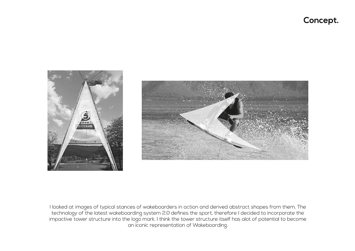
I looked at images of typical stances of wakeboarders in action and derived abstract shapes from them. The technology of the latest wakeboarding system 2.0 defines the sport therefore I decided to incorporate the impactive tower structure into the logo mark. I think the tower structure itself has alot of potential to become an iconic representation of wakeboarding.

After looking at these shapes I produced an abstract mark to represent Wake Lake. I made the edges sharp to reflect the cutting edge nature of this extreme sport and it's development.
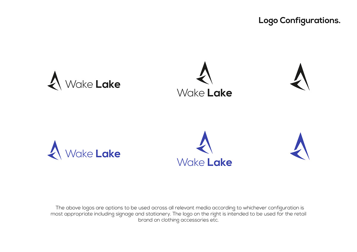
The above logos are options to be used across all relevant media according to whichever configuration is most appropriate including signage and stationery. The logo on the right is intended to be used for the retail brand on clothing accessories etc.
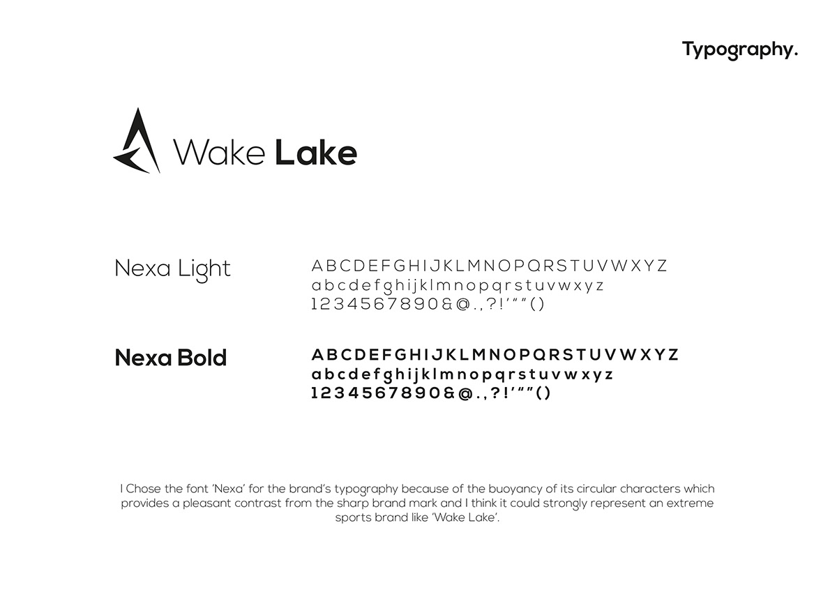
I chose the font 'Nexa' for the brand's typography because of the bouyancy of it's circular characters which provides a pleasant contrast from the sharp brand mark and I think it could strongly represent an extreme sports brand like 'Wake Lake'.
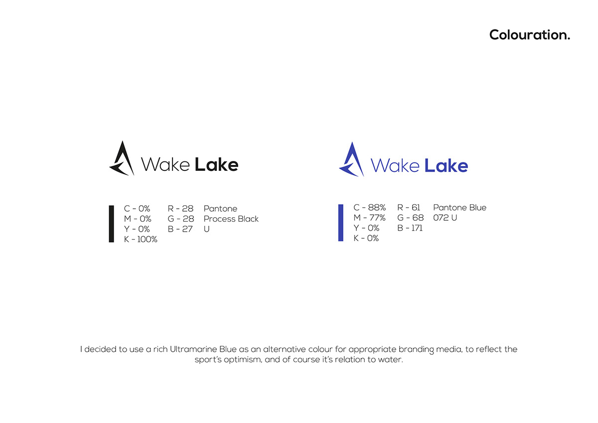
I decided to use a rich ultramarine Blue as an alternative colour for appropriate branding media, to reflect the sport's optimism, and of course it's relation to water.
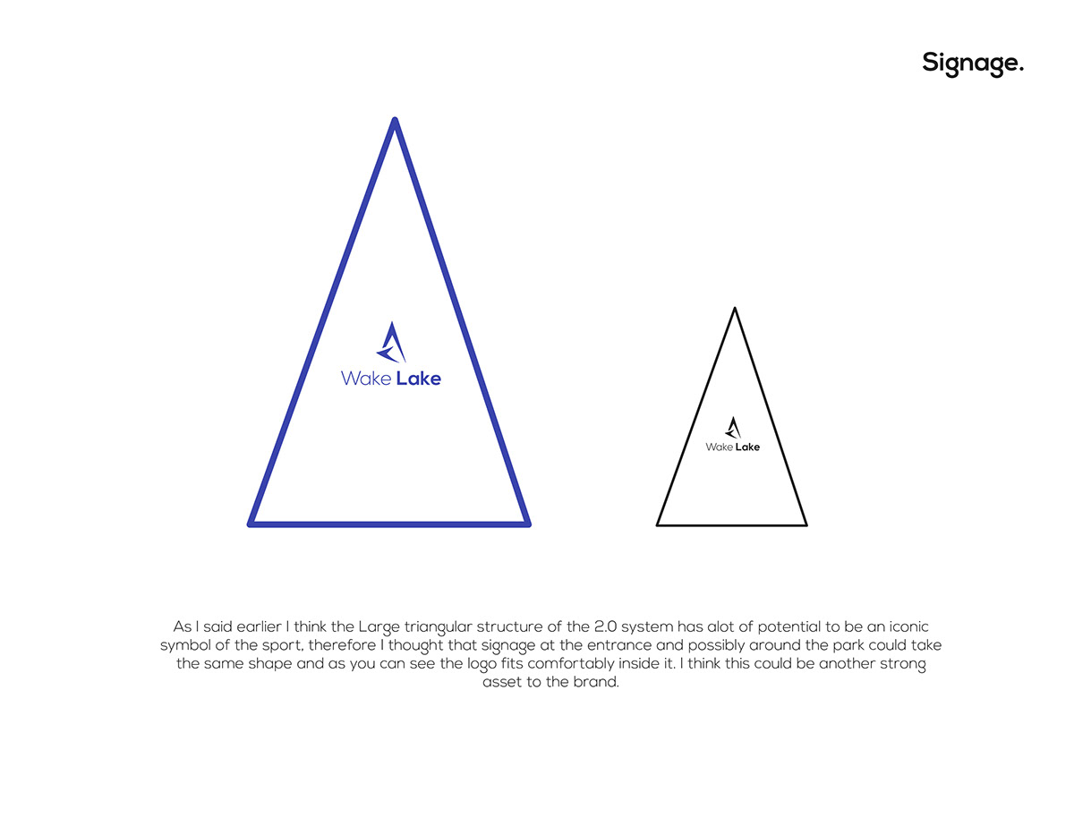
As I said earlier I think the large triangular structure of the 2.0 system has alot of potential to be an iconic symbol of the sport, therefore I thought that signage at the entrance and possibly around the park could take the same shape and as you can see the logo fits comfortably inside it. I think this could be another strong asset to the brand.
Thankyou

