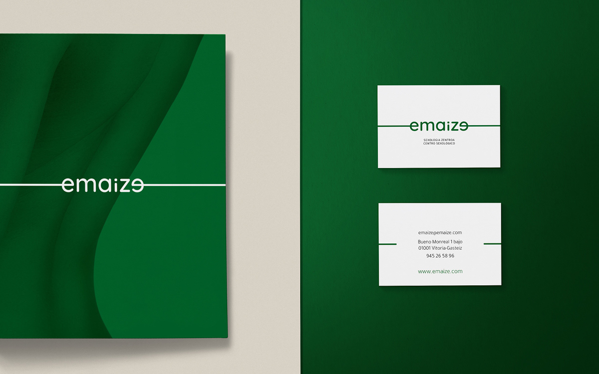
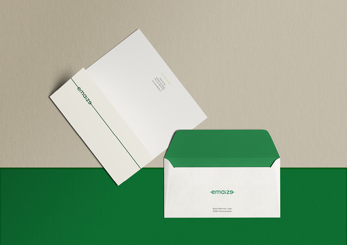
Emaize / Re-Branding & Stationary
Redesign of the corporate identity of Emaize, a sexology center located in Vitoria-Gasteiz. The object was to create a simple and memorable logotype. We used a typeface with rounded shapes and a palette of green colours in order to represent the naturalness and the closeness with which they work. The lines that go in and out of the first and last "e" letters represent continuity and fluency, and can be lengthened to adjust to each use.