


About Amicus
Amicus is a logistics company with a track record of successful business with an international scope. Amicus is dedicated to providing efficient logistics services with a focus on the best customer experience.
Comfortable change
Successful redesign of this proportion could only have been achieved with considerate and purposeful change. It was clear that the brand has to retain its original status with a newer, more up-to-date logo and visual identity. This is the thinking that enabled comfortable change, where the new logo is distinct and different, yet familiar and recognizable.
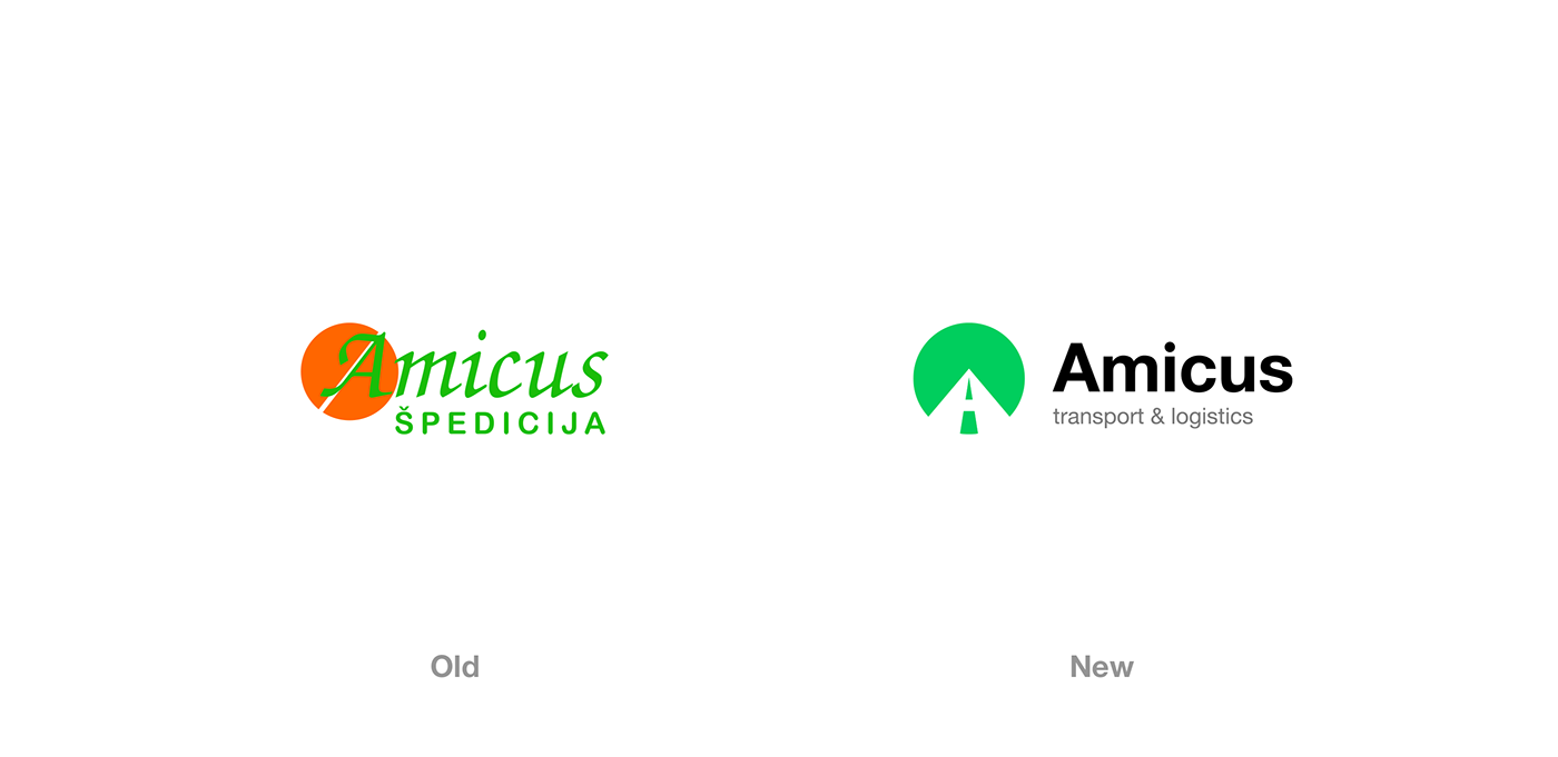
Logo Philosophy
Legacy form and layout allowed the space for the invention of new logo philosophy. With the new version, the logo sends the message of a long road ahead while, at the same time, depicts the letter 'A' as the first letter of the company name 'Amicus'.

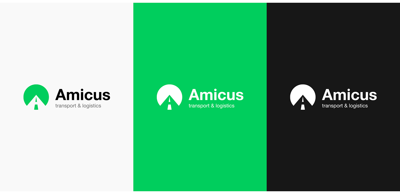
Familiarity in difference
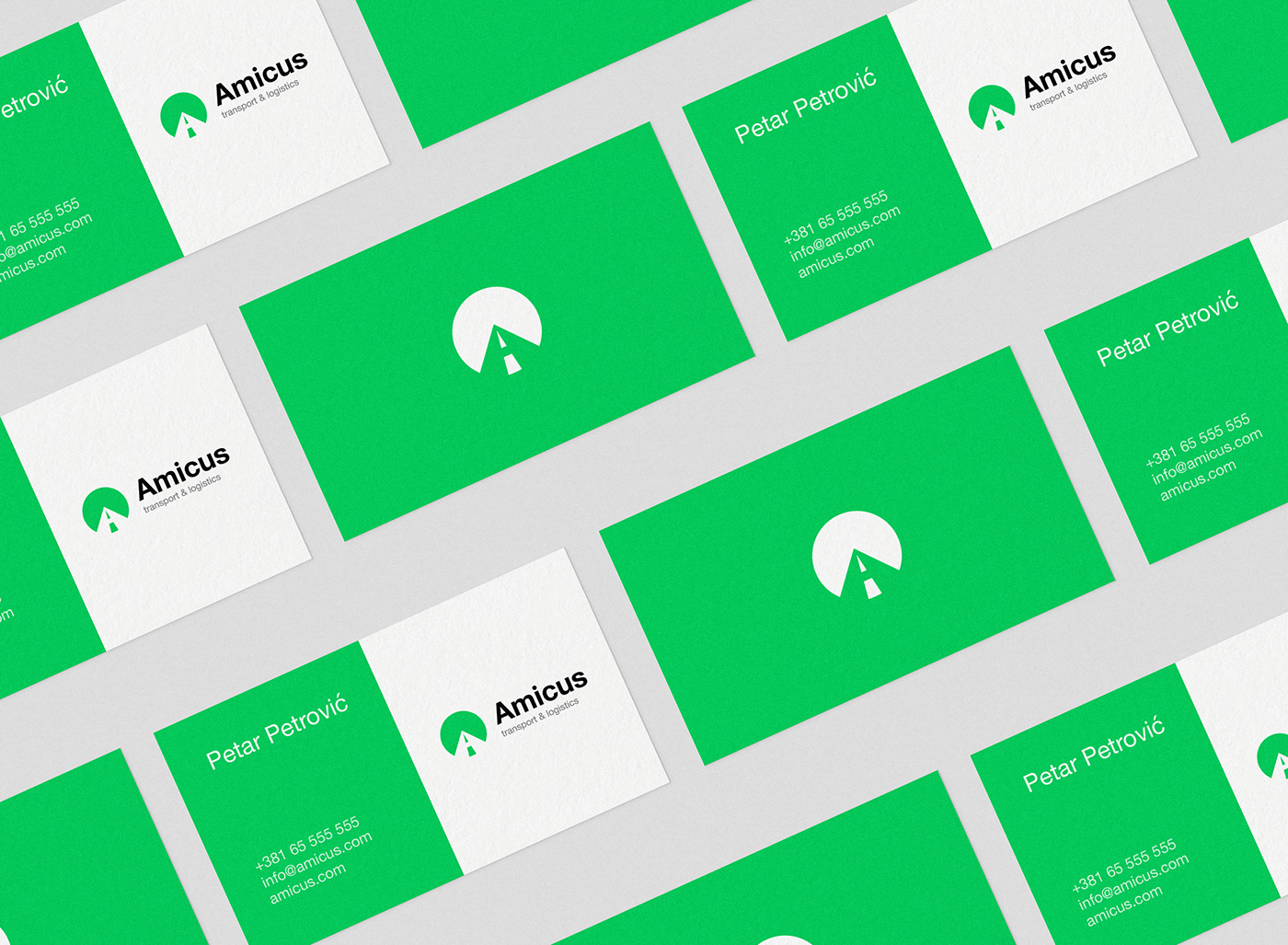
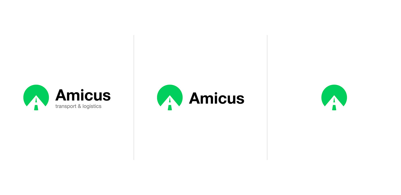
The logo is designed to allow for up to three different variations. The primary logo consists of the symbol depicting road, company name and description of the company industry. Its use is limited to print and marketing material, while the more web-friendly version consists of the symbol and the company name as it is hard to read small letters that describe the company industry.
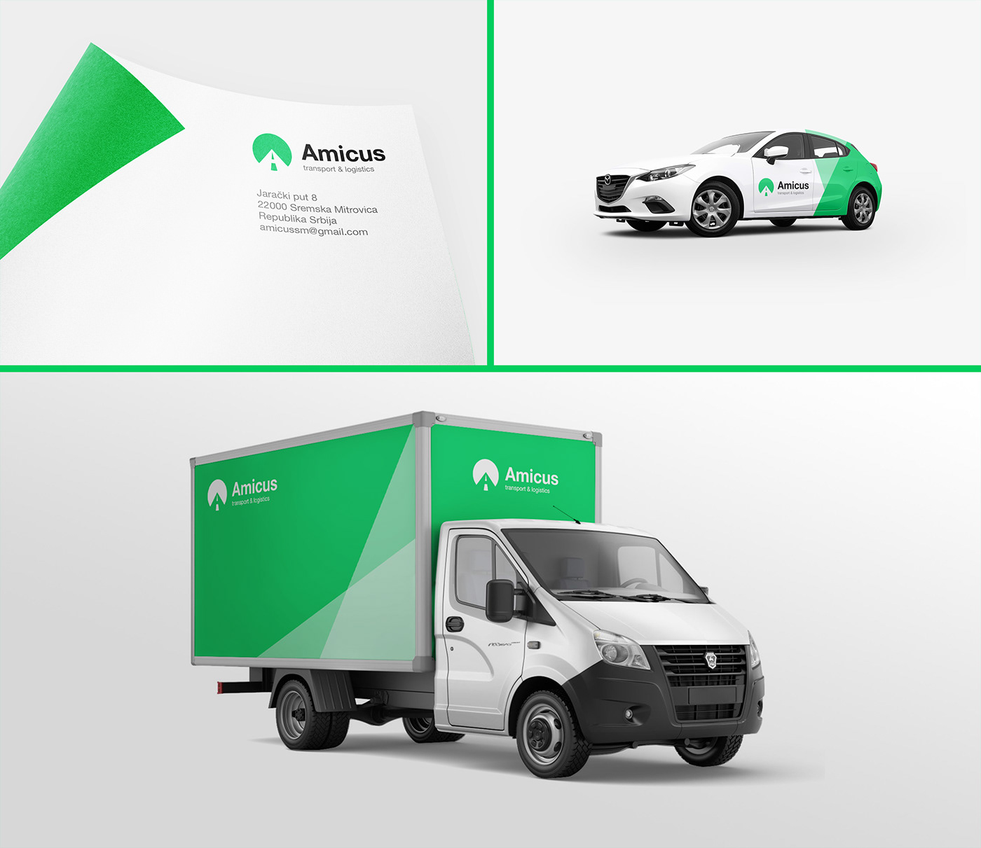
Logo in use
Green is one of the most frequent colors in nature. We picked green to make the visual appeal of the Amicus trucks and cars consistent with nature. We know that Amicus travels the world and our desire in designing the visual identity was for Amicus vehicles to be easily comprehended with its surroundings.
Thank you for watching!


