

___________________
HOPSCOTCH Branding
Hopscotch is a new permanent art destination for immersive installations; a 21-century un-museum. An art institution that marries technology, fine arts, media arts, and design.
Founders Nicole Jensen, Hunter Inman and curator Lisa B. Woods approached us as this project, still untitled, was taking shape. The mission was clear to them, as was the feeling they wanted to evoke: playful, unpretentious and an invitation to exploration. Our task: to give the project a name, a shape, a feeling and a brand to frame this one-of-a-kind adventure.


Process
The project needed a flexible visual identity that transformed the brand into a container of experiences and sights. The name is playful and open enough to allow the name to evoke (just like the logo) the visitor's childhood memories — to be a name that prompts pleasurable memories instead of echoes of solemn art institutions.
We were partly inspired by the 'hack/maker' attitude digital artists we met seemed to have. Much of the work is built using standard components, but the results are anything but standard.
The final brand system is enormously flexible and adaptable but it's made up of relatively standard components. Flattened 'boxes' can be stacked and moved as needed, which keeps the brand dynamic--but also practical for different layouts and contexts.

The color system is similarly flexible: there are base colors, and accent colors. Base colors occupy most of the visual space of the logo (for example, the inside of the cubes), and accent colors are secondary to the them and can be more vibrant and stimulating. To ensure proper readability we defined 20+ specific color duos to launch the brand.
Finally, we selected a set of simple sans-serif fonts. They were selected for impact and readability as well as how they play with each other, providing a clear hierarchy of information through size and weight.


Results
We landed on a visual system built on fluid frames: the logo’s volume is defined by isometric geometry, but one that when flattened and arranged, making it possible to add units as needed. It's a blooming, playful grid where the shapes not only support endless growth, but almost seem to suggest it.
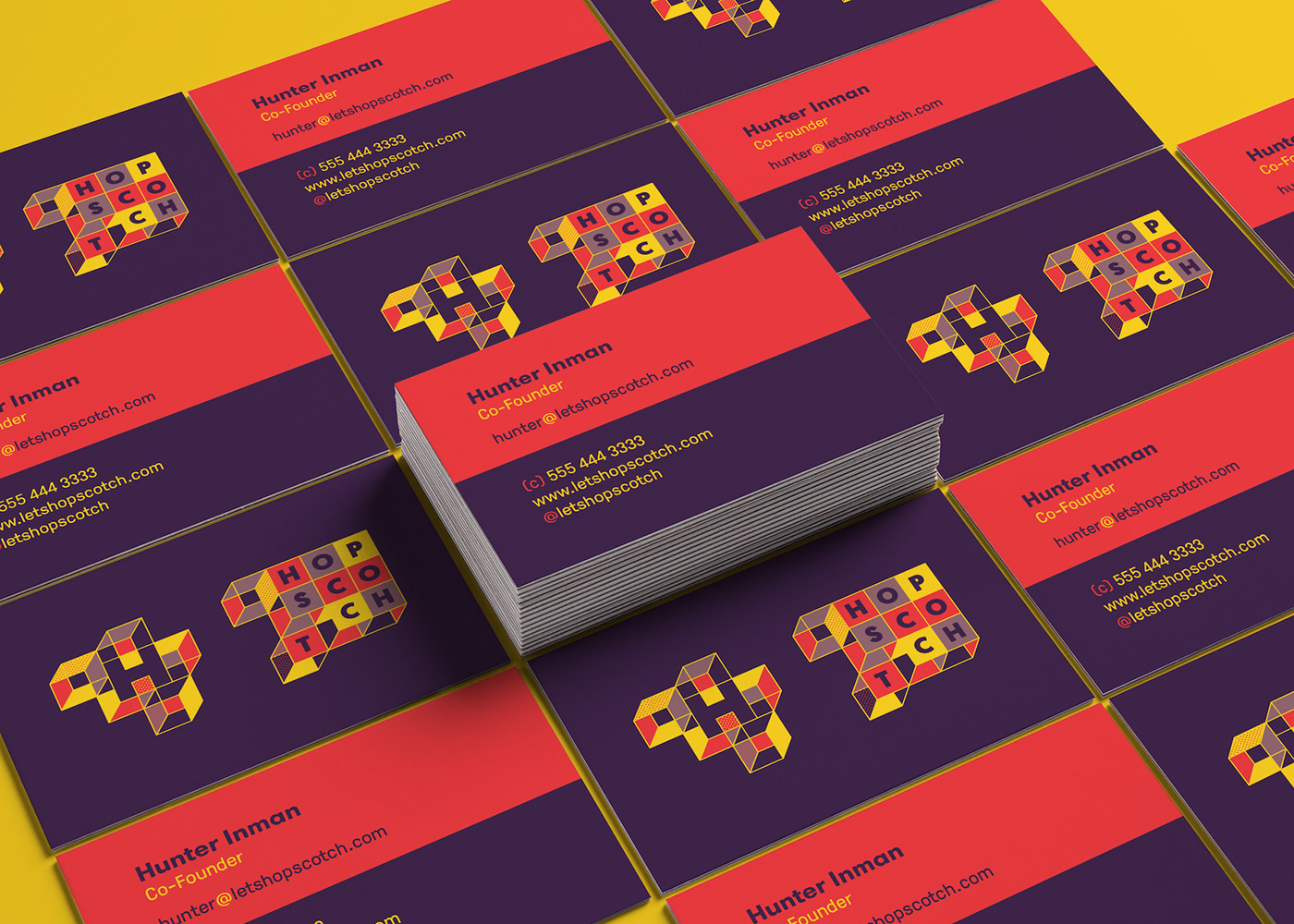
The system does away with the rigid edges around each box and around the logo. This fluidity gives the standard "logo-as-container" concept a little something extra. Ultimately, it introduces a system clear enough to be immediately recognized as a framework to grow with, and flexible enough to contain everything imaginable. Its simple and direct: once you have seen the logo, the system falls logically into place.
As with any brand, consistent use is key to building recognition. Since the Hopscotch identity is built for flexible experimentation, we made special emphasis on the brand styleguide, clearly defining the hard and fast rules that must always be followed to keep the brand cohesive.


Hopscotch announced its first pop-up in early 2019.
---> Thanks <O> <O>! Visit us at weareinhouse.com for more goodness <---


