
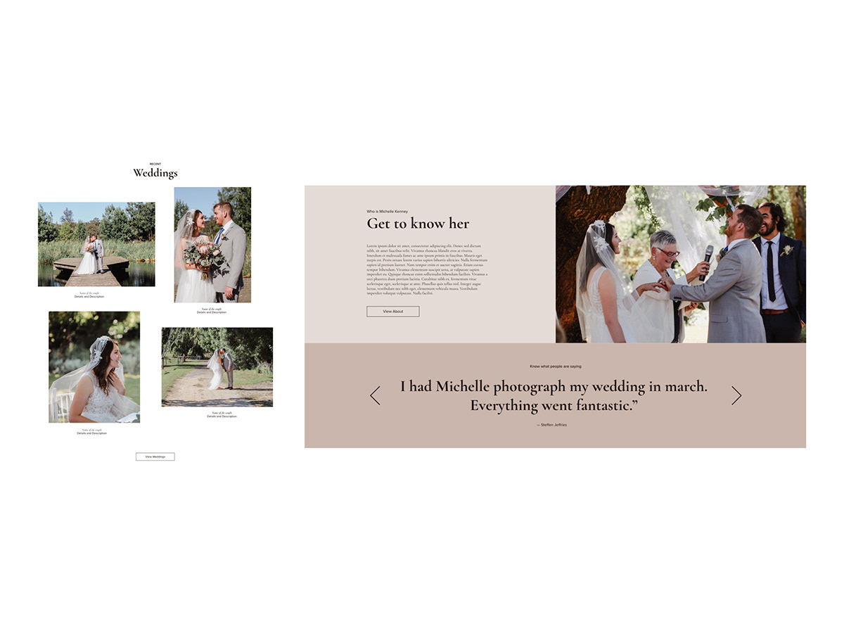
WHO IS MICHELLE KENNEY?
Michelle Kenney is a wedding photographer based in South Australia. Her expertise lies in creating stories through photography and documenting the rawness and emotion of all her clients special days. As the industry of wedding photography continues to rise, the challenge of this redesign is to reintroduce MKP to the market, creating a strong, personal and lasting brand impression.
THE CONCEPT
The logo is a raw representation of Michelle Kenney as a brand, simple yet affecting. The designer used a serif font called Cormorant Garamont due to its natural elegance. Also, to ensure legibility and to add better contrast, the word photography is in a clean sans-serif font, Proxima Nova. The addition of an inverted L to the bottom right corner of the logo simply represents the shape and beauty of a captured moment, a photograph.
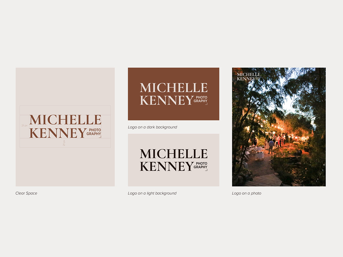
The Michelle Kenney Photography brand colours are inspired by the Earth and its organic composition. The used of the colour brown symbolises rawness, and in turn, the rawness of emotions and love stories behind all great photos captured by Michelle.
The aim is to convey the personality of Michelle Kenney Photography not only through its logo but the entirety of its engagement methods. The selection of photos must represent the different facets of the brand: elements, essence, environment and emotions.
