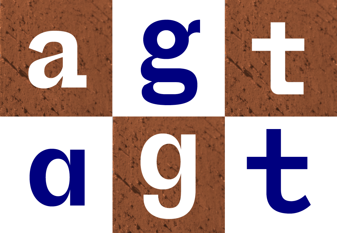
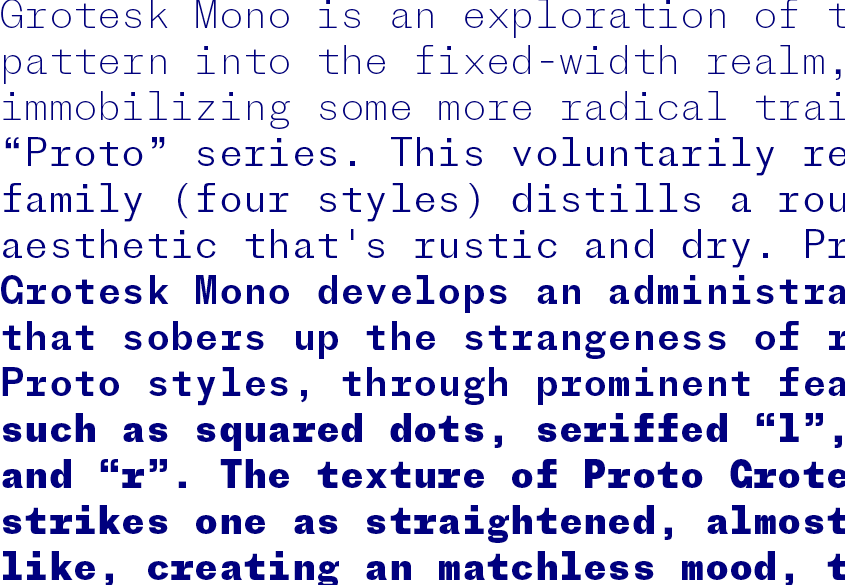
Grotesk Mono is an exploration of the Proto pattern into the fixed-width realm, immobilizing some more radical traits of the “Proto” series. This voluntarily restrained family (four styles) distills a rough-edged aesthetic that’s rustic and dry. Proto Grotesk Mono develops an administrative look that sobers up the strangeness of regular Proto styles, through prominent features such as squared dots, seriffed “l”, “i”, “f” and “r”. The texture of Proto Grotesk Mono strikes one as straightened, almost machine-like, creating an matchless mood, the kind of mood that a drawing machine could achieve. As mechanical as Proto Grotesk was, Proto Grotesk Mono looks and feels more technical, and will be a cinch to calmly assert a sense of order, not without a reference to Sol LeWitt’s “Paragraphs on Conceptual Art” and his machine-becoming idea.
In Proto Grotesk Mono, the bureaucratic seriousness is balanced by relatively softer details, such as an oval structure instead of a traditionally circular one. Following the incursions of Production Type’s Minotaur into mechanized CAD aesthetics, Proto Mono is another step in alleviating the tension between the mechanical and the hand-drawn, between faceless systems and humane considerations.
→ Buy Proto Grotesk Mono from €70. Family of 4 styles from €235.
→ Download the PDF specimen.
Design: Jean-Baptiste Levée. Team: Céline Odermatt, Hugues Gentile.
Pictures & AD by Avant Post.