The Brief
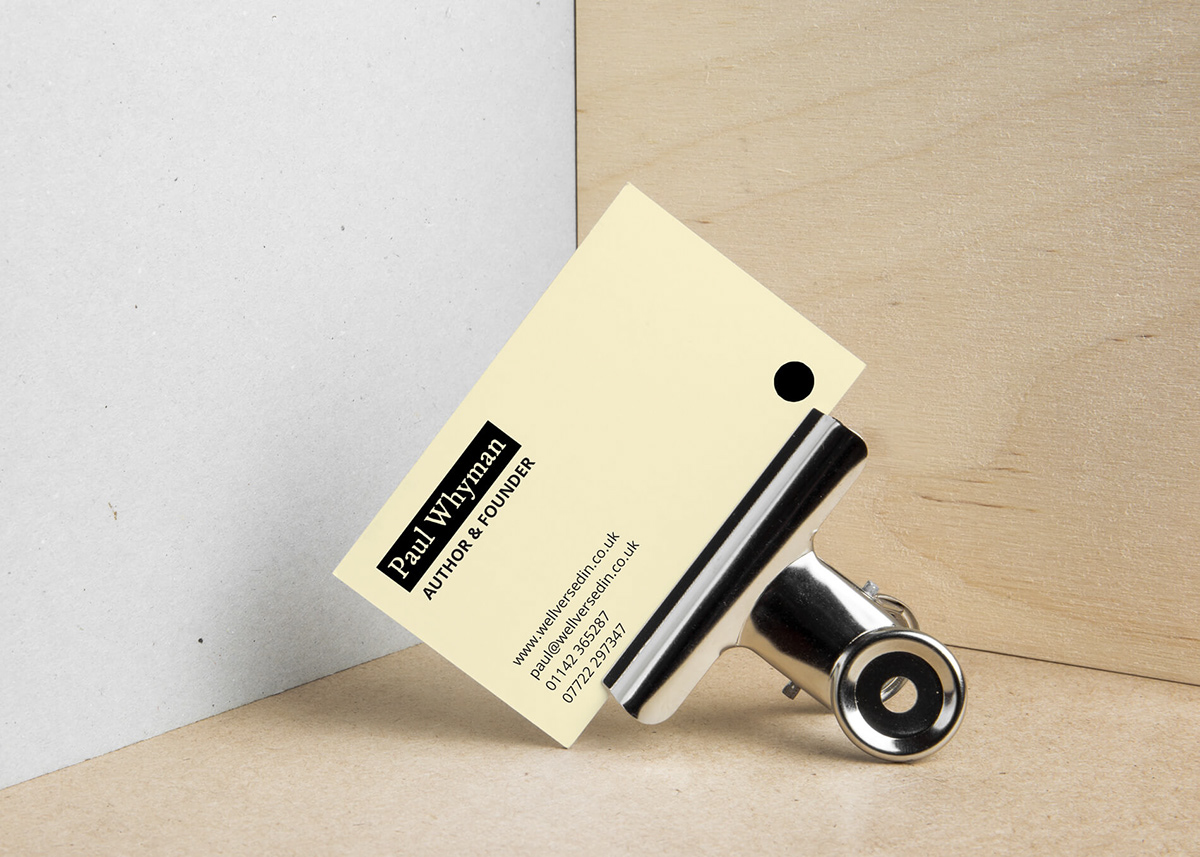
Well Versed In is a new book series created by a Sheffield writer, Paul Whyman. Paul's books contain educational comic verse and they mostly appeal to people over the age of 55 who are interested in subjects traditionally part of a classical education. Paul asked me to create a brand that reflects the informal and traditional nature of his writing and frequent public recitals.
The Solution
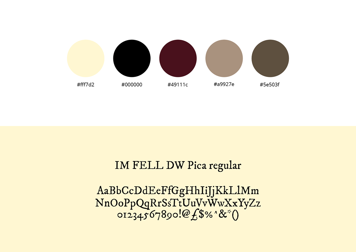
To evoke a sense of nostalgia, I used IM FELL DW Pica - an old, traditional serif with academic links to Oxford University. I opted for a cream, brown, and deep red colour scheme and a typeface with a worn look to evoke a sense of nostalgia for secondhand books from a bygone era - books with crisp yellowed paper, worn covers and faded text.