Skills: Naming & Branding
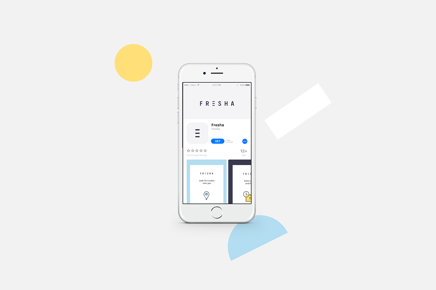
Fresha is an app that makes easy the connection and booking process with local spa or salon services from your mobile.
The challenge was to create a beauty-related brand neutral enough to work first, as a white label for merchants and second, connect at user-level with a majority of a female audience without neglecting a potential male public.
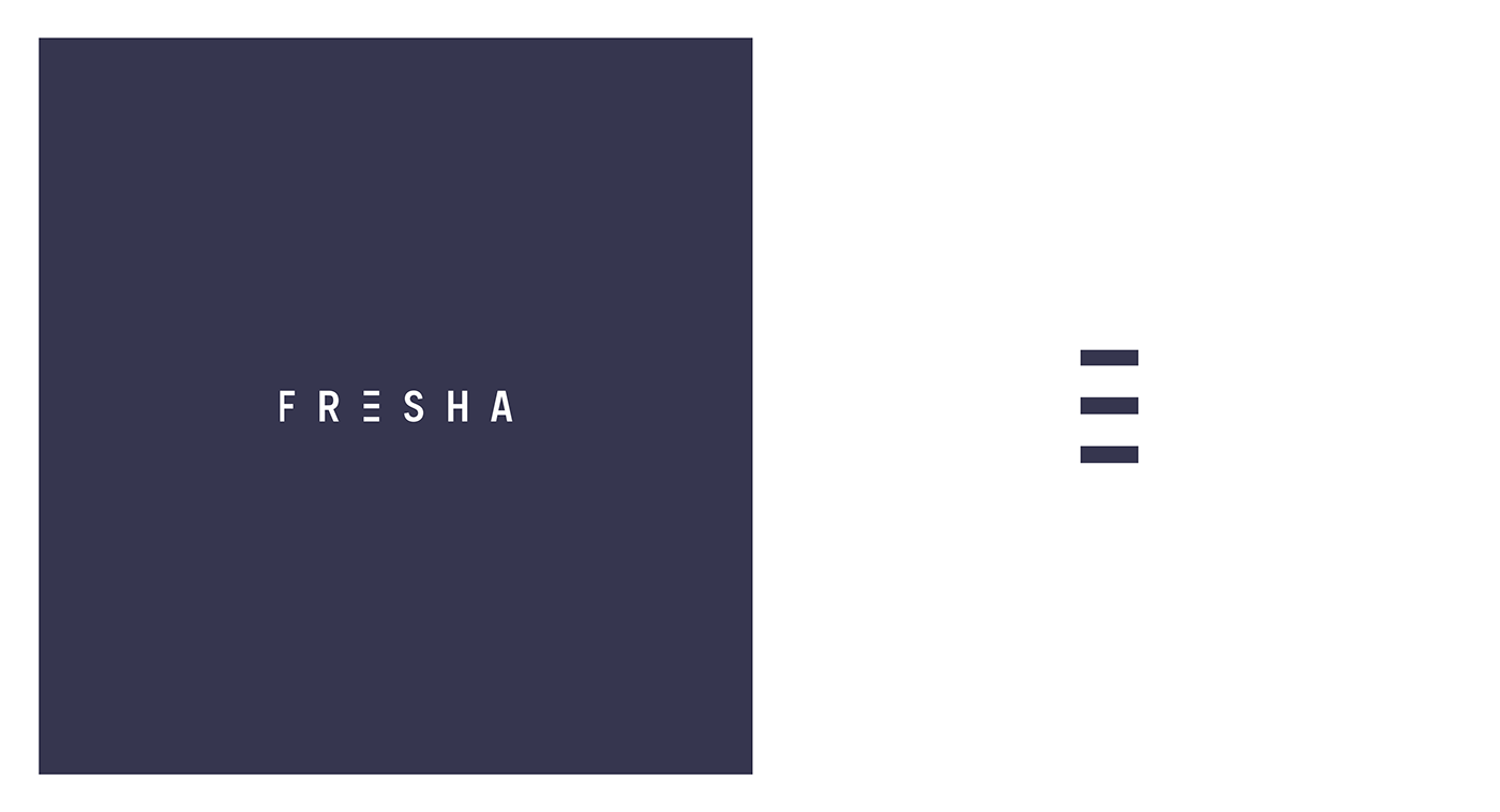
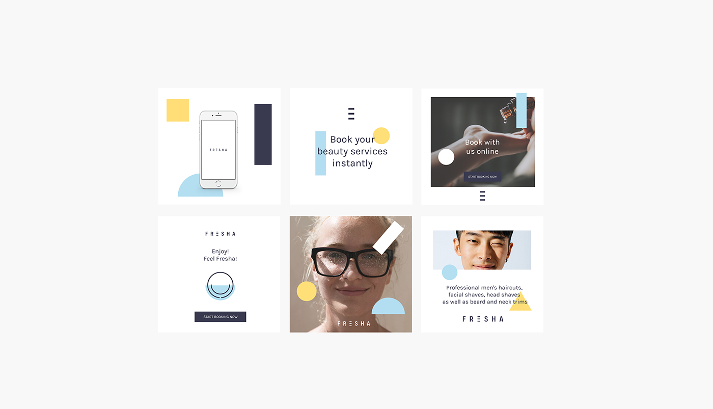
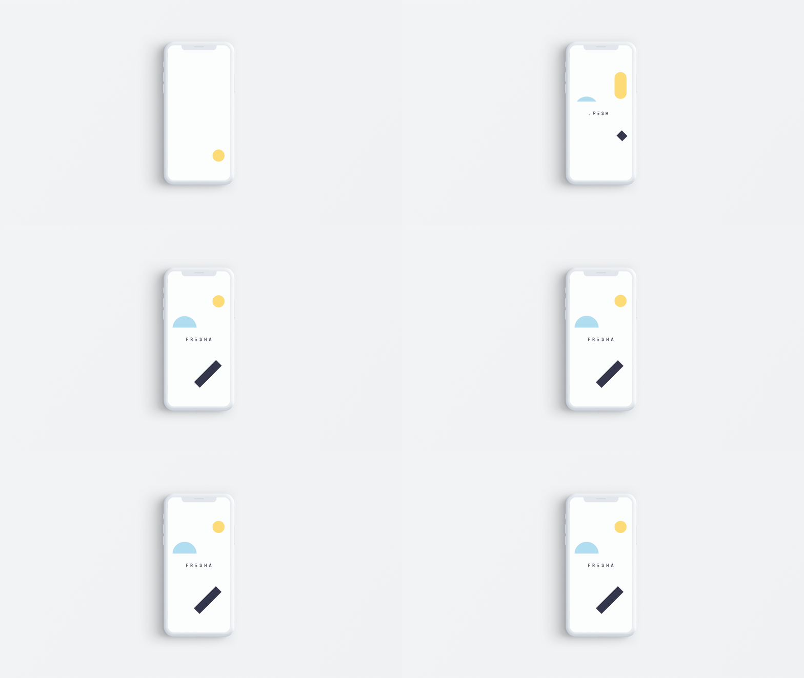
The name comes from "Fresh" that aims to refer to that feeling of well-being that is felt after a haircut or a beauty treatment. So for the visual world we used a trigram symbol to represent that line of well-being. The trigram is associated in asian cultures with wellness and energy and also reminds us of the navigational hamburger menu that symbolizes a container of options in a purely digital world. And that's what Fresha does in the end, it gives you options to make you feel good.
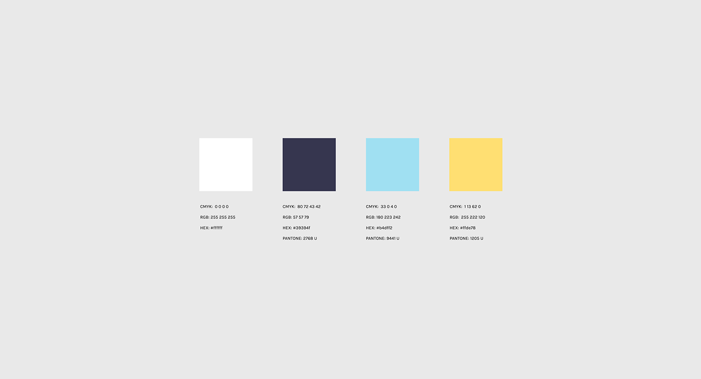
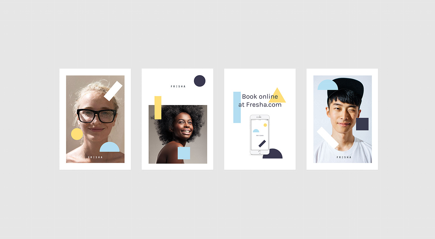
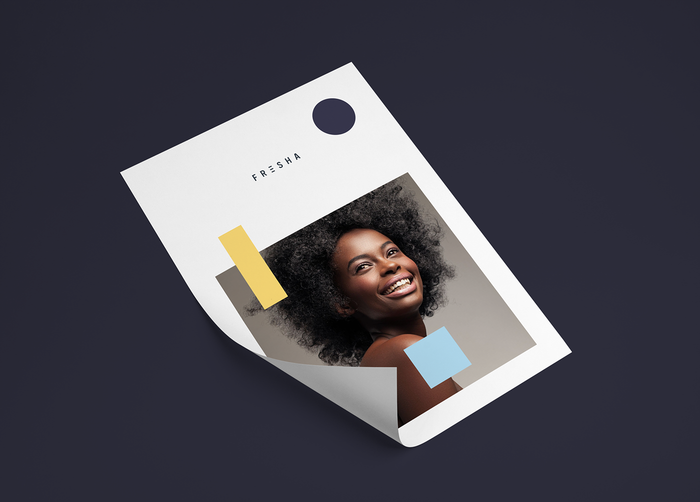
The color palette is based on a high percentage of white, with a navy blue that will act as our black and two color accents that will help us create brand awareness.
The color palette is based on a high percentage of white, with a navy blue that will act as our black and two color accents that will help us create brand awareness.
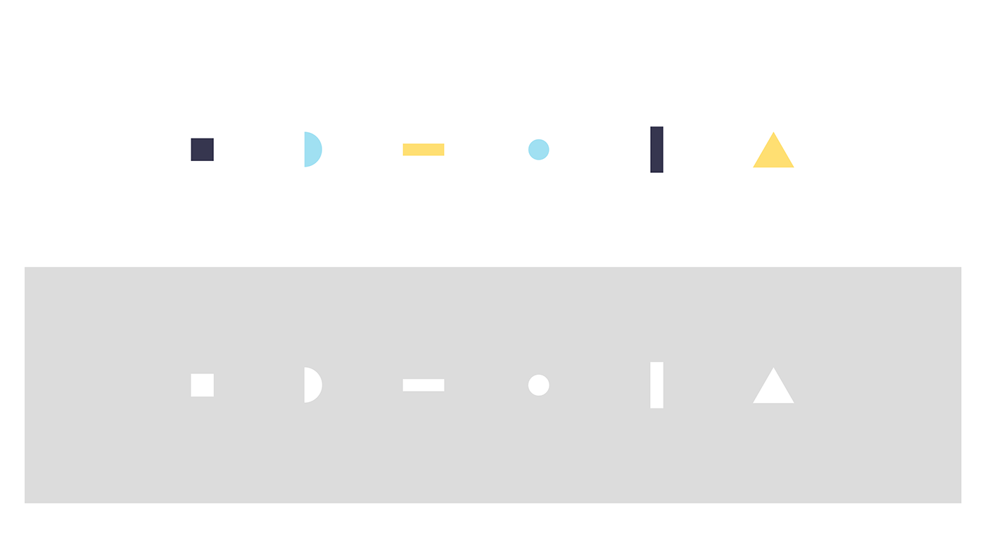
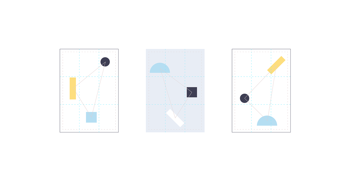
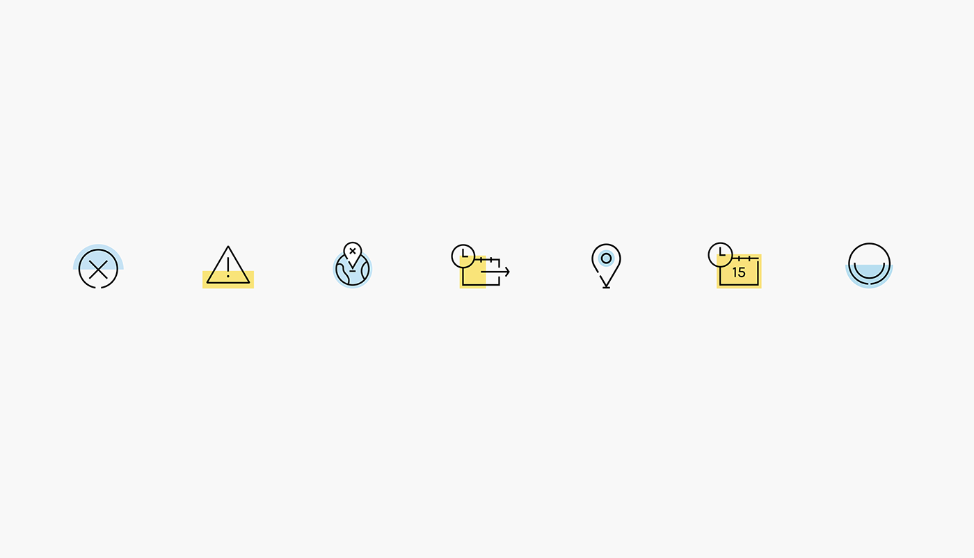
For the brand system, we drew upon number 3 again and used three geometric shapes extracted from the logo placed in a 3x3 retina coinciding with the vertices of a triangle. We also created a pictogram style to accompany the brand both in communications and in the app itself.
Special credits: The app animation was made with love by Maaaambo.

