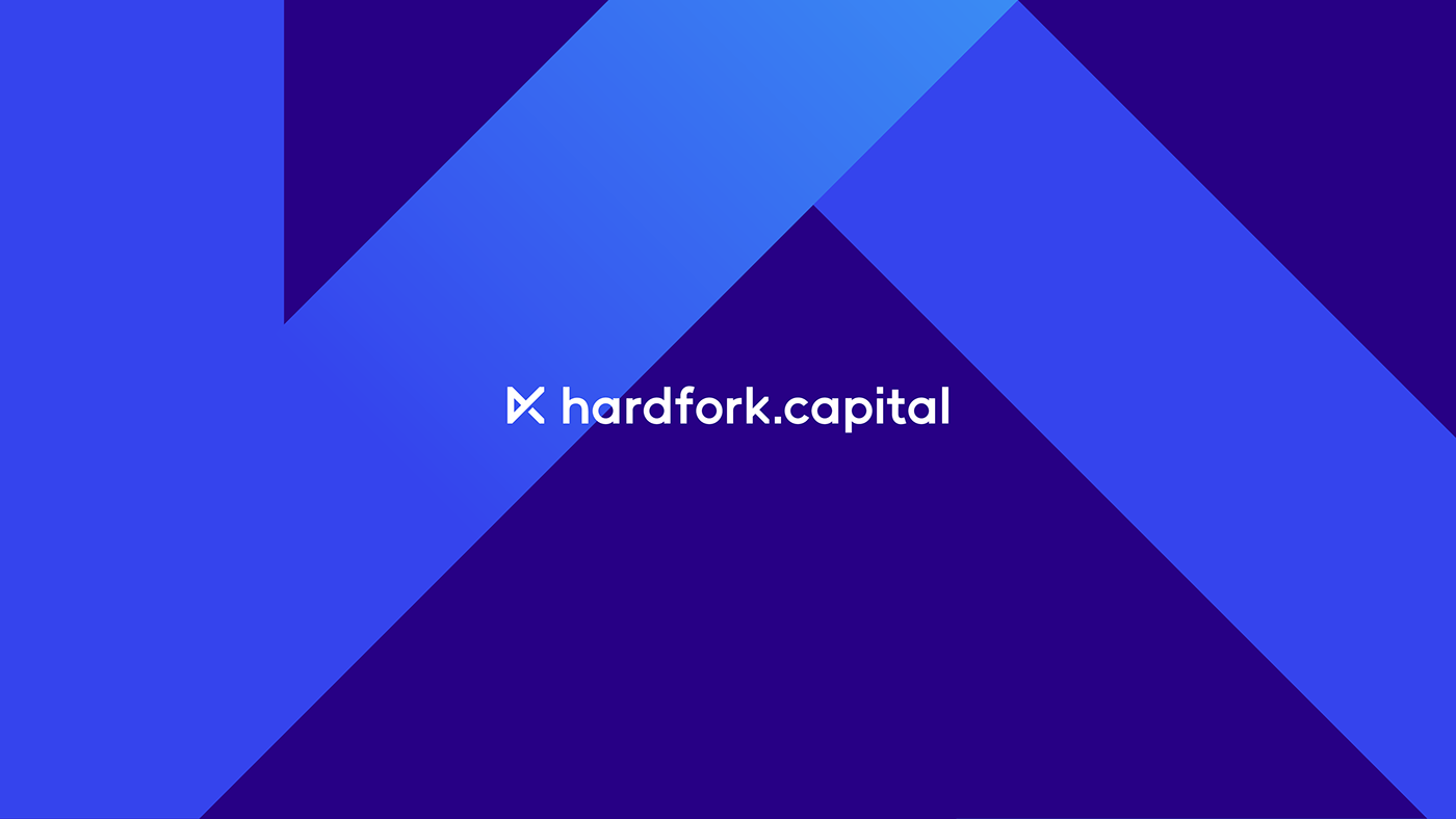
hardfork.capital is the investment fund that focused on Infrastructure-Based Blockchain Projects. The company helps to Identify Projects with High Investment Appeal by making analytics and giving recommendations to customers.
The main goal was to make a trusty and professional brand. The logo design also should look good at small sizes.
hardfork.capital handle a lot of information and choose Projects with a good potential. That's why we used the metaphor of a prism, which divides flow on a spectrum and allows exploring it in details. The sign is catchy and designed in minimalistic style represented information analysis investment diversification and currencies. We proposed calm and deep colours to highlight the professionalism of the fund.
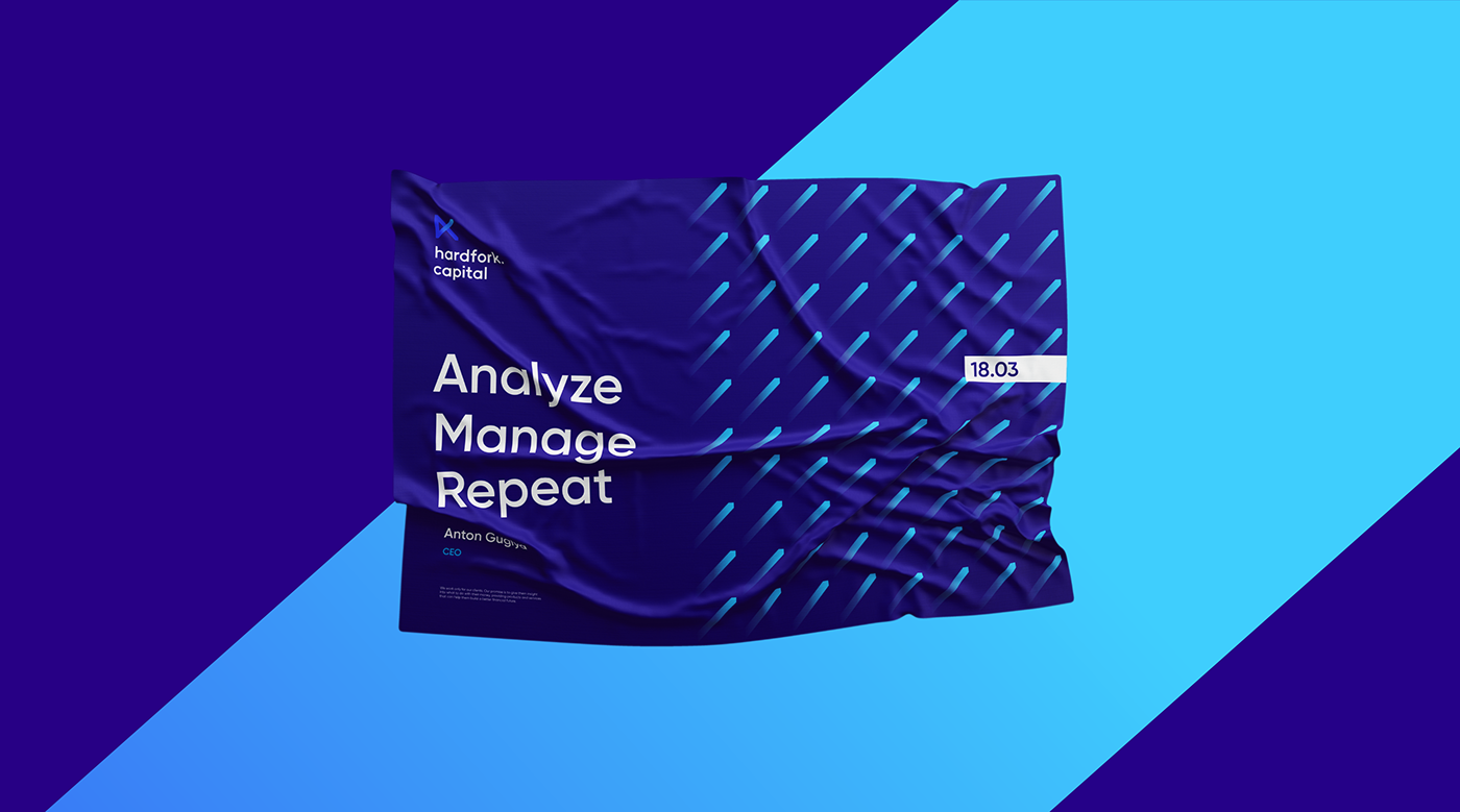
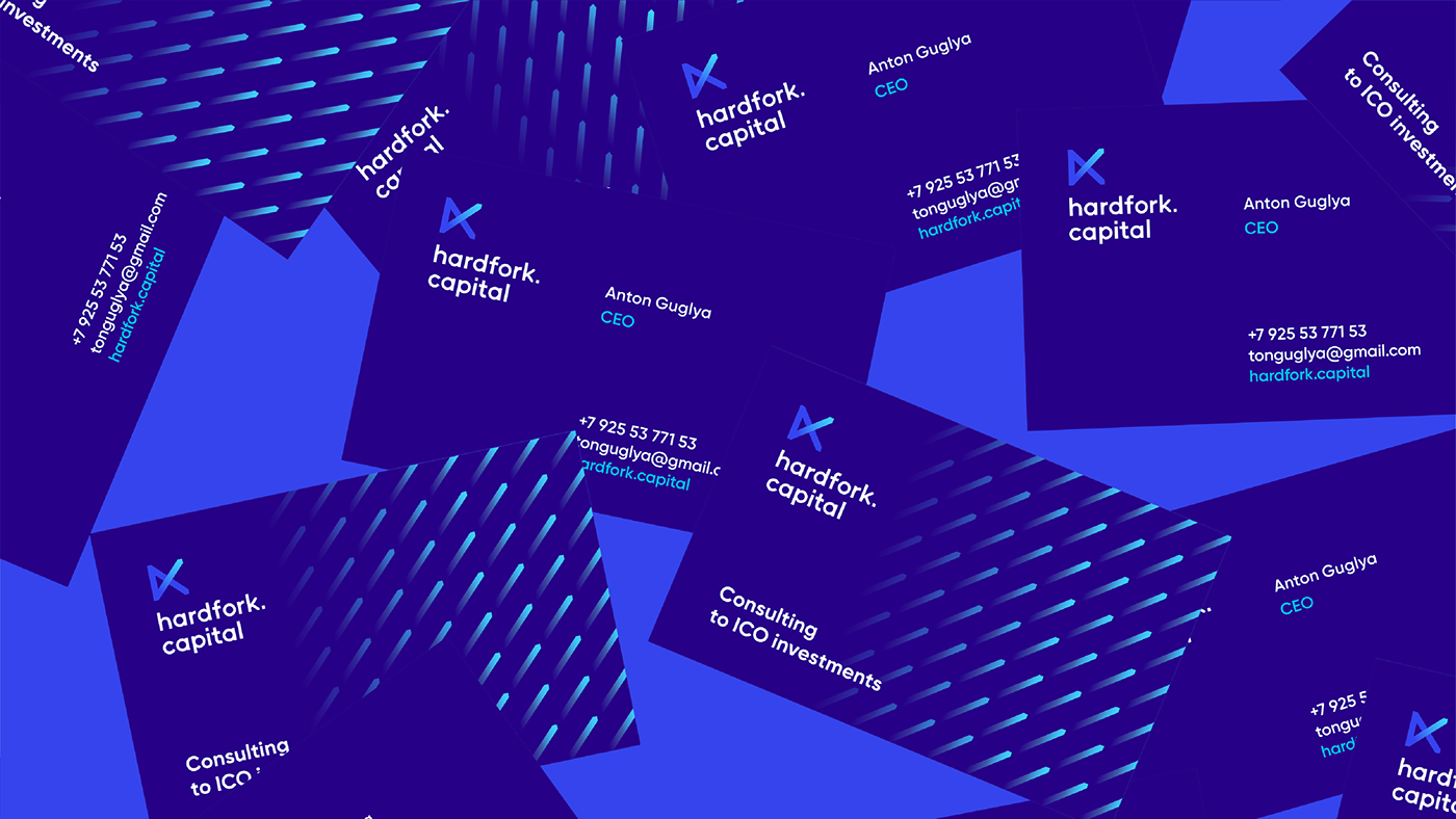
The pattern repeats logo lines and can be used on each element of brand communication.