


Brand Identity & Packaging
Wan
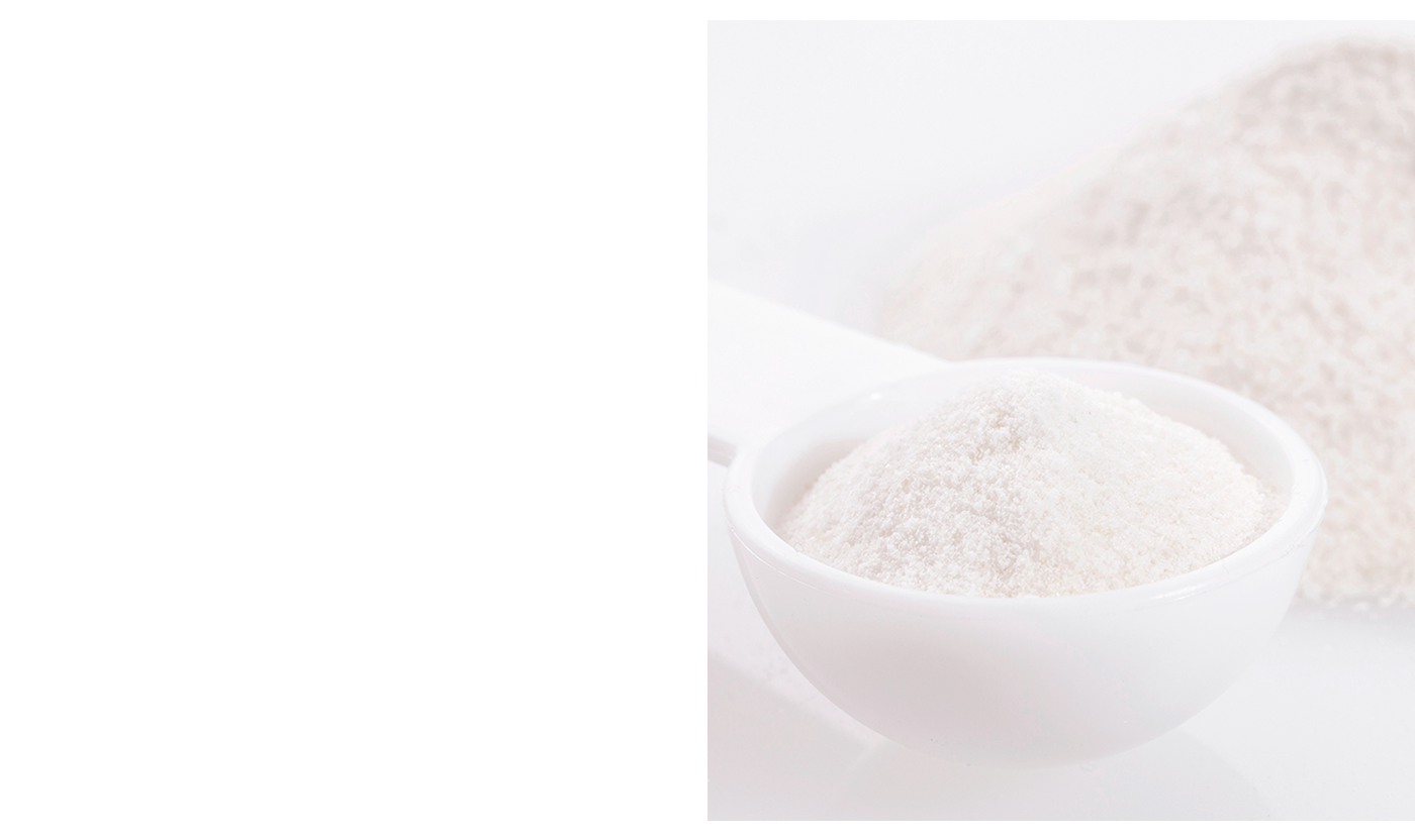
→ Wan is a perfect supplement that has all the essential standards to generate great results in our body. Its improved dose has a necessary amount of vitamin C, improved with hydrolyzed Quinoa and atomized Camú Camú, which helps to look and feel young. Because of this, a friendly, clean design was made.
For the construction of the logo, it was also opted to make it typographic linear, with rounded edges that represent confidence, health and well-being. Be designed a pattern inspired by the textures of the product content (powder) to create a dynamic and safe brand for the industry. The color palette was the pastel blue range to give you a healthy outline.
-
Cualquier consulta → Info@diegocis.com


Thank you for appreciate
-
Brand Design: Diego Cisneros
3D Generalist: Julio Ruíz
-
FOLLOW ME ON
-


