ILLUSTRATION | CONCEPT | DESIGN | UI | MOTION | COLLABORATIVE
RYAN HAHN Design Portfolio 2019
Hi! My work is often guided by an illustrative urge to paint a visual image of fantastic and speculative worlds, but through the lens of design. I take a critical approach to my work, often scrutinizing phenomenas in culture, society, technology, and our progress as human beings as a whole.
I love interesting and thought provoking challenges, meticulously detailed processes, and like to play with the dynamics and balance the dichotomies between Design and Illustration, Organic and Mechanical, Old and New, Right and Wrong, Familiar and Strange, and more though worlds, stories, characters, studies, and styles.
If you enjoyed my work, please contact me here!
email : rhahn01@mica.edu

SOLID, LIQUID, GAS
Illustrator; 2018.
Transformation of (subject) matter through expansion of medium and concept.
1. SOLID
Illustrator
The presentation of a fictional, speculative object as a real object.
What kind of world would demand on object like this?


2. LIQUID
Illustrator and After Effects
Chronologically examining technology through a diptych fluid chart.
I used familiarity of known technology and inventions to contextualize speculative evolutions of the tech in an attempt to bridge fiction and real.


I began by selecting 4 domains of technology that were essential developments to both Neolithic and modern humans.
I then created a timeline of a possible route of progression that the tech can take, and animated them accordingly.


3. G A S
Illustrator, printed on canvas
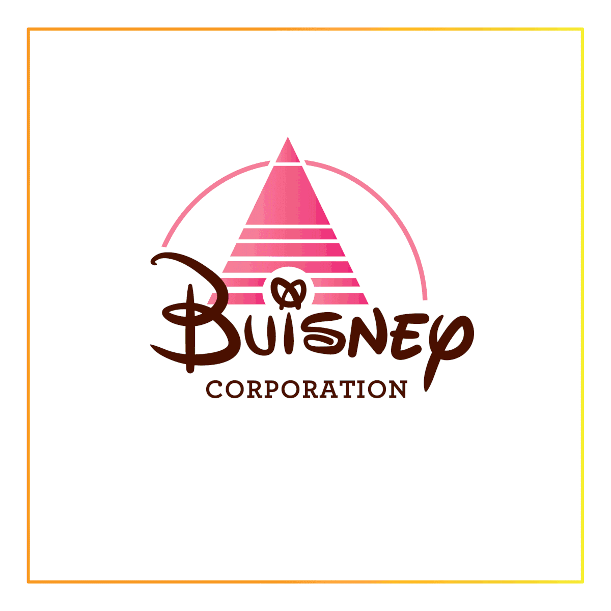
Expanding and stretching the concept one more stage in the form of a fictional corporate map.
By investigating a world of familiar but fictional corporations, the roles of these fictional companies are contextualized to the viewer by their real life counterparts, thus giving the viewer a "key" to base these fake companies' significances, services, and products on.


Process


HEPHAESTUS HAND Branding
Illustrator + InDesign; 2018.
This identity deck was made as a part of the Quarter Zero (Q0) Incubator Program with verynice.
It is a unique opportunity to work with young high school student entrepreneurs who have inspiring, socially conscious start-up ideas. Volunteer designers helped get them ready to pitch their ideas to investors by creating a logo and presentation deck template for their venture.
Hephaestus is the Greek god of fire, forges, sculpture, and metal work who often constructed tools for other gods and people in need. Like the god, Hephaestus Hand seeks to provide lowest-cost, battery powered, and 3D printed prosthetic hands for below the elbow and above the wrist amputees across the world.

Brand on company website


I wanted to use 4 fingers of a hand as the stems of two capital H's to reference the company name
and the prosthetic hands they build.
The dark grey and orange as the primary colors reference the fires or lava that Hephaestus used to build his tools.


Process Sketches


ADVRTAS DESIGN INTERNSHIP
Illustrator + Photoshop; 2018.
Advrtas is an immersive and interactive 360 advertisement company in Santa Clarita, California.
Advrtas combines 360 videos and interactive coded elements to create ads that are engaging and playful.
Website Gallery Assets


Immersive Advertisement Concepts


Ad Sample Demos


Website and Presentation Icons


Website and Social Media Content


Company Letterhead Designs


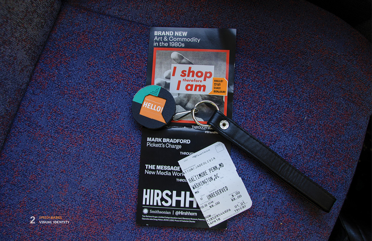
IDENTITY GUIDELINES for SP∑ECH B∆ßEL, by Point Echo: Breaking the Language Barrier
Illustrator + InDesign; 2018.
Speech Babel is a conceptual product and service that offers instant daily translation, thus “undoing” the effects of the Babel Tower using bone conduction technology and advanced translation software.
“Babel” comes from the biblical tale of the Tower of Babel, where a greedy king attempted to construct a tower to reach the Heavens and God. After witnessing this, God struck the tower with lightning and changed the participants’ languages so they may never attempt such a thing again.
See full guideline deck here:


The brand’s colors and mood takes large inspiration from the flag of South Africa, using variations on the Orange/Red and Blue/Green tones, contrasted by the white and black.
I began with the type, and stacked them in different ways. I observed the B’s forming window like shapes, and the L creating representation of a wall/building edge. I also noticed a speech bubble like shape
forming around the words.


As a tool made to create and promote universality, the name was simply fitting. Beyond that, Univers is notable for its immediately universal accessibility.


I built a live mockup of the device out of museum board and colored paper, and attached a leather wrist strap to it.

Storefront Projections


Application mock ups


CHARTING TASTE
A graphic and formulaic approach to music taste.
X-axis= Genre and Y-axis= Tone

The genres are organized in a mostly linear way, going from the slowest paced genres like Trap and Dubstep, to the faster paced genres like Bass House and Drum and Bass.
The tones are organized in a similar way, going on a spectrum from "Wonky" and "Chaotic" to tones like "Somber" and "Sinister".


Songs with influences from other genres and songs that share tones are visually interconnected and linked to their respective sources.


Each song is listed by artist name and then song title.

The region with the highest concentration of songs naturally and accurately reflects my music taste.
Interestingly, it also reveals a comparative demonstration of the reigning popularity, diversity, and range of certain genres, styles, and moods.

Ideal graph system distillation process


HAPPY COMPANY UI
Illustrator + After Effects, 2019.
Mockup of the User Interface for a hypothetical precision-based tactical simulation shooter titled "Happy Company", where the player gets to play and engage an arsenal of mechanical soldiers.
Animated mockup and demonstration of UI movement and behavior made using After Effects

HUD Assets


The GO!GO! Instagram Sticker Set
Illustrator + Photoshop; 2018.
The GO!GO! Sticker set is an Instagram story sticker set proposal using an original robot character. The GoGo is enthusiastic, optimistic, and positive, but with a proper and formal twist, using technical terms like "Critical!" as opposed to "Cool!", or "Salutations!" as opposed to "Hello!". This will appeal to be used by a wide range of audiences, from those who are remarkably enthusiastic, to those who are more cynical and sarcastic.


The GoGo is an animated iteration of character based on a robotic soldier unit in an original, speculative, fictional world.
It is designed to bare a smiling face and an upbeat personality at all times, even while engaged in combat.


FESTAS DE LISBOA 2017
A Devonian visualization of human progress.
Illustrator; 2017.
This piece began as an entree for the 2017 International Lisbon Festival of Sardines Contest, where sardines are celebrated as a cultural delicacy.
The only restriction is to fill a provided sardine shaped template.

The final designs explore 3 distinct time periods of human technology and its relationship with humans.
Mainly I wanted to illustrate our codependent relationship with our tools.

the Geared Sardine

the Motorized Sardine Locomotive

the uSardine
A motion graphic expanding the concept of cyclical progress and evolution.
I was inspired by a biological illustration of the organic and skeletal structures of a sardine. Because I enjoy illustrating mechanical parts and technologic designs, I began by interpreting the skeletal structure in a robotic style. I then vectorized it in Illustrator, and took it into After Effects to animate each part.


Thank you for your time.

ILLUSTRATION | CONCEPT | DESIGN | UI | MOTION | COLLABORATIVE


