

The Louis Vuitton Oreo. 19
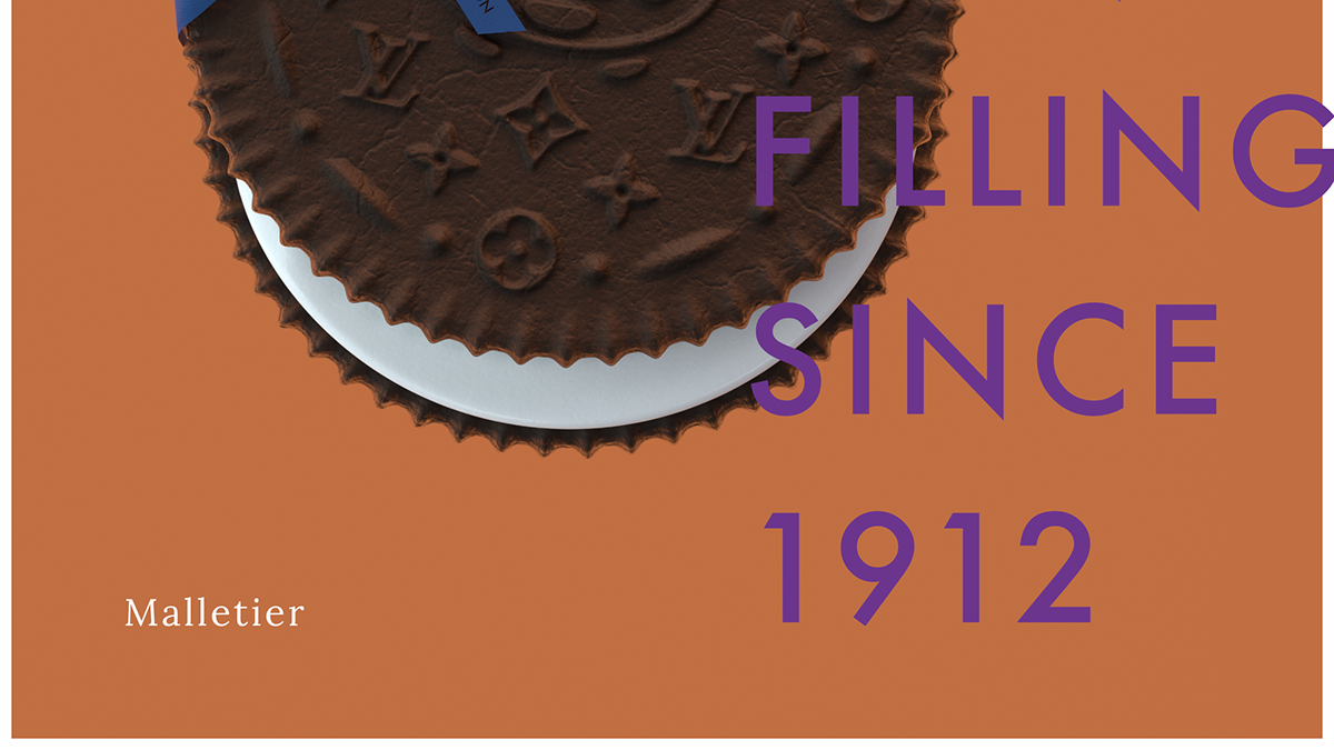
The chocolate texture of the Oreo is a little lighter than usual to merge the two brands together, Oreos being dark and The Classic LV Monogram traditionally being a light brown. The leather texture for the creases and cracks were created to reflect the old LV trunks and the ‘biscuity’ nature of the Oreo. Finally, The central LV x Oreo graphic/displacement map was created by hand, the ribbon created in Marvelous Designer and the ribbon and background colours were inspired by the Louis Vuitton gift box which house the LV items.

Kết cấu sô cô la của Oreo nhẹ hơn bình thường một chút để hợp nhất hai thương hiệu lại với nhau, Oreos có màu tối và The Classic LV Monogram theo truyền thống là màu nâu nhạt. Kết cấu da cho các nếp gấp và vết nứt đã được tạo ra để phản ánh các thân cây LV cũ và bản chất ‘biscuity của Oreo. Cuối cùng, bản đồ đồ họa / dịch chuyển trung tâm LV x Oreo được tạo bằng tay, dải ruy băng được tạo ra trong Marvelous Designer và dải ruy băng và màu nền được lấy cảm hứng từ hộp quà Louis Vuitton chứa các vật phẩm LV.


Thank you.

