I use quickteller. A lot. To send money, to buy airtime and to pay for my internet plan.
Before the quickteller interface redesign, it was hard to admire the interface. I wanted to logout as quickly as I logged in. But after the interface redesign, it was easier to look at. I’ve always wanted to use Quickteller as a case study. Today I have. I did a research to improve Quickteller’s landing page and overall UX.

Observe
Problem Assumption:
I tested the redesigned platform to arrive at some assumptions.
1. Discovery of the platform's features isn't clear. While I understand that they were going for a minimalist design, some prominent features were hidden.
2. The use of the images in the background give the platform an outdated appearance.
3. There is no indication on the landing page that the platform has a mobile application. Seeing as more people use mobile devices to perform such tasks, there ought to be an indication of a mobile application and where that application can be downloaded from.
User Interview:
I interviewed some friends of mine who use the platform regularly. I asked them if "they knew about all the features of the platform?", "what do they think about the interface redesign?", "do they know that there was a mobile application available?", "What they thought about the background images". 6 of the 8 people I spoke to said they were not aware Quickteller had a "Loan Request" feature. 3 of them were satisfied with the interface redesign while the other 5 felt the overall experience could be better. 4 of them said that the there felt that the background images were a mismatch for the type of services that the platform offers. 3 of them were aware that the platform has a mobile application.
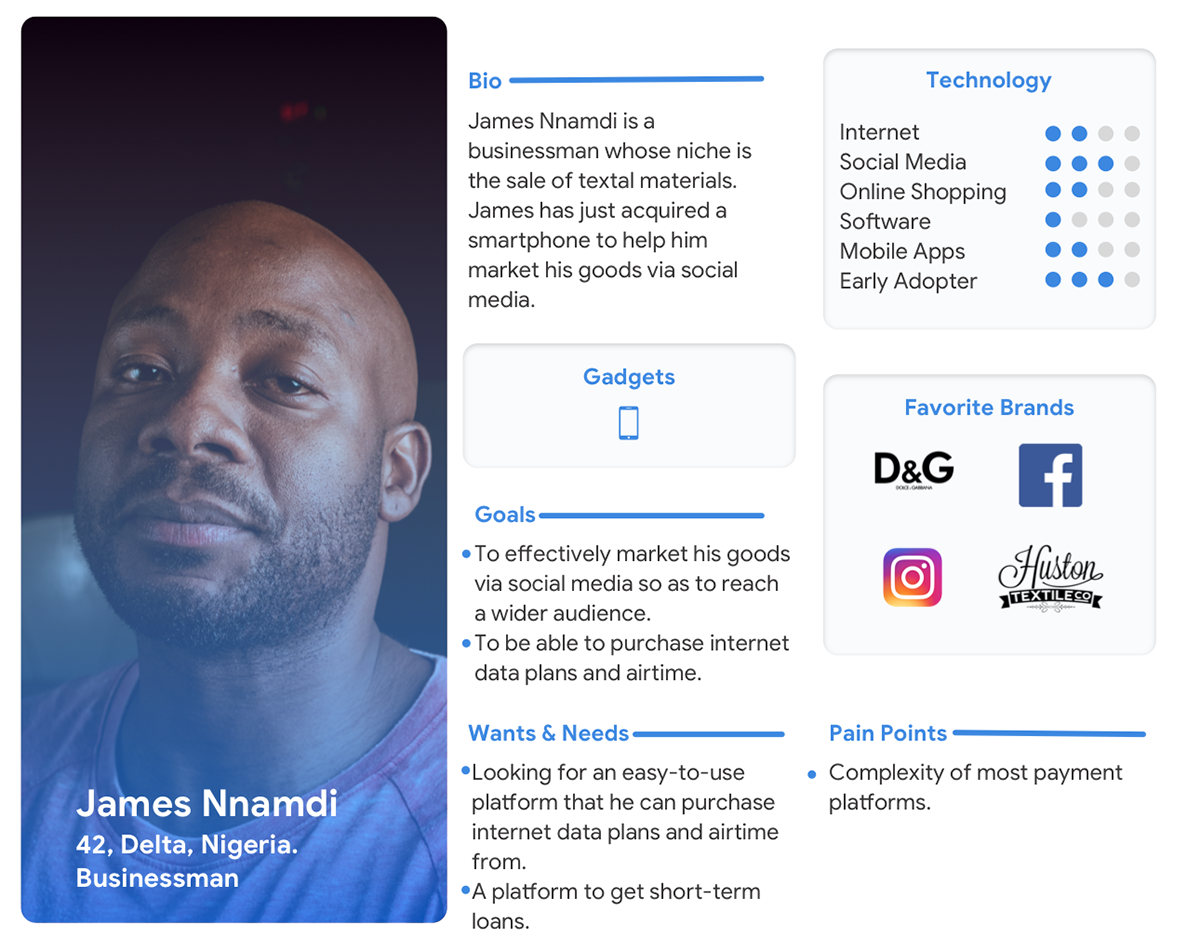
Persona:
I was able to come up with personas based on the observation and research.


Define
Having validated the assumptions:
Pain Point 1: The features(Discoverability)
Some users want to see all the features of the platform at a glance.
Pain Point 2: Redundant features
Some users felt the vendor search bar was redundant because they could perform the same task from the "Pay Bills" section.
Pain Point 3: Mismatched background images
Some users wanted to see the platform have a more modern look and feel.

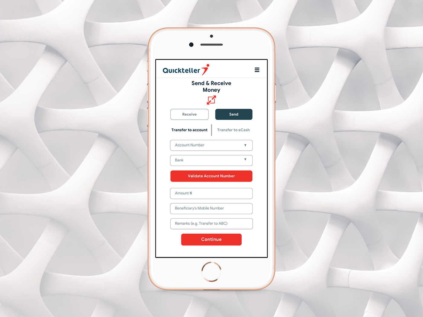
Current Quickteller Interface
Ideate
To solve the user problems, sketched out some possible solutions on paper.
Sketch 1:

Sketch 2:

Protoype
UI Design:

Computer Screen

Tablet Screen

Mobile Screen: Landing Page
Mobile Screen: Transaction Page
Pain points 1,2,3 addressed:
-Take out the side menu and use cards.
-Each feature of the platform is represented as a card.
-Added a page section to indicate that there is a mobile application available.
-Changed the main background image to give the platform a more modern look.
Validate:
To make sure that the redesigned interface addressed the pain points, I interviewed the users. One of them had this to say:
"At a glance, one can see what the product is all about and can quickly assess and access the various functions by toggling. The redesign retains the simplicity of the original while increasing the overall comprehension."
Disclaimer: I do not work for Interswitch group nor am I affiliated with them. I did this UX case study improve my problem solving skills.


