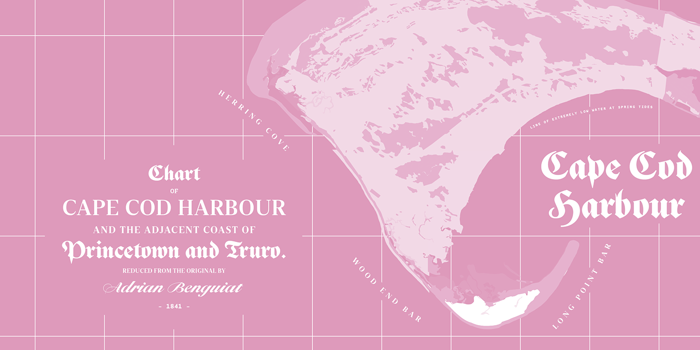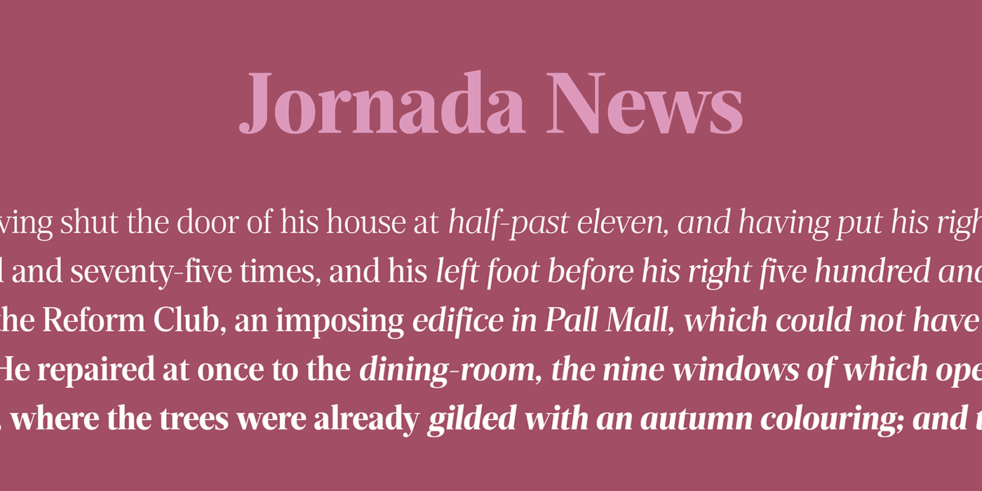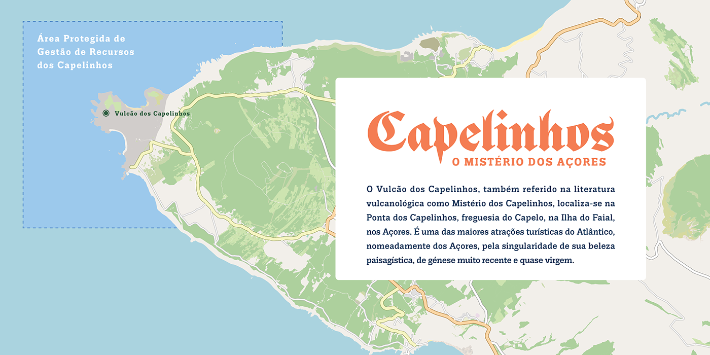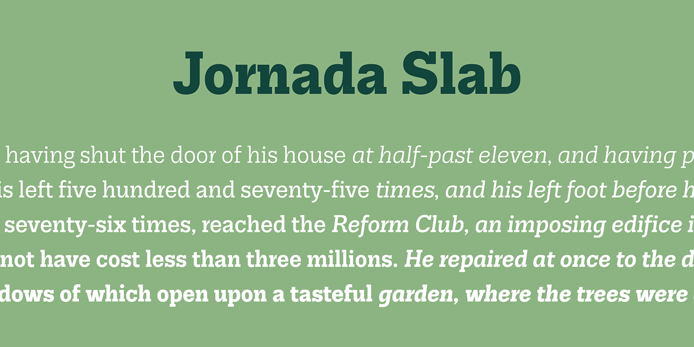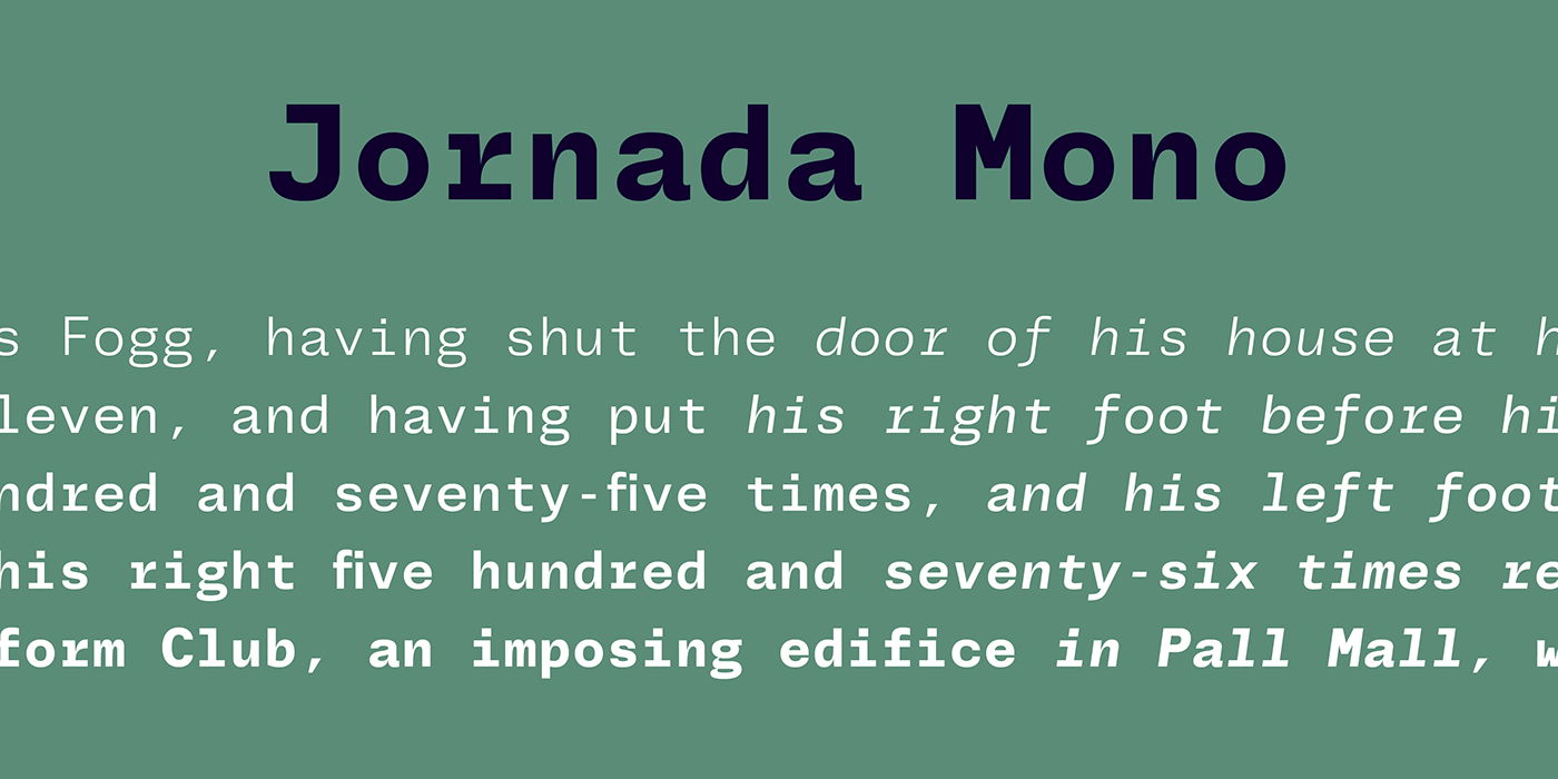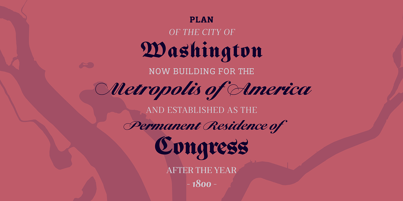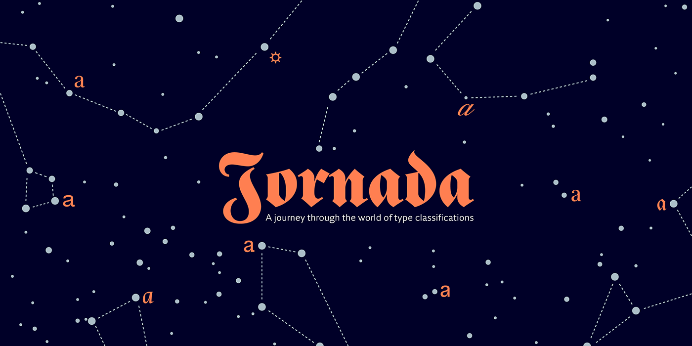
Jornada is a sort of reinvention of the super type family concept. Instead of committing to the idea of homogeneity, Jornada was conceived as a typographic journey through the world of type and classifications, from the fifteen to the twentieth century. Jornada is provided in a wide range of styles, each with five weights and some with matching italics: a Blackletter in the Fraktur style, a classic Chancery with Italian flavour, a bookish Libro, a News text serif, a clean Sans with Slab and Monospace companions, a Script vaguely reminiscent of the English penmanship, and a useful set of Symbols. Because all the fonts in the family share the same proportions and weights, they were all designed to be used at the same time, allowing the designer to mix several type styles without having to change the size, in a sort of “hygienic post-punk” style. Get to know Jornada here!