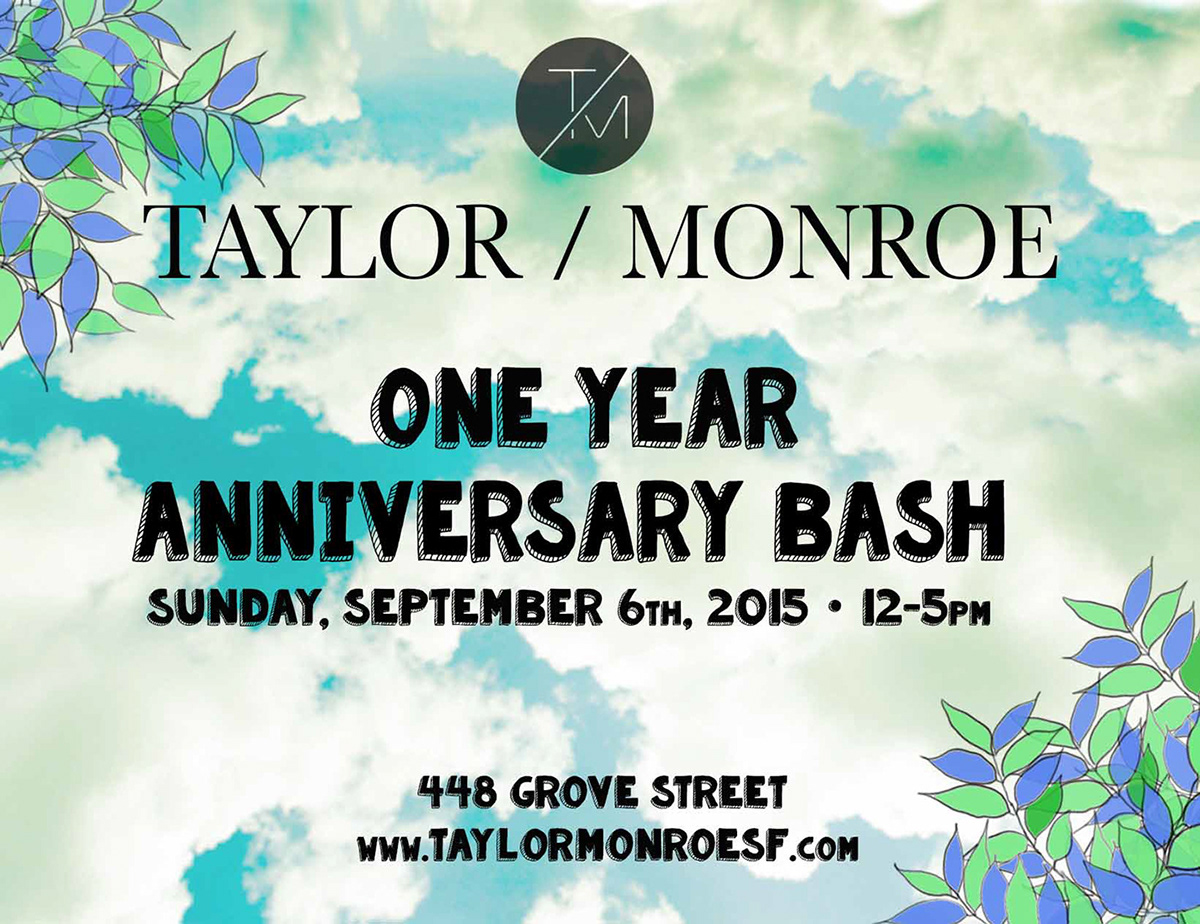
Flyer design for Taylor / Monroe's One Year Anniversary party in 2015. This event was a daytime party, so I used a mixture of images and sketches to give the vibe of an outdoor, summer BBQ.

This is the back of the event flyer. I used a cream colored background to give it some warmth so it wasn't stark white and then I continued the sketched leaves onto the back to frame up the event details.
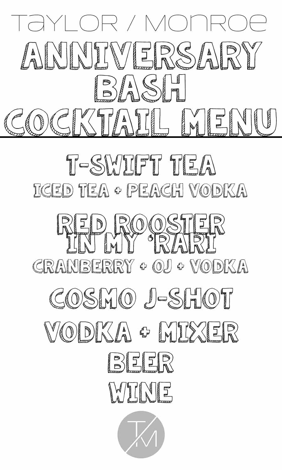
I designed the cocktail menus for the event to have the same font from the flyers. I also helped come up with the fabulous, summer cocktail names.
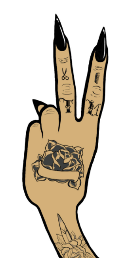
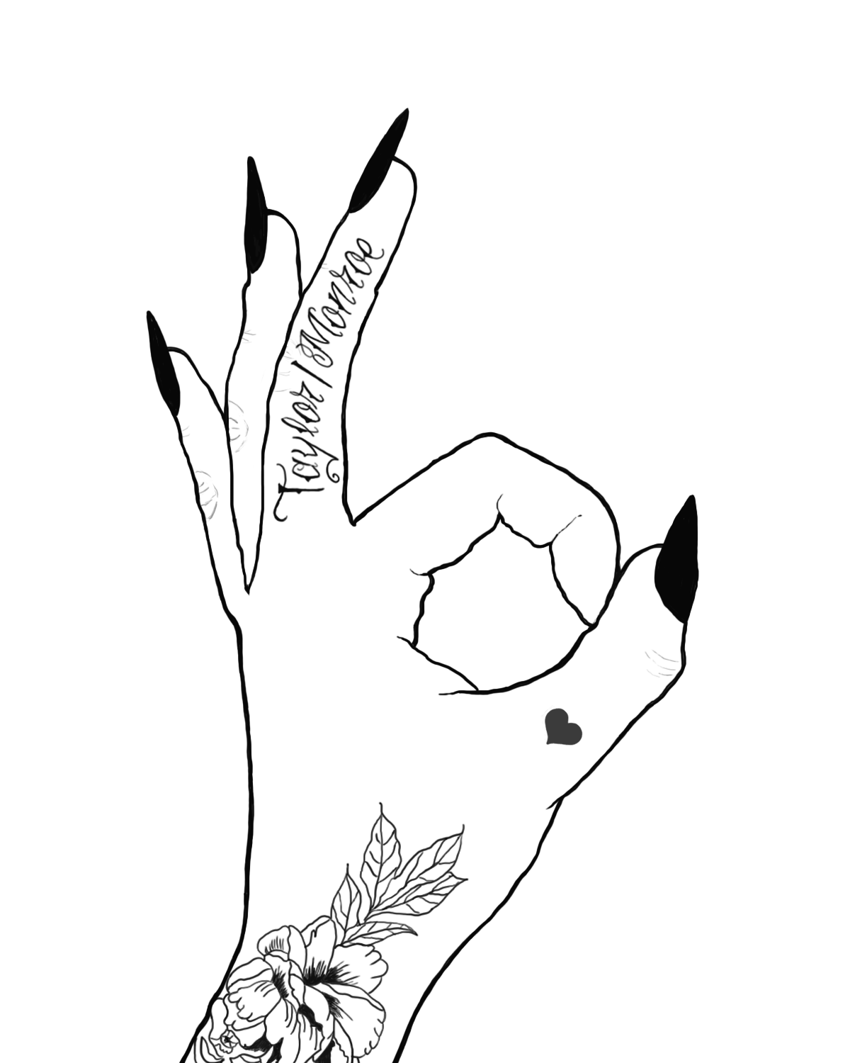
Original illustration designed for Taylor / Monroe's Two Year Anniversary party in 2016. I liked the idea of representing their two years in business with a hand giving the peace sign. I added hand tattoos to echo the vibe of the salon as well as adding in small images in the tattoos to represent the hair salon.
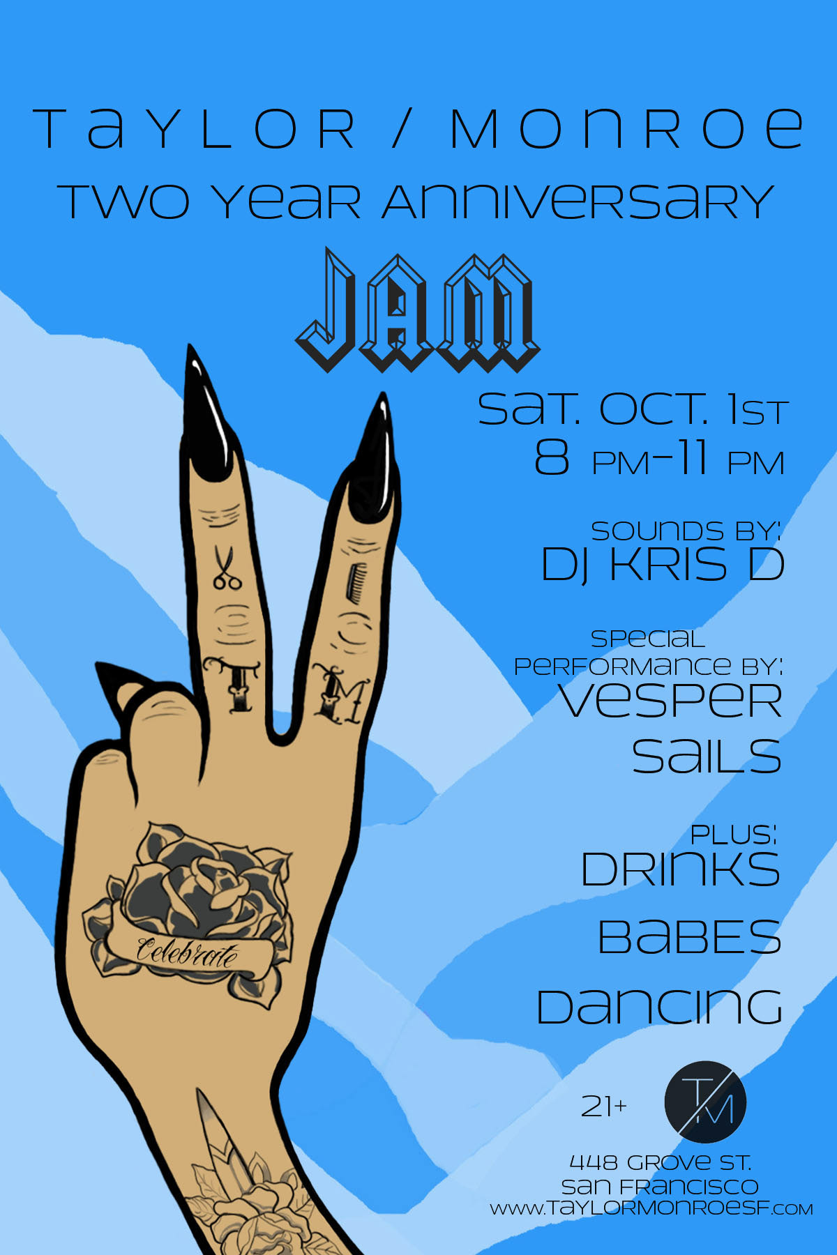
I used the illustration for the anniversary party flyer and added the word "Celebrate" into the banner of the hand tattoo. Added interest and movement with the ripped paper effect in the background. The layered effect works down, which keeps the viewer's eye continuously moving down to read more of the flyer details.
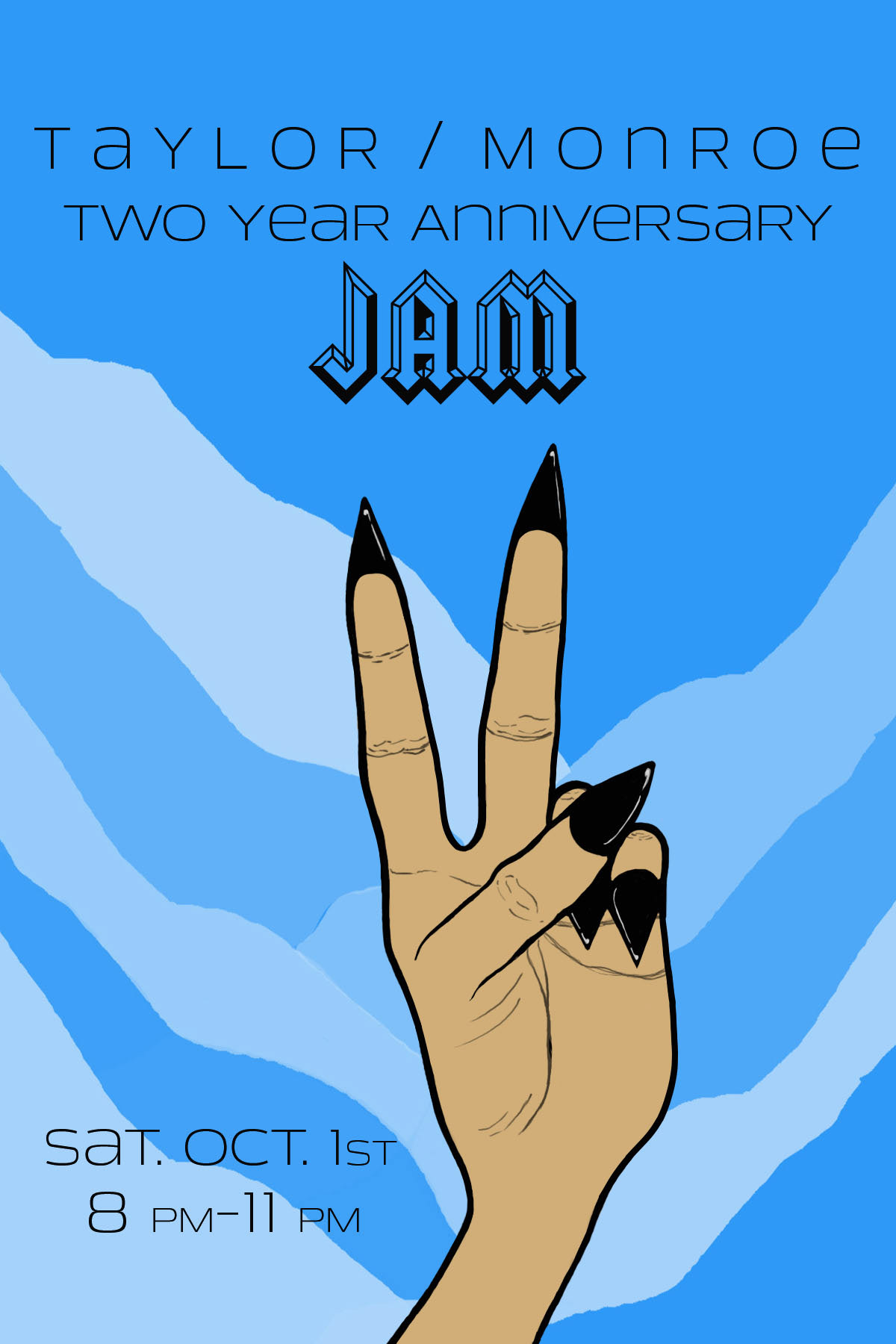
This was the front of the event flyer I designed. I illustrated the front of the hand here with the long, pointy black nails. I liked the idea of showing the front of the hand on the front and the back of the hand on the back side.
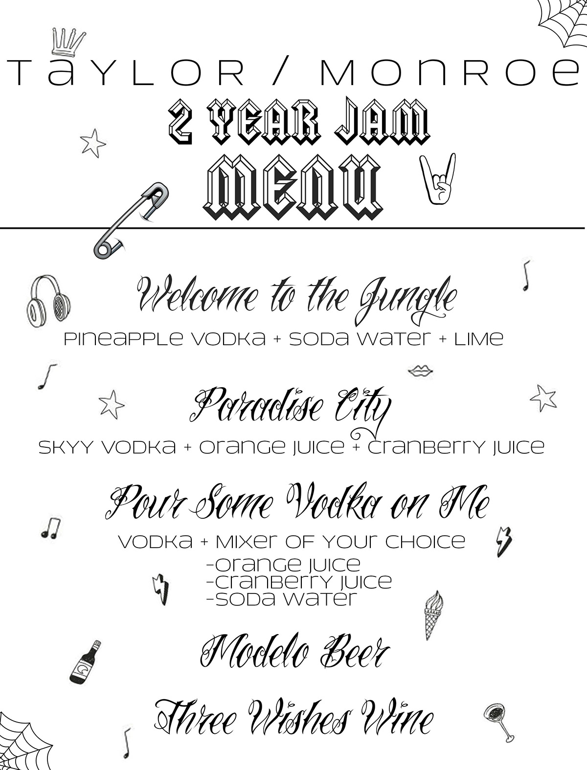
Used the same font from the hand design and flyer to make the event's cocktail menu. Echoed the tattoo vibe by adding in small "flash" like images that you may see in a tattoo artists flash art.
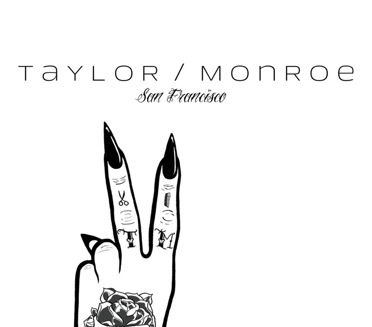
The hand design was adapted to be printed onto tote bags. Here the hand was cropped down and the company's preferred font was used.
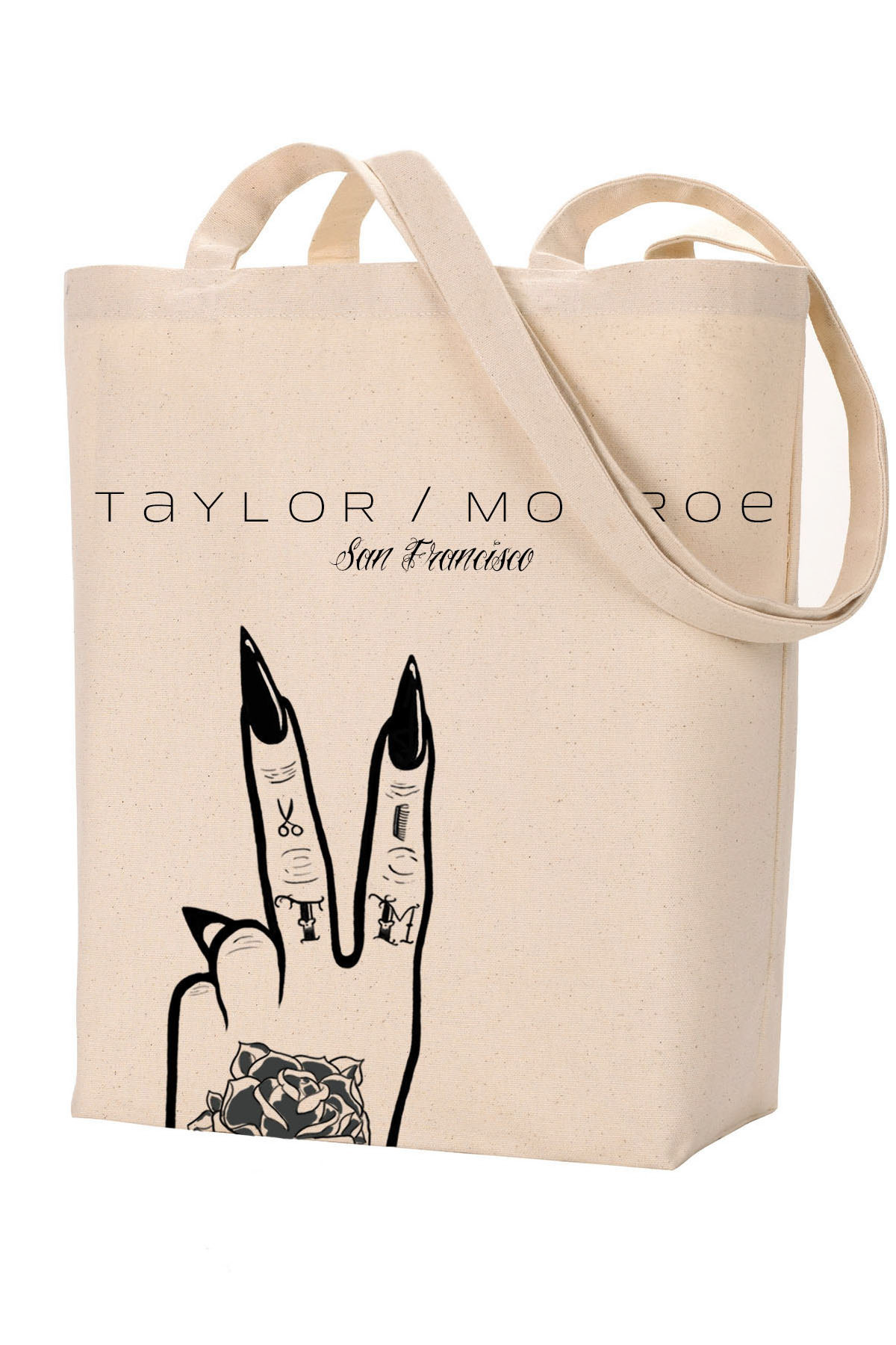
A mockup of what the printed tote bags look like.
Original illustration designed for Taylor / Monroe's Three Year Anniversary party in 2017. I continued the tattooed hand theme from the previous year but laid out the company's name into the design in a new way.
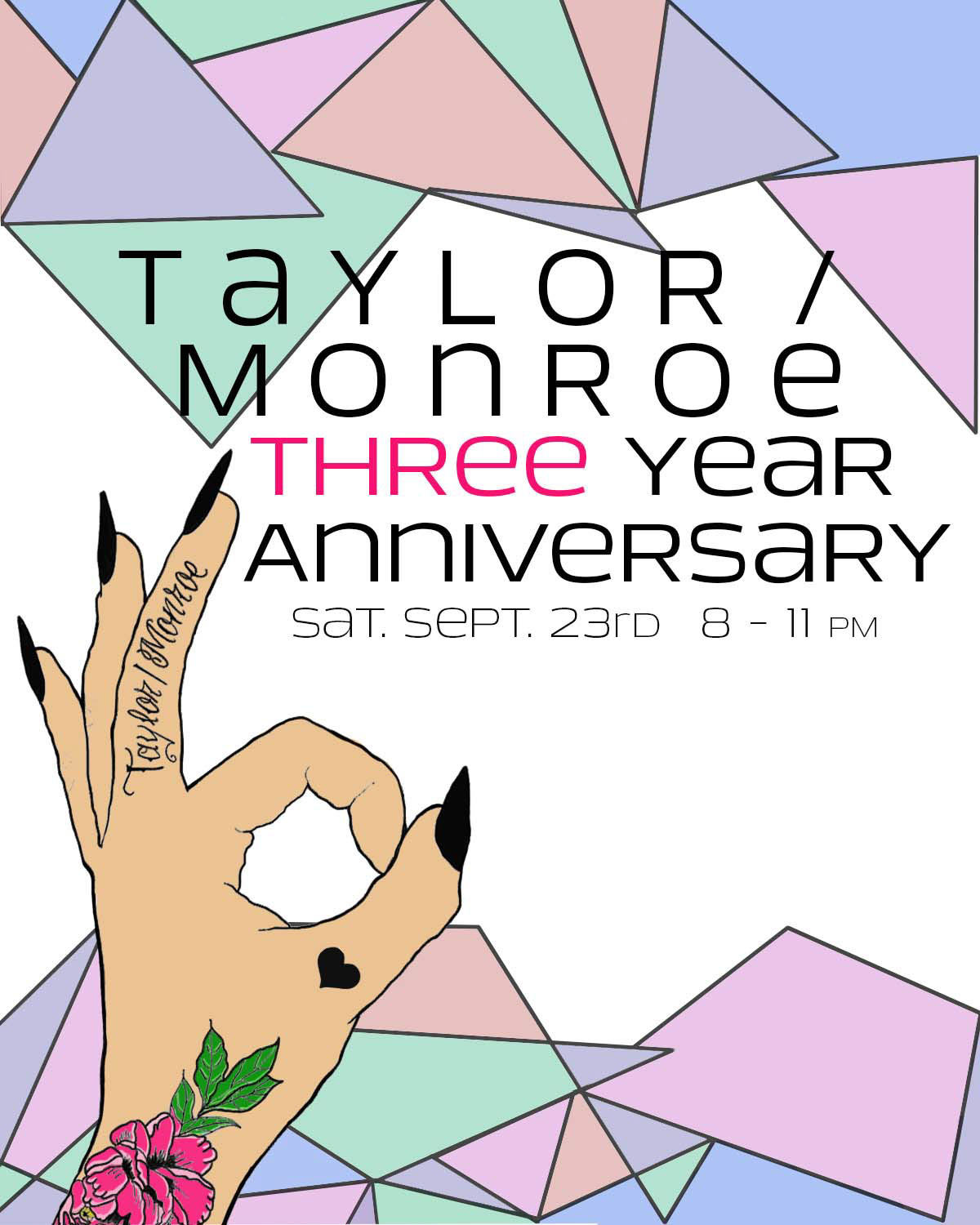
I included the hand illustration into the event flyer and added some interest with a geometric background.

The employees all requested a darker tote bag, so I adapted the illustration to be printed onto a black tote bag.


These were some brainstorming mock ups I made to get some direction from the client on a four year anniversary tote bag design.
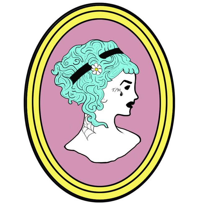
This illustration was originally made for the two year anniversary party as an enamel pin design, but it later served as my inspiration for the four year anniversary illustration.

The illustration designed for Taylor / Monroe's Four Year Anniversary in 2018. The idea was inspired by old cameo brooches but with a modern take. The figure has face and neck tattoos to show some style and edge and very textured, flowing hair to also echo the hair salon vibe.

Here is what the finished tote bag design looks like. The font chosen was Old English to further juxtapose the classic with the modern.
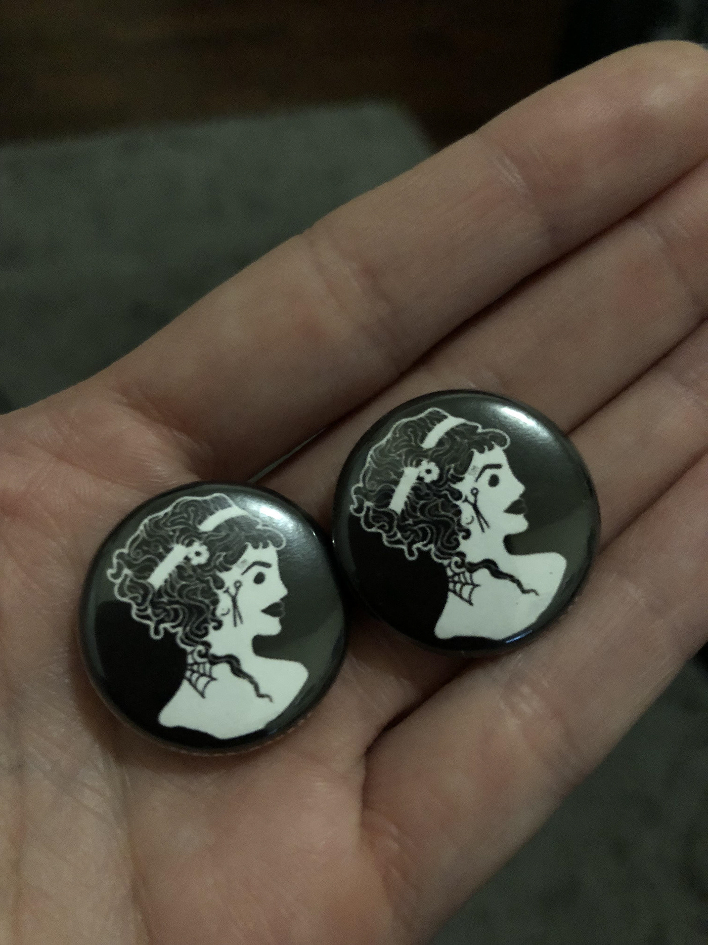
I also had pins made with our Four Year Anniversary image for the party as a small piece of merch that guests could take home to remember the event.