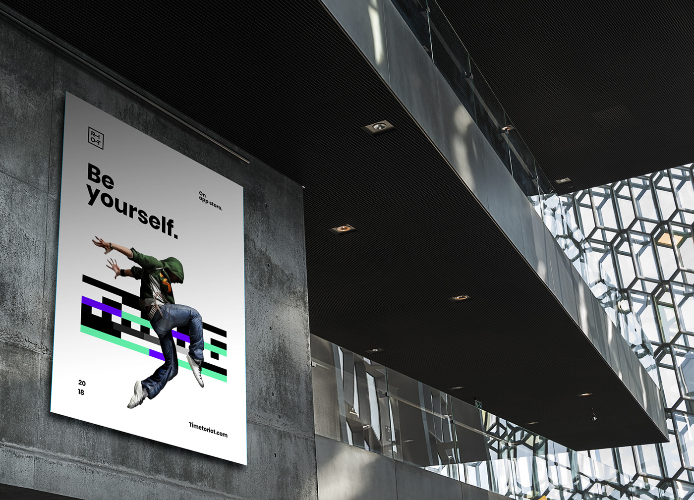
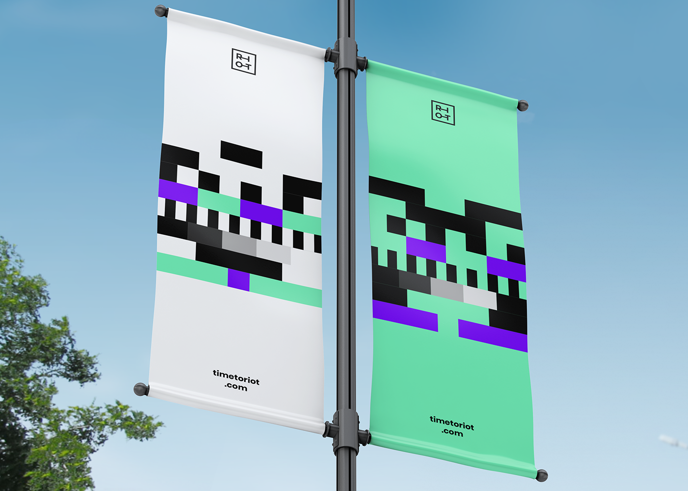
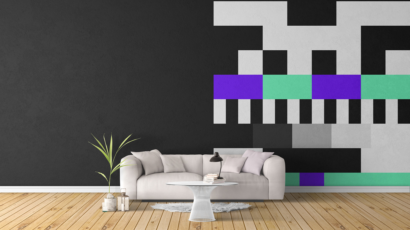
Time to Riot came to us, asking for a fresh new logo, that their users would feel like they already knew. It was important to develop a brand that visually said “lets Riot”. Let the pixels riot, let the logo riot and fight against the box that supports it.

“We took inspiration from a test card. By its symbolic values of communication fail and correcting the signal, we felt it was the perfect association with a digital rebellion.”
– Mats Hope


The RIOT App
RIOT originally came teamed up with us for visual favors such as branding, but quickly realised we could create even greater things together. RIOT and our app team would then develop what is now RIOT’s newest product, that we, as them, are very proud of:
The RIOT App.


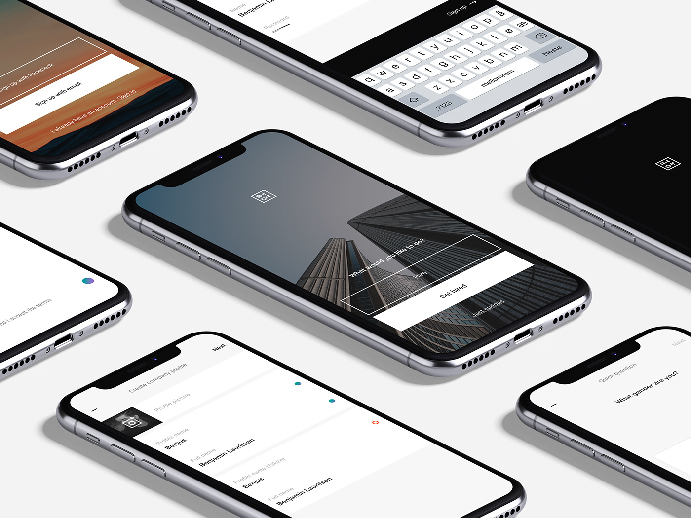
The RIOT App lets producers find film crews and actors a lot easier than traditional casting processes. And that makes for a much more smoother process for the actors who are looking for gigs.


Animations
An app meant for people needs to look and feel alive. To accomplish that in The RIOT App, we spiced up the icons with some magical looping movements by using our best animation tricks in our book.


We made the app familiar and easy to use for the existing users, but also introduced users the new RIOT branding. The solution is an app that works almost like a game, making work easy and fun, as it should be.
Credits
Creative Director: Björn Myreze
Branding: Mats Hope
Branding: Mats Hope
UI design: Benjamin Lauritsen
Animations: Martin Lavik Nygaard, Mathias Birkeland
Animations: Martin Lavik Nygaard, Mathias Birkeland