


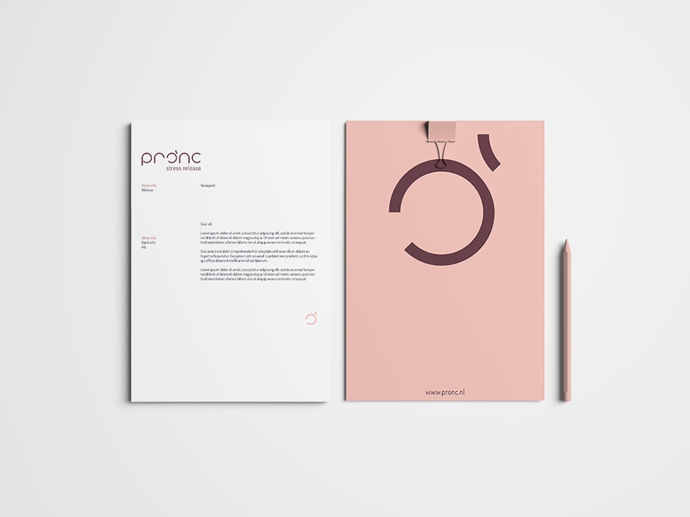


Concept development and design of the Visual Identity for Pronc who is specialised in stress release ability. Character O from Pronc gives a meaning to the logotype; Reverse circle, release locked in body and mind stress; leaving an opening. Work commissioned by Product Margje with who I have been collaborating previously on several projects.


