


OVERVIEW
During my senior year at the University of West Florida, I took an independent project class, where I decided to pursue my interest in makeup and packaging design. Around this time I was inspired by brands like Colourpop, Glossier, and Billie. I created the concept for Fōposh as well as its branding and packaging.
ABOUT FŌPOSH
Like many modern people, Fōposh clientele are juggling personal life and career goals. They want to feel put-together while fulfilling their dreams (on a budget, of course). Fōposh's goal is to help people feel powerful and stylish without breaking the bank. With quality products, attractive branding, and a fresh brand voice, Fōposh will become a drugstore makeup aisle staple.
SERVICES
Branding | Packaging Design

LOGO
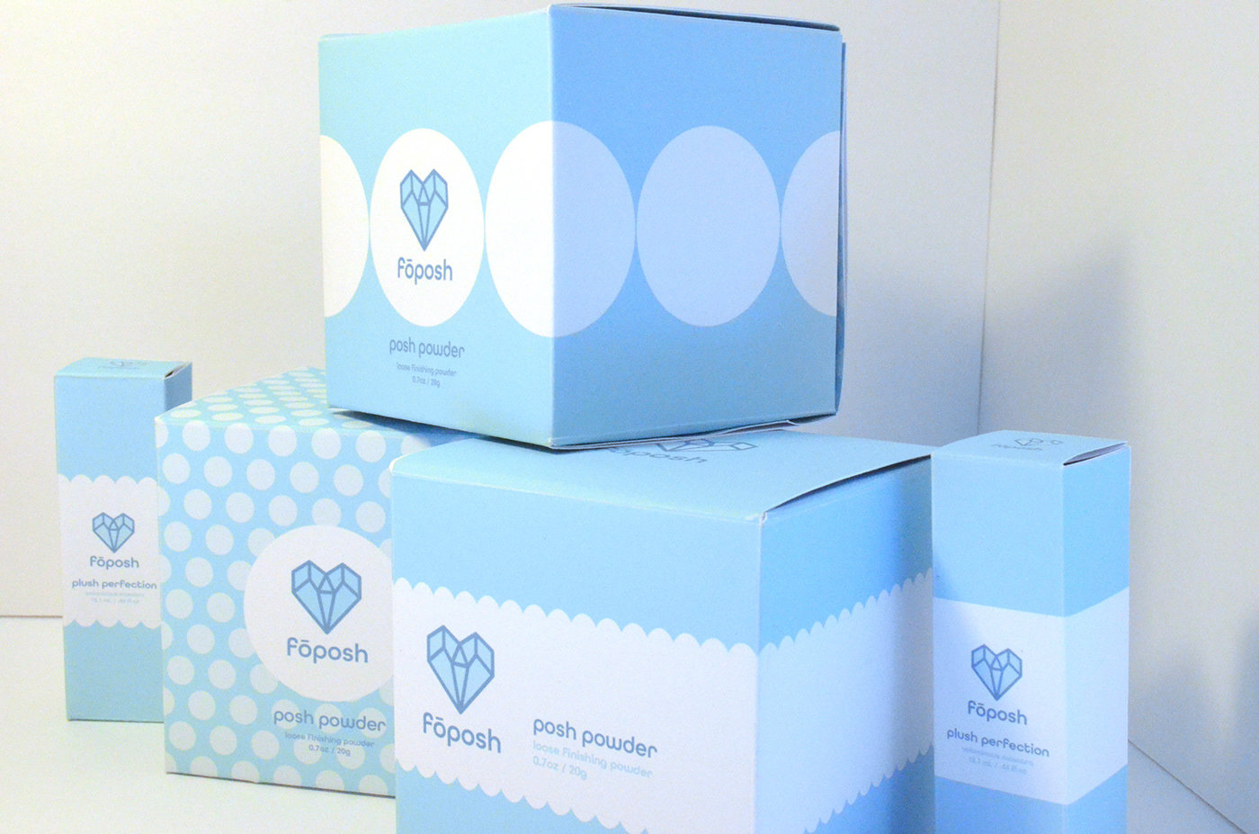
The Fōposh logo is a blue gem heart icon with the brand name stylized lowercase below.
During the sketch phase, I contemplated type customization and using accent(s) on the "o"s. When deciding what to develop further, the gem heart icon led the way. After comparing fonts and layouts, having the gem heart icon with Fōposh beneath (in the font All Round Gothic Demi) was the best choice.


BRANDING ELEMENTS
Colors, font, and patterns to represent the brand.


PACKAGING
Product mockups of three variations of Posh Powder: Loose Finishing Powder and two variations of Plush Perfection: Voluminous Mascara. Each product's packaging includes surprise patterns on the inside.


Check out my portfolio website for business inquiries.


