RAWRNIE: LOGO DESIGN
After traveling and exploring 12 countries, I have collected and written stories of my voyages in my "Notes" App.
Several chapters are unfinished, most of them consist of emotional and creative writing which made me fell in love with writing.
I decided to create a website for me to share my stories and my art and I thus went on a journey to create my website.
Several chapters are unfinished, most of them consist of emotional and creative writing which made me fell in love with writing.
I decided to create a website for me to share my stories and my art and I thus went on a journey to create my website.
Moving on, I worked on creating a logo.
I was torn between QOZMO, and RAWRNIE, which both are my handles and I have this innate love for the cosmic space. The astronauts and rockets are my usual "spirit-emoji" and I decided to have them along in my logo as this is a part of me.
I was torn between QOZMO, and RAWRNIE, which both are my handles and I have this innate love for the cosmic space. The astronauts and rockets are my usual "spirit-emoji" and I decided to have them along in my logo as this is a part of me.
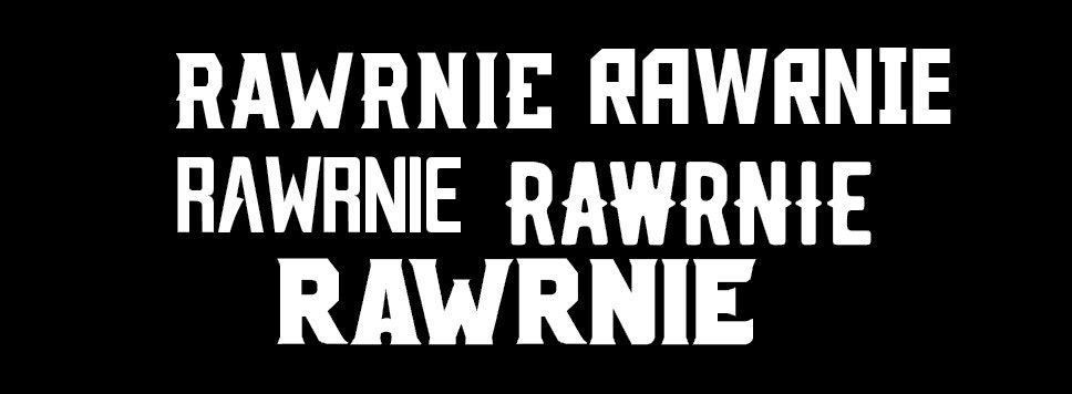
For QOZMO, it'll be a thinner more minimalistic font type, and for RAWRNIE it'll be more bold, with more personality and flamboyance to bring out the "RAWR". I shortlisted 5 commercial fonts and continue my design.
As a wanderlust, a storyteller and an artist, I seek to experience new things, explore new places and meet different people. And the Astronaut seems like an ideal logo as I am on a journey to discover more about the universe (even though we're on Earth).
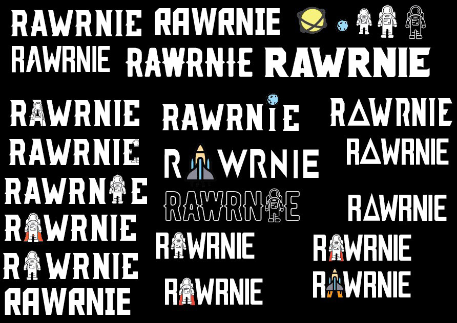
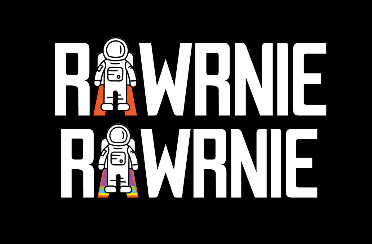
I decided to incorporate the astronaut in various ways into my logo.
While taking shape of the A, I try various way to make the outline of the A still readable while the astronaut stood in view. I did a try with a rocket icon too. After manipulating the vector files, here's what I had concluded!
While taking shape of the A, I try various way to make the outline of the A still readable while the astronaut stood in view. I did a try with a rocket icon too. After manipulating the vector files, here's what I had concluded!

Here are 2 designs that after finalizing!