
The 1986 @topps set featured the bold & jagged Napoli Serial font in varying shades of 6 colors: Yellow, Orange, Blue and Red... plus White (White Sox & Yankees) and Green (A's). That season is best remembered for Bill Buckner's between-the-legs error (Curse of the Bambino) on Mookie Wilson's dribbler in the 10th inning of Game 6, which probably cost the Red Sox their first World Series title since 1918. The back of Buckner's '86 card is in the mosaic.
Original artwork by #MatthewLeeRosen


I have very fond memories of my grandfather spoiling me by dropping random packs of 1985 @topps on the floor around the house, and I likely chewed every hard stick of gum inside.
So, I've chosen to re-create Bazooka Joe using a mix of 1980, '84, '85, '92... and the '88 All-Stars, highlighting one of my favorite All-Time @cubs, Andre Dawson. My diamonds are on 24" squares... about 34.25" x 34.25" when hung upright.
Original artwork by #MatthewLeeRosen


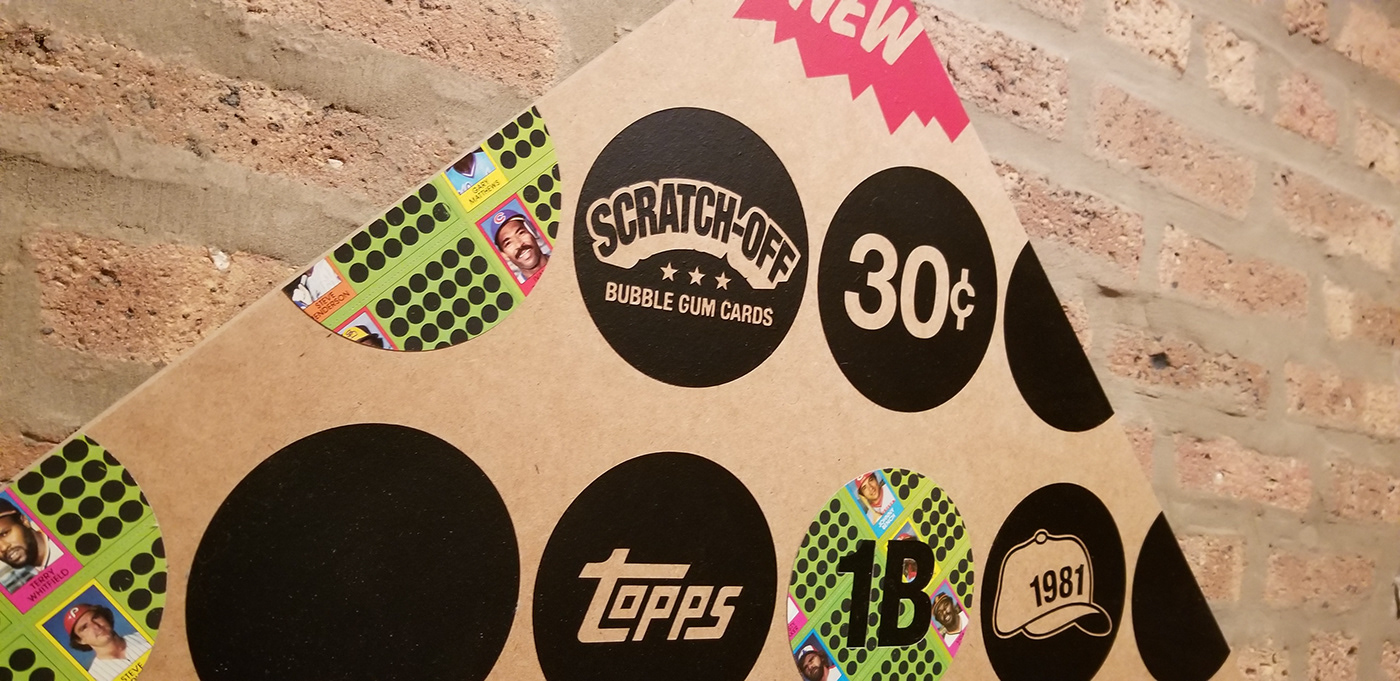
In 1981, @topps came out with a scratch-off game for card collectors to play. The cards featured stars from both leagues... green for NL, and red for AL. You'd scratch a dot to reveal the outcome of an at-bat in a simulated game. The cards came in perforated strips with black scratch-off dots, which made for great inclusion in this artwork. Reggie, Rickey, the Hawk, Wizard and others are on the board.
Original artwork by #MatthewLeeRosen
Original artwork by #MatthewLeeRosen

1986 Topps


In the early 80's, @topps introduced their late season "Traded" sets, which was basically a software update. The sets contained 132 cards of players either dealt to new teams, or who didn't have cards printed yet in the previous full set. The 1989 set is most famous for its Ken Griffey Jr. Rookie card, however there were some big trades that year: Rickey Henderson back to the A's, Rafael Palmeiro dealt by the Cubs for Mitch "Wild Thing" Williams, John Kruk became a Phillie, and Eddie Murray not playing in an Orioles uni for the 1st time in his career.
The sets were packaged in small boxes with rather iconic artwork, which I've replicated in this design.
Original artwork by #MatthewLeeRosen
The sets were packaged in small boxes with rather iconic artwork, which I've replicated in this design.
Original artwork by #MatthewLeeRosen


In 1975, Fleer filed a lawsuit against @topps for monopolization. Five years later, a judge ruled against Topps' exclusivity. So, in 1981 two new brands entered the market: Fleer and Donruss. Facing competition for the first time, Topps began to brand themselves as "The Real One," and used the new slogan on their packaging for several years.
I used cards from the 1981-84 sets featuring the World Series champions of each year: Dodgers, Cardinals, Orioles, and Tigers.
Original artwork by #MatthewLeeRosen
I used cards from the 1981-84 sets featuring the World Series champions of each year: Dodgers, Cardinals, Orioles, and Tigers.
Original artwork by #MatthewLeeRosen


In 1989, @upperdecksports entered the market with a new license from MLB to produce "premium" baseball cards. They quickly distinguished themselves with hologram printing on vibrant white card stock.
So, I've re-created the old Upper Deck logo using a 1992 Team MVP Holographic Set (one of 216,000 produced). Complementing the mirrored cards is a spot gloss I made to create a sparkling baseball diamond that changes colors with your viewing angle.
Original artwork by #MatthewLeeRosen
So, I've re-created the old Upper Deck logo using a 1992 Team MVP Holographic Set (one of 216,000 produced). Complementing the mirrored cards is a spot gloss I made to create a sparkling baseball diamond that changes colors with your viewing angle.
Original artwork by #MatthewLeeRosen


