The Problem
With an ever-changing tech industry, travel-inclined millennials have countless trip planning options at their fingertips, but do they get the job done? This is the question posed to my small group of three at the beginning of our second project at DevMountain. We were tasked with coming up with a travel itinerary solution that would help make travel easier and more collaborative. Our first step was to dive into research and see what options currently existed on the market.
I decided to research the Google Trips app, which had a lot of great features. It synced up with your google account, allowed you to search for a variety of location-based events, and even create an itinerary. All in one convenient package. Seemed like a great app to begin, so what could my group and I bring to the table? We had to come up with something unique to overcome pain points that weren’t being sufficiently addressed.
Before conducting interviews, we made a list of assumptions we had about millennials who travel.

The Interviews
I’m a millennial who rarely travels, but I have a number of friends/family members who do…so I reached out to a number of them. The rest of my group interviewed a number of people as well. This was mostly done through phone calls. Our goal was to see how millennials currently travel and what they use to plan their trips.
From the interviews, we learned that it’s hard to make general statements about millennial travelers. While some are spontaneous, there are others that are meticulous planners. In most cases, people liked having both structure AND spontaneity in their trips. Options seemed to be important. One of the things that really stood out as a pain point was the complications of traveling with others. Sometimes it was a matter of wanting to do different things, other times is was a matter of money. Maybe Couple A wanted to go see an expensive show, while Couple B was traveling on a tighter budget. Interviewees seemed to want to be able to do things as a group, but also break off on their own without causing problems.
The Survey
After conducting the interviews, we surveyed 50 participants to re-emphasize what we learned, what was important to the user, and their methods of planning travel. We used our findings to build our persona: Mookie and Kaiya, a millennial couple who travels multiple times each year


The USER STORY MAP
Our User Story Map was a bit of an interesting point in the process. We had it in our minds that what could set us apart from the competition would be an Amazing Race-like type of “choose your own adventure.” When we started to analyze user goals, we realized we were spreading the app too thin, so we reigned it in and focused on the collaborative aspect of the app. Users had expressed that as a major pain point, so we felt it would be most beneficial to focus our efforts there…a group planner

The CARD SORTS
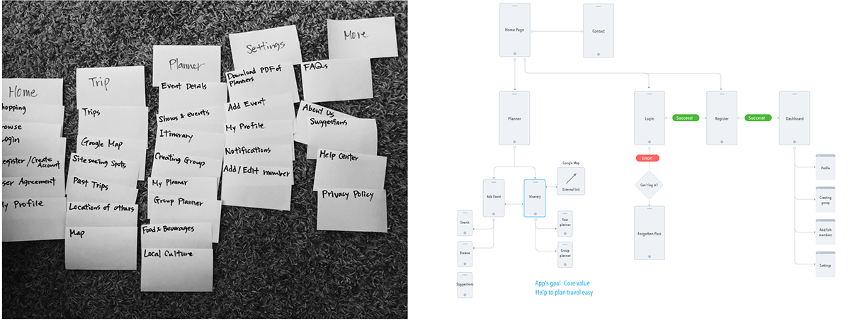
Now that we had a plan, we turned to card sorts to solidify our information architecture. We conducted both open and card sorts for the sections/pages we felt should be included in our app. I was in charge of conducting closed card sorts. Based on the sorts, most of the categories we’d thought of seemed to make sense to the user, however a couple of things got lost in translation. One example of that was when users thought “Shopping” was an opportunity to buy something within the app, rather than a type of even a user could search for. We made sure to make that distinction more clear. From there, we built out a sitemap to see how things would navigate
The WIREFRAMES
We had a few main goals with our app. We wanted users to be able to:
1) Have the ability to create groups.
2) Compare the group planner with their personal planner
3) Add/edit events to an itinerary
4) RSVP to group events.
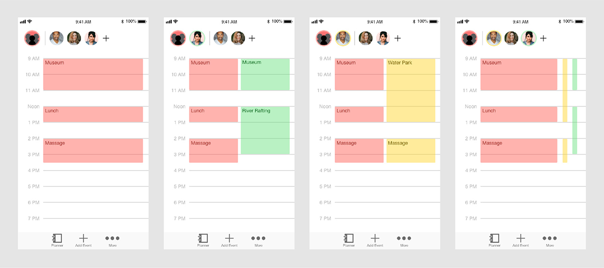
In my personal wireframe sketching, I drew inspiration from the iOS Calendar app, wanting to keep things clean and breathable. I used the concept of having icons at the top of the screen, representing each party involved. As a group we experimented with having the icons on the side as well, but ultimately thought they made the most sense at the top. I experimented with viewing multiple schedules side-by-side by condensing items, or by having them represented by a small bar to the side. I felt like this idea made a whole lot of sense, so I jumped into the next step and prototyped the concept in Adobe XD. Since the planner was really the crux of the project, we wanted to focus on that first and then apply that same style to the rest of the application. I was responsible for establishing that visual style

The USABILITY TESTING
Thank goodness for usability testing! I’d felt strongly about the bar concept working, but testing showed that wasn’t the case. Functionality wasn’t immediately clear and we hadn’t taken accessibility into account. We were presenting color as a way to differentiate one user from another, but that’s something that just wouldn’t work for people who were colorblind. We had to come up with another way of representing who would be attending each event. Ultimately we ended up using both color and the initials of the person. Users could also click further into an event where they could see a list of everyone in their group who was attending.
Another valuable piece of feedback we got was the need for an onboarding tutorial. We had a strong concept, but we needed the user to understand clearly how to use the product in order for it to reach its full potential.
The RESULT
After applying these changes and other minor ones, we built out the rest of the application.
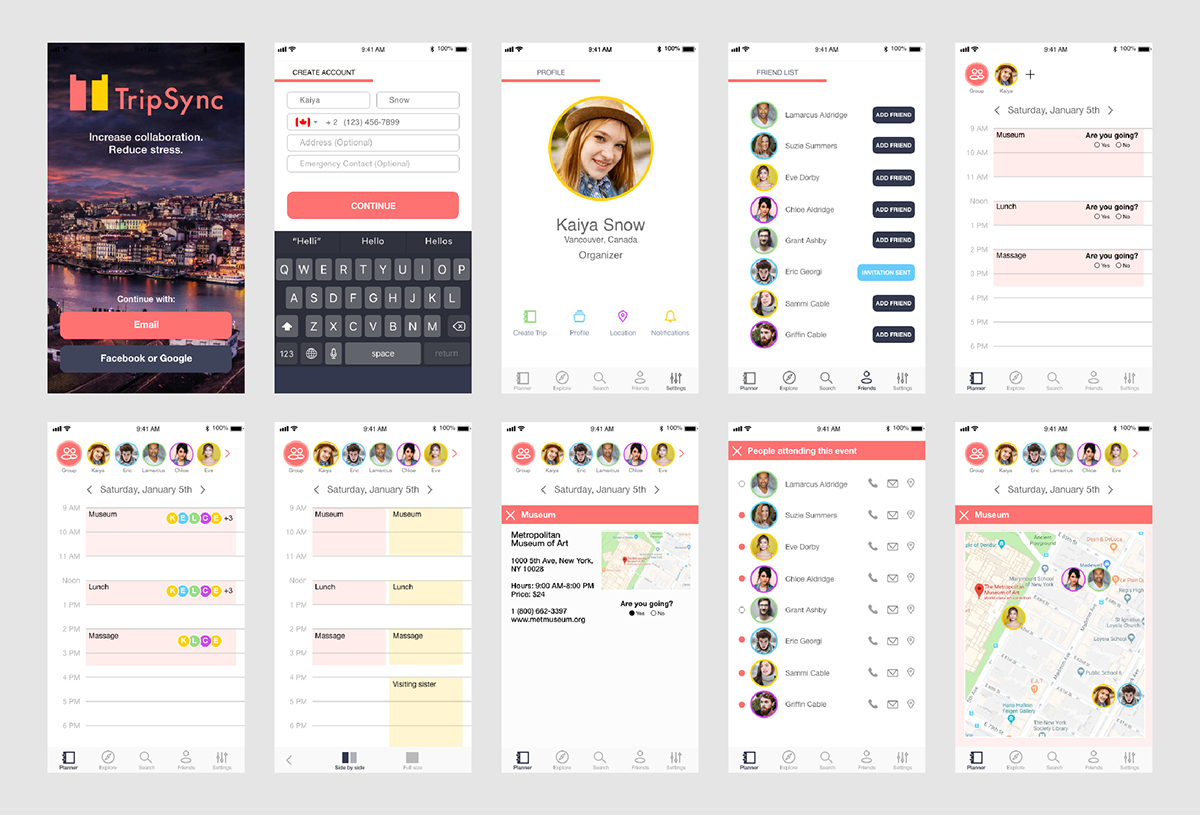
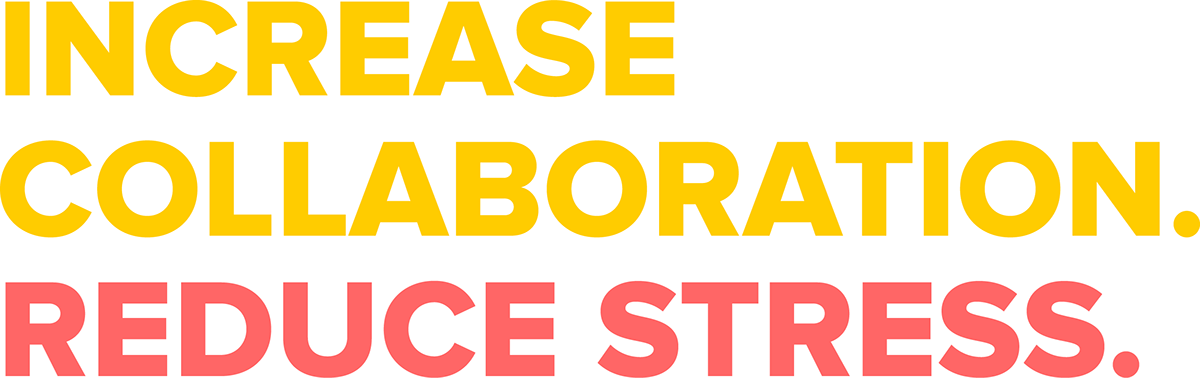
I focused on the group planner and event pages, while other members of my group worked on the onboarding, sign up/login, and group pages. The end result was TripSync, the travel itinerary app that helps you seamlessly plan trips with your family and friends. Increased collaboration. Reduced stress.
I focused on the group planner and event pages, while other members of my group worked on the onboarding, sign up/login, and group pages. The end result was TripSync, the travel itinerary app that helps you seamlessly plan trips with your family and friends. Increased collaboration. Reduced stress.