

Branding of Cao Bu Economic Cooperative
Cao Bu is a district of Guzhen town in Zhongshan city, Guangdong province. It's formed by 3 villages named Cao one, Cao two and Cao Three. We are honored to be invited by Cao Bu Economic Cooperative to design the branding.
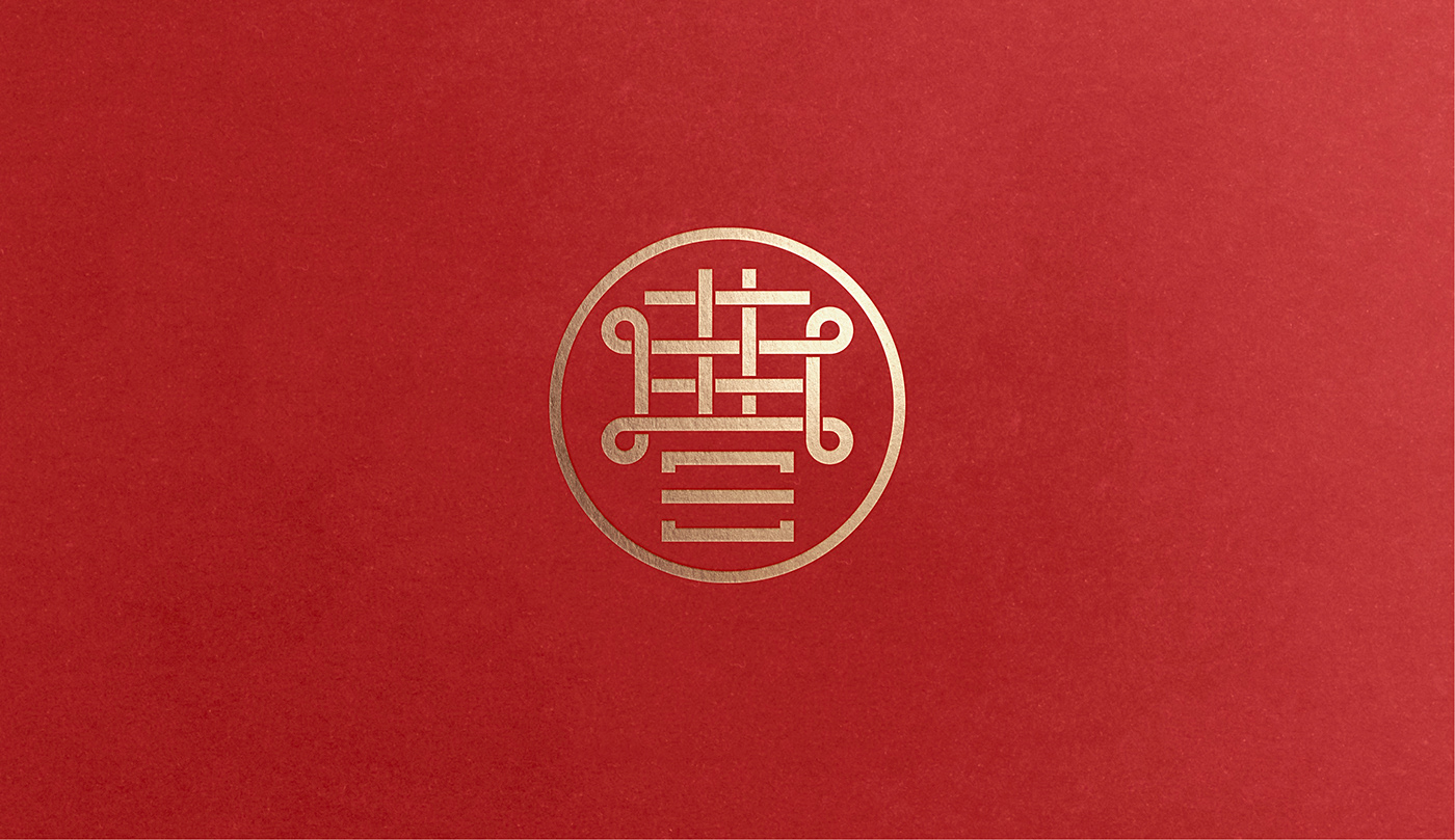
The logo is a combination of the Chinese character "曹" (which is the initial of the Cao Bu) and a Chinese knot. A very modern and contemporary approach that shows the Chinese traditional culture. The strokes of the Chinese character are arranged in a crisscross pattern, like a Chinese knot that could bring good fortune to the people in Cao Bu.
The lower part of the "曹" is formed by 3 strokes, this is a representation of the 3 villages: Cao one (一), Cao two (二) and Cao Three (三).


